HOME | DD
 mrbasic — _ v e c t o r . 1 9 7 7 _

Published: 2004-06-25 14:56:32 +0000 UTC; Views: 2028; Favourites: 29; Downloads: 815
Redirect to original
Description
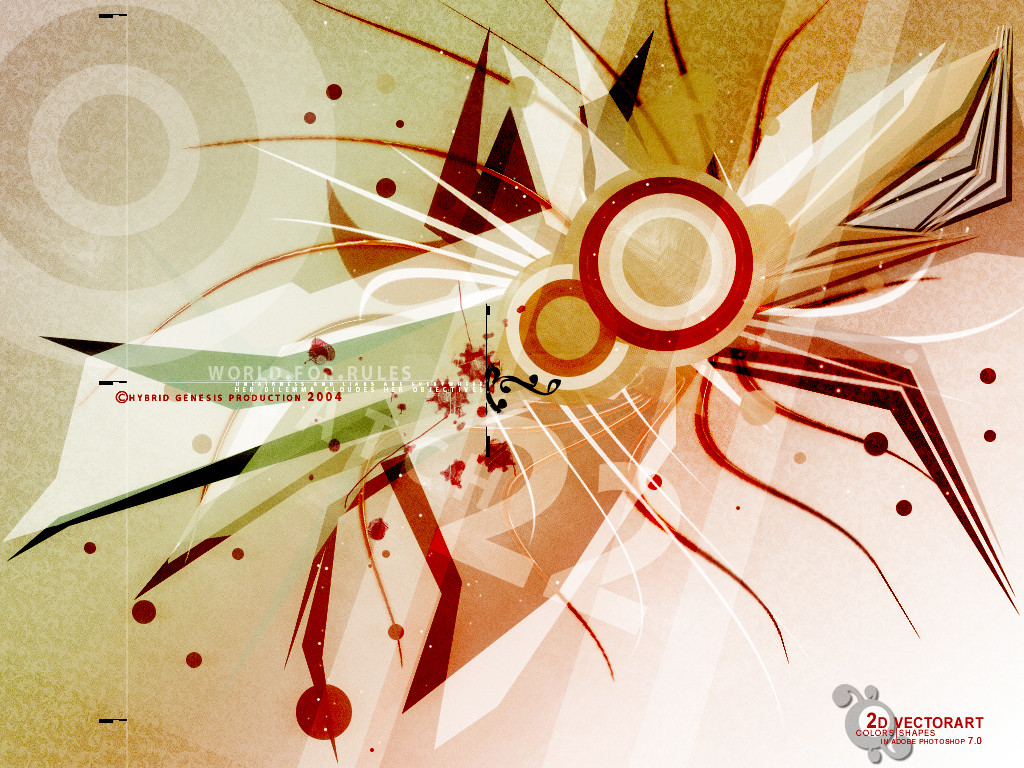
.._//// __ I have digital thoughts, do you ? __////..____________________________________
. 100% vector / Illustrator 8 .
Related content


Comments: 60


 (Wink)")
")


tis very astract....i like it....very imaginative....good work
👍: 0 ⏩: 0

Great job a try display of proving what true vector art looks like, wonderful looking piece of work makes me really want ot buy a copy of illustrator for all that I know i can do in it
👍: 0 ⏩: 0

 (Smile)")

Omtg.... O-m-g-g-g-g-g-g-g-!!!@!21jlasdjKSJDSLKjf KLSDjfKSLAJSLF AHHHHHHH
Ok, jesus that is so nice. I almost spooged on my keyboard after I saw it ")
👍: 0 ⏩: 0


It is truly awesome. I love it. I will strive to achieve a style like yours.
👍: 0 ⏩: 0


Awesome keep up the good work!
come see my stuff!
👍: 0 ⏩: 0

That's awsome, I love the colours and the fonts cool, great work!!!
👍: 0 ⏩: 0


This is almost reminiscent of the 60's and 70's with your color choice. The flower petal design also helps here, kind of like "NBC" on acid. The detailing of the boxes and small lines in their diagonal sequence is superb, and the entire piece flows very smoothly. I am wondering a bit as to why the bottom corner changes colors as it has, but other than that, you've done a great job.
👍: 0 ⏩: 1


*arrgh* I had a pretty comment for you, bt this got mad! So, summing up:
About vectors I dunno so i won't be able to give you some technique critique. Tho I like it all about the estetics of it!
Anyway, I also couldn't think of anything else appart from the seventies, due to those colors you selected, but aminly because of those flowerry thinguys! So, the image speaks for itself, but it's allways good to have some concept around it, like it appears on title and description!
Funny, from the thumbnail it looks like some kind of instrument (a weird one!), but in full-view its like in those type of paintings, that we just see points... well, not likely points, but you got the idea, right? (I hope)!


👍: 0 ⏩: 1

I'm glad the color combo rang true to the seventies feel i wanted, thank you for the comment
👍: 0 ⏩: 0


i like the colors!!! Digital thoughts, huh? I must have mush for thoughts then.
👍: 0 ⏩: 0

This is really cool!!! I love the letters and everything!!!! This is nice for a wallpaper or something!!! Good work!!!

👍: 0 ⏩: 0


sexual healing.
good direction, tasty vector.. can taste original elements.
👍: 0 ⏩: 0

Thats a pretty cool design. nice layout, the colours work good together.
👍: 0 ⏩: 1
mega? havent heard from you in a while...thanks for the words
👍: 0 ⏩: 0

That's dope. Love the colours ^_^. The only thing that dosen't seem to fit is the typface. Not so 1970...
👍: 0 ⏩: 0


| Next =>