HOME | DD
 mrcrypt — WhoDunItDeb2

Published: 2003-12-27 23:01:33 +0000 UTC; Views: 242; Favourites: 1; Downloads: 23
Redirect to original
Description
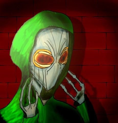
Now in OBSCUR-O-COLOR!I'm still on a clean version of this but, this looked too good NOT to do...'least I think.

Enjoy!
Related content


Comments: 13

damn!! it's a great work... i would like to draw as your
👍: 0 ⏩: 1

Thanks, sir. Thanks
...but you already have far more motivation than I
what, with making a movie and all
I'll be back around to check you guys out A.S.A.P.
Thanks for your kindest of words
Be well!
")
 (Wink)")
👍: 0 ⏩: 0

Really nice!!! I agree about the colors....very cool

👍: 0 ⏩: 1
Thank you! Thank you Very much

👍: 0 ⏩: 0

I love this, the color is so awesome. It really makes the picture stand out and appealing!
👍: 0 ⏩: 1
Thanks! 
High contrast ... make all the colors stand out
Thanks again, ya' reject

👍: 0 ⏩: 0

I REALLY REALLY like this version...
the feeling of it.. somewhat warm.. like a indie movie or something.. heheh
very sketchy still strong.. I like it.. yeha..
👍: 0 ⏩: 1
Thanks more for this than the last...'cause this one's finished
You called it...strong & sketchy
Again, thanks

👍: 0 ⏩: 0

hey cool, too...I´d like to see something abstract in that style...rock on

👍: 0 ⏩: 1
We'll see if I can oblidge
ThnX for your kind kind of words...much appreciated! Glad you dig it
 (Smile)")

👍: 0 ⏩: 0
Thanks, yo!
I actually wasn't too sure if it was too strong. That's why I did a sepiatone
I'm very glad you like it...and you're more than welcome to hang it on your wall, if you want
👍: 0 ⏩: 0

Actually I like this one more than your sephia one. It has a much stronger grunge feel cuz of the color scheme combined with the dark harsh lines. I really like the perspective you used for the person, gives it all a cool feel. It looks like something you'd hang on your wall.
👍: 0 ⏩: 1
uh...I don't think I put this in the right box...um...k...
Thanks, yo!
I actually wasn't too sure if it was too strong. That's why I did a sepiatone
I'm very glad you like it...and you're more than welcome to hang it on your wall, if you want
👍: 0 ⏩: 0