HOME | DD
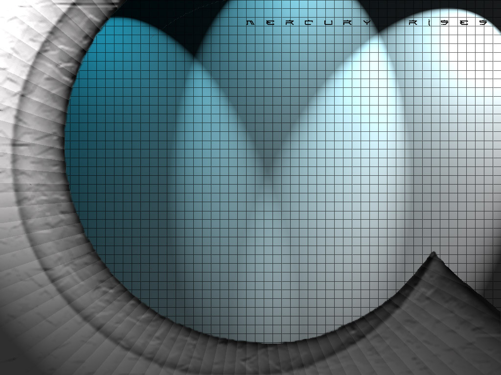
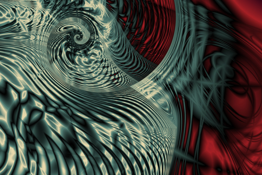
 mrmercury — The Summoning
Published: 2000-09-27 19:19:42 +0000 UTC; Views: 3816; Favourites: 9; Downloads: 1886
Redirect to original
Description
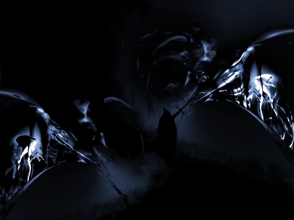
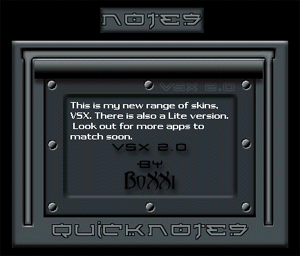
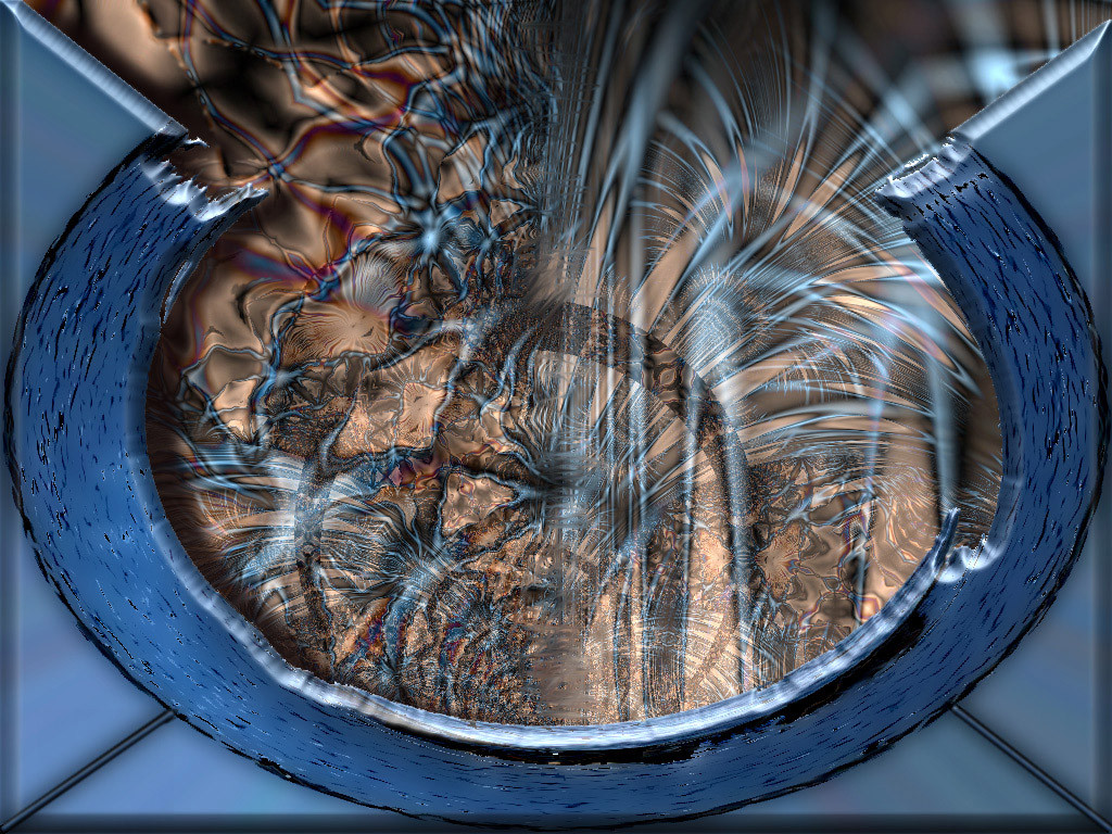
Dark....With scary bits.WHOOOOOOOOOO.....
hope you like it.
and I dont read comments, so don't bother. Thanks.
Related content


Comments: 11

who are you guy's talking to? He says he doesn't read comments.....
👍: 0 ⏩: 1

talking to you of course..
soo.. hows the beer?.. mine needs a little bit of juice and walrus feelers..
....
bored.. sorry..
👍: 0 ⏩: 0


i was just browsing this fine place and stumbled onto this piece...i dont remember seeing it before...but it is real nice dude! real nice!
D I G I
http://www.awedigi.com/optic
👍: 0 ⏩: 0

I don't know what matteo is talking about... i like the fact that it is not symmetrical. I like the fluid stream from one side of the peaper to the other. The color scheme is simplistic but sharp. I like it.
👍: 0 ⏩: 0

Skinz.org : "The Summoning", Downloads: 2181, Comments: 12, Top 5 list for 2 days!
KUDOS to you! mrmercury, aka BoXXi, aka Bryan Cook!
👍: 0 ⏩: 0


Very very nice! I love the dark, excitingly frightening, tone of this deviation!
--[ jark ]--
👍: 0 ⏩: 0

i love the right side but the left side looks different.. try and make the left more like the right.. then it would own
👍: 0 ⏩: 0

