HOME | DD
 MumblingIdiot — Angst Muffins
Published: 2008-04-16 23:33:57 +0000 UTC; Views: 1506; Favourites: 10; Downloads: 0
Redirect to original
Description
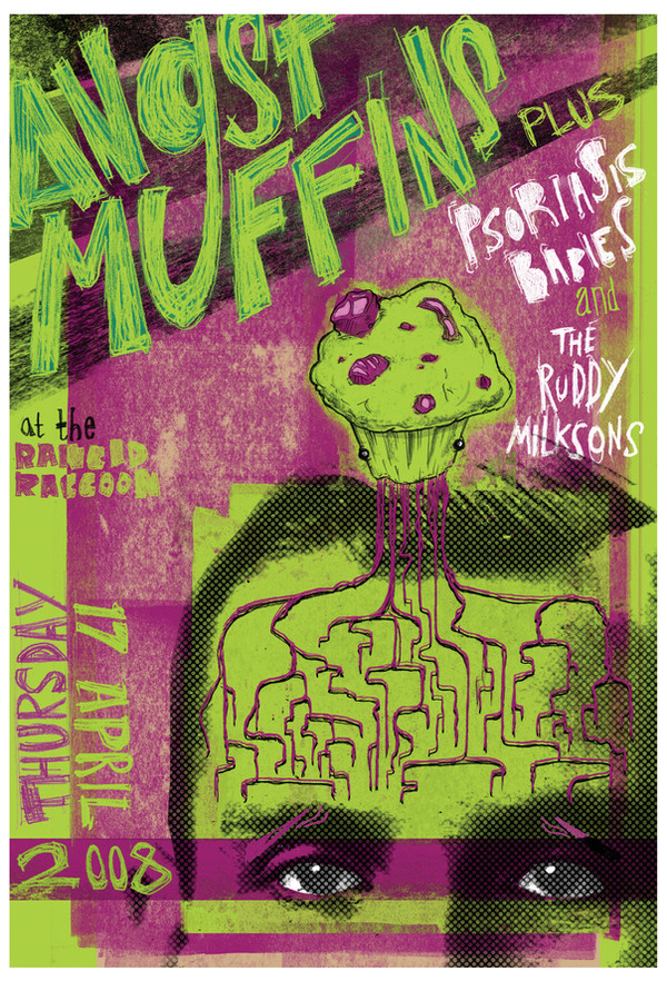
This was for a photoshop workshop which became sort of a pointless exercise.I don't really like this much. It's meant to be a poster but it looks more like a shit magazine cover. Type is horrible and all over the place.
Photo stock from
Related content


Comments: 18

I've gotta say I quite like this. Good to see you doing something more designy.
Nice composition + that photo really blends in very nicely!
I'm almost getting a bit of a David Carson vibe off the floaty text (though the hand drawn text makes a difference in that regard)
👍: 0 ⏩: 1

Thanks a lot.
Hmm, not quite that cool yet, but a pleasing comparison.
👍: 0 ⏩: 0

Ill admit the text is a little erratic nut it looks like the poster to some underground band known only to music elitists that hang around obscure clubs.
👍: 0 ⏩: 1
Haha, yeah that was the idea.
👍: 0 ⏩: 0

It's not as bad as you're saying - though I'm agreeing with some of the previous comments that have been given.
But to be honest I do quite like it.
")
👍: 0 ⏩: 1
")

Love the colours - looks like a student gig poster
Thanks for using my stock!
Also as first to use this stock I`ved placed your icon and a link to this in my description box here [link]
👍: 0 ⏩: 1
Yup, that was the idea. And thanks alot!
 (Smile)")
👍: 0 ⏩: 0

 (Wink)")

If the text didn't exist on the left, it would have been better.
Very 90's ish.
👍: 0 ⏩: 1
I strongly agree. I was actually gonna do a cropped down version so that it's slimmer with the picture dominating and redoing the text so it comes in at the top and the bottom. But I ran out of time. If I feel inclined I may still do that, but I'm not sure it's worth the trouble.
👍: 0 ⏩: 1
Its always worth the trouble.
Whenever I post work or even in school it is a bad habit that I might purposly take a F to do a project the way I intend to do it.
I'm not a perfectionist but I try not to disappoint myself.
👍: 0 ⏩: 1
Well it's more a time issue and the fact that no ones gonna really care, since I think it'll still be a bit shit.
It's a good mentality to try and keep up though.
👍: 0 ⏩: 0
I hope your laughing at the muffin and not my complete ineptitude.
👍: 0 ⏩: 1

I'm laughing actually at the title. Angst Muffins, seems like everything is a teenager now.
But It's a good picture also.
👍: 0 ⏩: 1
I'm afraid I can't claim credit for the awesomeness of the title but I won't divulge it's origins.
Thank you!
👍: 0 ⏩: 0