HOME | DD
 MyBurningEyes — Spring

Published: 2010-09-16 14:23:47 +0000 UTC; Views: 10642; Favourites: 262; Downloads: 0
Redirect to original
Description
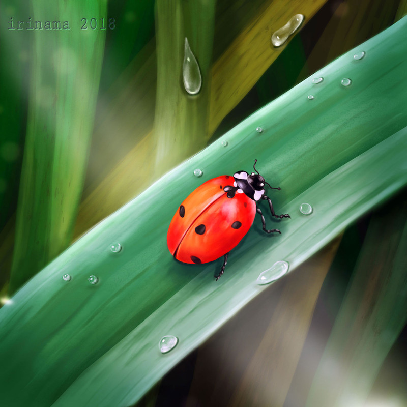
For my school project i decided to make a seasonal calander so i made a painting for each season. This one is meant for spring. (Smile)")
Don't know if i'll upload all of the seasonal paintings because i don't like some of them

Made with photoshop CS4 and tablet in 3-4 hours or so.
Hope you like it!
Related content


Comments: 222

omg, this painting is so amazing!
👍: 0 ⏩: 1


oo i like it ^_^ great job on it! wonderful!
👍: 0 ⏩: 1

no problem, buddy! (: <3!!
👍: 0 ⏩: 0

the detail on this is amazing! nicely done!!!!
👍: 0 ⏩: 1


just speechless. you draw them professionally. ")
👍: 0 ⏩: 1

Awh thanks for the kind words!
👍: 0 ⏩: 0

wow, this is amazing. it's so beautiful
👍: 0 ⏩: 1


OMG do eet. I want the other seasons as well 
I just love it. I'm much into nature and scenery anyways so this is just lovely. The pure rich colors and the soft details the shading creates. I pretty much adore the lady bug as well - it's just a pity that the watermark distracts the eye from the important thing - the image itself. but I think you have your reasons. Though I like the composition I think the stipe of the flower could be a littel more gracile/delicate. the flower would also get more attention when the background was a little less obtrusive - well in my opinion at least. Otherwise if you woul make it darker it might lose the impression of spring 


👍: 0 ⏩: 1
The other seasons aren't very well 
Cool you like it
What should exactly be changed about the stipe of the flower?
Well this is as far as i could go with the colors, before it got more of a cold look
I edited it allready in the wip fase it was way more bright in first instance haha
They liked it 
Thanks for your comment
👍: 0 ⏩: 1
well the stipe should be more gracile in my opinion but well - as long as your teachers liked it...I want to see the other ones anyways 
👍: 0 ⏩: 1
I'll maybe adjust it later on thanks
👍: 0 ⏩: 0

that's a drawing!? i thought it was a photo. omg it looks damn realistic.
respect.

👍: 0 ⏩: 1
Haha it's still a drawing
👍: 0 ⏩: 0

woww!! Deze is eecht supeer vet!! Ik dacht eerst dat het een foto was xD
Looove it!
👍: 0 ⏩: 1
Haha dat heb ik al vaker gehoord
👍: 0 ⏩: 1

The result is nice! The background looks a lot more smoother and not as piercing as it was before. You made a fine finish

👍: 0 ⏩: 1
Yeah, this jpeg got better haha
👍: 0 ⏩: 1


looks real....
and in 3-4 hour??!!
believe me, youre great
👍: 0 ⏩: 1
Awh, thanks for the nice words
👍: 0 ⏩: 0


Haha
👍: 0 ⏩: 0


Wauww, vind deze echt mooi!!
 (Wink)")
👍: 0 ⏩: 1

This looks beautiful 
👍: 0 ⏩: 1


Wow, you did that in 3-4 hours??? O_O Goodness, that's beautiful work within that little bit of time! Awwww, looked real too, till I saw the droplets up close! Cute ladybug.

👍: 0 ⏩: 1
Haha yeah, had to speed up because i had a tight deadline!
Haha yeah droplets could be better next time, jus made it with an easy technique this time to save time
👍: 0 ⏩: 1
Hee hee! I can relate with the deadline thing. >_< Well, if you can do all that in 3-4 hours, I can't imagine what you can do with a more flexible deadline! Wow!!
👍: 0 ⏩: 1
Well, this might be better haha, i tend to geting TOO precise, pixel by pixel adjusting, bit perfectionist sometimes haha
👍: 0 ⏩: 1
Ooooh, yeah! You're right about that! What a way to make a person stop when they're ahead! Or...stop before going insane. XD
👍: 0 ⏩: 1
More insane will be hard to accomplish

👍: 0 ⏩: 1


<= Prev | | Next =>