HOME | DD
 mynti — Ice Castle WIP

Published: 2010-06-23 20:21:04 +0000 UTC; Views: 3401; Favourites: 68; Downloads: 118
Redirect to original
Description
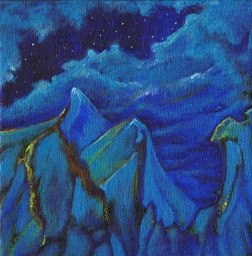
This is a painting I started in late April 2010, showed as an unfinished work in my May show, and am contemplating what needs doing.It needs some help and some reworking but I'd love ideas and critique in the meanwhile because I won't be able to pick this piece up again until I complete the commission work that is on my plate currently.
So far:
Liquitex Professional Heavy Body Acrylics
on 20x24" primed and stretched canvas
15 hours in one long and frantic painting session
Inspired by `memod 's Brrrrrr and referenced with prior permission.
Part of my "Blue Series" I've got going on.
Sorry for the bad photo - as usual, I struggle to properly capture my traditional work...
Related content


Comments: 12

Overall


Vision
Originality
Technique
Impact
This piece has lots of potential! The extreme scale, wonderful colours, as well as the palace and jumping penguins give it character and drama.
The major thing I would suggest you work on is the 'idea' behind the picture - does it tell a story? Does it convey an emotion? More than the technical things, I think a picture, any picture, ought to have a some sort of meaning to it. It may be technically astounding, but what makes something 'great' for me is the underlying message.
Right now, I feel that you have some 'idea' - indicated by the penguins and the palace.
The palace is beautiful, towering and delightfully fairy-tale-like in its architecture, and especially its placement here; an odd location for dwelling.
The penguins too, invoke interest in the viewer. It is customary for penguins to dive into the ocean, but the way they line up - so perfectly straight and patient along that small peninsula - gives them a whimsical look.
The surroundings, too, adds to the picture: here, a strangely man-made-looking arch; there, a dark cleft at the base of the cliff leading into the unknown; in the distance, a tall, solitary column of ice.
Like I said, I really see some great things here, but I'm not really sure what it is you want to convey?
On a technical note, you could add more detail. A lot of your other works are filled with intricate details and look absolutely stunning for it. Even if what you add is so small as to not be immediately noticeable, I think you should still work on it. Often, it's the tiny things that give a piece real depth, lifting the painting.
You could also work on the background more, especially the 'blocks' of ice. What struck me about a.deviantart.net/avatars/m/e/m… " alt=" " title="memod"/>'s Brrrrrr is the translucent look of the ice arch. You don't need to change this if you don't want to, but I feel that that semi-transparent, almost glowing appearance of ice is important in expressing it well on paper.
I like how you've used subtle hints of colour besides blue - the violet and green hues are very nice. You should intensify them, I think, like a.deviantart.net/avatars/a/r/a… " alt=" " title="Ark-souzou"/> said. Not too much that they take away from the blueness (which is very lovely and serene) but enough to be a little more prominent. I think it's also important to spread the colours evenly - for example, the pale purple icebergs in the background are not as blue as the ice sculptures in the foreground - they can be lighter or darker, but a greater similarity in hue might give more continuity.
And just one specific thing - the top edge of the large arch in the foreground needs more contrast, perhaps. Now, it blends a bit much with the pale background icebergs. It is a large feature and, I think, should have more definition.
Overall, maybe more dramatic contrasts would work well to increase the impact of the painting.
Hope that helps. e.deviantart.net/emoticons/b/b… " width="15" height="15" alt="
")
👍: 0 ⏩: 0

I like the iciness of it all, but ... miss life (beside the penguins), maybe add some sparkling touches here and there?
And the sky ... wouldn't go for the same blue, unless you want to go for an ice cave? ^^
👍: 0 ⏩: 0

I defenitely like the pinguins being all lined up
I think what you might want to do is add a little bit of a different color, at the moment it's all blue, white and black. If you could put another color in there it might look even more stunning than it is already
")

👍: 0 ⏩: 0

It looks so.....realistic! And it's not even done!
God.....i can't wait to see the result c:
👍: 0 ⏩: 0


I think this would look stunning if you intensified some of the other hues besides blue. I see some pink and yellow in there, and I kind of imagine a gentle aurora-type glow to the entire painting. This is such a beautiful and fantastic imagine, so why not let the imagination go big and have fun with a mixture of colors  (Smile)")
I really like the castle up on the cliff; I feel like it needs a story behind it. Who lives there? Is it abandoned?
A really beautiful scene, I love it already but those are just a few things that pop into my head
👍: 0 ⏩: 1
Should have proofread for typos before hitting "Send", haha! Anyways, now that I think about it you probably do have more colors than I think because cameras never capture a painting in its full glory. If you feel it's colorful enough, then that's cool!
👍: 0 ⏩: 0

Hmm, I don't know, perhaps its a bit too blue. I really like blue^^ but there could be some more red or something like that?
Anyhow the penguins are cute
👍: 0 ⏩: 1

It's meant to be very blue, but I see your point. What other color would you consider putting in? More purples and greens than I have here? (The camera did not pick up on most of the greens in the foreground) It's hard to integrate other colors into this sort of landscape where it is water, sky, and ice.... it's a tricky painting.
👍: 0 ⏩: 1

I think you could reinforce the aerial perspective by graduately intensifying the purple/pinkish tones in the background. You already did it with the rocks, but maybe you could try it also with the sky, so it lets the foreground stand out.
Also... I think the castle's perspective is a little too exagerated. But I don't know...
👍: 0 ⏩: 1
Yes, exactly, the background can have other colours. It could be in the morning, so the sky is red or at least the icebergs in the background. That would give it a fresh touch I think.
Hmm well, I'm german, it's hard to explain, but I hope you'll understand^^
Concerning the perspective, I'm quite bad with that, but for me it looks ok.
👍: 0 ⏩: 0