HOME | DD
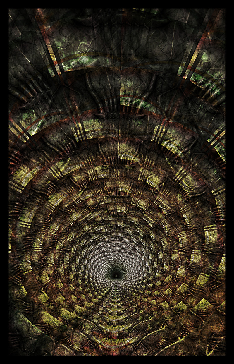
 n0zix — Light the Way beta

Published: 2001-03-04 15:25:30 +0000 UTC; Views: 576; Favourites: 2; Downloads: 154
Redirect to original
Description
beta version of a wall, im stuck, so any suggestions would help!Related content


Comments: 9

")

i don't see a huge need for improvement..
maybe a person in the center of it...
👍: 0 ⏩: 0

hrmm neet, like the tunnel, perhaps something to pull the whole image together in the forground? seems sort of dull around the sides, unless you want the focus to remain in the middle i notice theres a bit of a circle/square design running around the center, perhaps if you played with bringing that out so it was more prominent in the picture. I'm thinking kindof a decayed stone circle or something
good start
👍: 0 ⏩: 0

Awesome for whats there. I feel that something focused on top of that would make it look really awesome.
----------------------------------
http://www.createdbycheney.com/
👍: 0 ⏩: 0

reminds me of the Indiana Jones: Temple of Doom movie... i can picture little weakly demons chained to the floor being whipped by bigger demons... thats just my twisted mind though...
i definately see a tunnel, one that might benefit from having some machinery pieces added to it.
👍: 0 ⏩: 0

hmm, try this, make a new invert adjustment layer. set it's layer compositing to difference. then make a new hue/saturation adjustment layer and play around with it... see how it looks, i don't know, might give you a new direction or something...
the twilight souls coming to us with inspiration and dreams, leaving us insomniacs...
👍: 0 ⏩: 0

Very good work. I would suggest putting a central image in the center to draw attention to it. The blur stated above would also be a nice choice. As for the image, i'm not really sure, that part should be up to you.
Mathias
http://www.antisteve.com -Ever wanted to kill your best friend?
👍: 0 ⏩: 0

Ah i love it. as for how to improve it maybe add some blur so it looks like your being sucked into the center of it or something along that line. Otherwise awesome job!
.:schrunk:.
http://perfectcircledesign.cjb.net
👍: 0 ⏩: 0
