HOME | DD
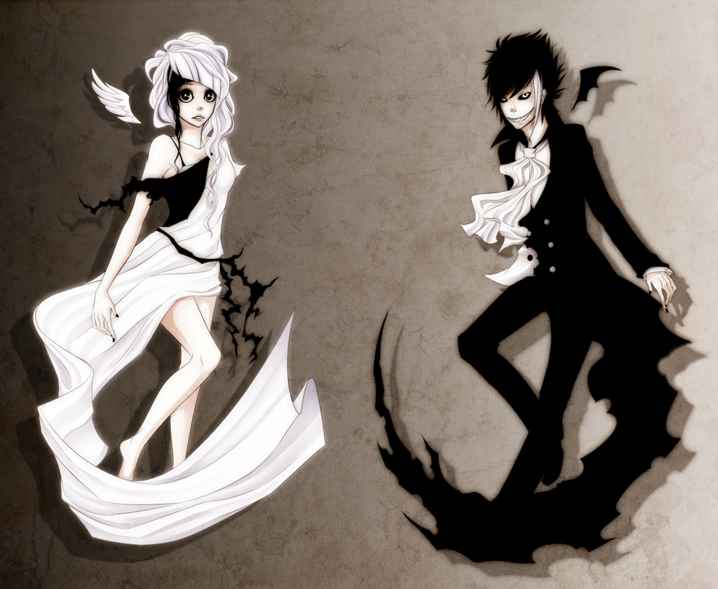
 Naimane — Yin Yang
Published: 2011-11-26 19:31:16 +0000 UTC; Views: 59876; Favourites: 4691; Downloads: 705
Redirect to original
Description
For who wanted me to design two characters that would represent Yin and Yang~Waah I've never been so nervous about a commission before ;A;
Hope you like <3
Edit: Guys. GUYS. You don't have to tell me that the colors are wrong, I knowwww xD But it is what it is now, whoopidoo.
Related content


Comments: 606


Vision
Originality
The picture is very lovely. I don't see much unique Yin-Yang paintings on here but I must say this one would be my favorite. Its exquisite and tells a story all by itself. It represents Yin-Yang perfectly I believe. The way that they seem exact opposites but there are little details that imply they are in, very few ways, alike. I enjoy that fact that the woman is elegant and graceful in appearance but has the little bit of edge. Now moving on to the man, he also in appearance is rough and edged but holds a small amount of elegance such as the women. All in all I believe you portrayed Yin-Yang perfectly. So nothing to worry about. Please keep up the good work.
👍: 0 ⏩: 0

Overall
Vision
Technique
Impact
I think this piece is very striking. It stirs emotion in the person who is looking at it. I personally, am very impressed with this piece. There are little minor details in which I have to critique.
First, let's start with the woman. I think she looks wonderful, though being that she is representing the good in the world, I think that her dress should have been just a little longer. I love her facial expression, and I think that it goes good with the piece. Her eyes tell you that she is frightened by the man dressed in black. Though, I believe her frown should have been a bit more...scared, if you're going for that look. But, you could have NOT been going for that style, and if so then I think you did well.
I love her hair, you must have put a lot of work into it. The design is ingenious and I think you got the perfect look for it.
I also enjoy how the black tendrils in her dress seem to be enveloping her body and wrapping her. It adds to that frightened effect. I also like how she's barefoot, I think that you made a great decision with that. It makes her look more natural and innocent. Though, I think to give the piece a bit more balance, sandals would have been appropriate.
Moving on to the man: He's...well, to be honest, scary. If I ran into a man like that in a dark alley, I would be terrified. He's also very handsome which I think contributes to the woman. He's so very handsome that if there was a story to go behind this, the maiden representing good would be troubled to have to resist him and that's why I think the black tendril are able to attach to her. I think that it symbolizes the balance between the two. I like how the man's hands are bony, whereas the woman's are elegant. They are complete opposites of each other and that's wonderful. You really did a fantastic job incorporating a bit of white into the man's outfit. I am very impressed.
Again, I think the hair compliments the character and just adds to their persona.
I really like the background, I think it's a wonderful transition. It definitely shows their differences. And the grunge kind of feel on one side transitioning into a marble kind of feel on the other works quite well. Though, I think that it might be a tad bit to dark on the left side.
You did VERY well with the shadowing and shading, I'm very impressed with that. In fact, it's one of the many reasons I enjoy this piece so much. I think that you did a fantastic job on it.
Overall, it's a lovely piece. In my opinion, I think that whoever ordered this commission will be VERY pleased and should be.
👍: 0 ⏩: 0

Overall
Vision
Originality
Technique
Impact
I rarely ever see anything such as a Yin-Yang piece, but I really do enjoy this piece of art. I think it's very interesting how you used a guy/girl for the yin and yang. The shading is very well done and I think it's interesting how the wings on both of the person's don't actually connect to their backs. The background is very nice as well and it puts emphasis on the whites and shadowing on the blacks.
The tears that you do on the suit (and dress) are very soft, but considering the fact that the entire picture is in more of a "soft" environment I can see how the tears would like like such. I personally would've put something in the middle of both of the people since the way they are both posing, it's as if they are "framing" something, especially with the way the veil and the torn tail of the suit are curled into the middle.
The demon facial expression the male has is very nice but the expression on the female isn't so much. The frown makes it seem not so soft anymore but I guess the fact is that the only good way to critique is for the actual artist to do so, your the one who envisioned this piece. I think her eyes could've been a bit smaller and instead of a frown, perhaps a small mouth to make it seem a bit more soft.
All in all I believe this is a nice piece of art but I would've liked to see more of a frame in the middle, perhaps a "mix" of both of the yin and yang, though I can see how that may make the artwork a little too busy. I love the framing of both of their bodies and how the edges on the clothing and their bodies are softened so it goes well with the shading and the background.
👍: 0 ⏩: 0

Overall
Vision
Originality
Technique
Impact
The repeat-reversed theme of the character designs are fairly well thought out, though slightly overdone. The whole composition, placing, and posing of the characters is very bland and not very stirring or impacting-it's actually a bit awkward to look at. I understand the feel you were trying to get with the whole grunge-texture background, but it really stands out from the characters in the foreground-in the bad way. The background has more detail than the characters(since all the shading the characters have is mild amounts of very inaccurately placed super-soft cell-shading)and it has no way of flowing together with them.
👍: 0 ⏩: 2

Uh, sorry, but I think this piece is pretty awesome. The posing is fine. How is it bland with all those wrinkles and expression? And the characters have a LOT more detail than the backround, just saying.
👍: 0 ⏩: 1
You're probably in middle school then.
👍: 0 ⏩: 1
What, did you look at my profile?
👍: 0 ⏩: 1
HAHA OMG I WAS JOKING this is perfect
👍: 0 ⏩: 0


The overall piece has a very good feel to it, the edges on the character designs nicely give a glow to the female and the feeling of being sucked into darkness on the male, this was the first thing I noticed, which set me in a good mood for the picture overall.
The female representing good is well designed, with smooth(ish) flowing lines in the outfit and hair, representing softness and good in a way, black incorporated nicely to follow the yin and yang theme, the male is the perfect contrast with jagged aggressive lines, white eyes and streak of hair.
However on the male character the white part of the jacket to the left, just doesn’t seem to fit in the picture, especially as his shirt is white. I see that there is the jagged black coming off the female I guess in a way to symbolise where they come together or something of the sort, but it feels like it was added in as a later thought and not incorporated in the character’s fundamental design, I also feel it is unnecessary as his shirt and cravat serve the purpose well, the jagged part coming off the girl seems to fit nicely somehow, perhaps as it is such a contrast from her flowing clothing.
I personally love the style of line art, and it is what draws me back to your work quite often, so no problems there, I especially like the female hair design, it seems quite different to what I’m used to seeing, however the male’s hair design, while cool, is quite similar to that of recent drawings of yours, I’m thinking a mix of “fail” and “The Ventriloquist”. But I don’t know, perhaps it’s just some sketch or something I noticed while you were livestreaming or in a sketch dump that’s lodged in the back of my mind, it just feels very familiar. But as usual I’m just picking at tiny things; it must be pretty hard to come up with something completely different considering the large variety of male hairstyles you have drawn over the years.
As is often the case with you, the background is extremely simple, but I assume you weren’t paid in the commission for a background, and I do appreciate the clever dark to light gradient in juxtapose to the characters respective colours. Perhaps go a little less defined on the texture next time, as in the darker regions I feel it’s a little too imposing on the piece.
I like the costume design in particular the male one, but I do have a penchant for that style of clothing <3 The tail of the jacket stretching into this jagged distorted spike is a very nice transition which I like very much, similarly I like the way that the female’s clothing flows to a point, very contrasting as is the aim with the theme of the characters, however flow of material is very difficult to draw and the depth of the material doesn’t feel like it’s been captured in places making some areas seem flat and others dynamic, but it’s overall well executed.
This is the tiny details section, shouldn’t be too long. I like the little wings, they are nicely designed and well they just look good and I like them. I have a minor qualm about both characters having black fingernails as up to now everything of that sort has been the opposite on each. I like how the girl has round full eyes, and soft lips (characteristic of a girl, but I feel emphasized for the purpose of the theme) and the male sharper more jagged features (amg that smile). Final little thing is the negative space between the bulk of the picture, it’s just sitting there unused and boring, dead centre where the eye naturally rests, this on the one hand allows you to focus peripherally on both characters but on the other hand it can be perceived as dull unused space, but in the very nature of the design it is impossible to avoid, I just feel that yin and yang you see as one fluid thing as opposed to spaced out, but I wouldn’t sacrifice the clothing ‘tails’ for that <3
In summary I’d say that this is a well thought out piece, with lots of nice little touches that make it special. It’s relatively simple in construction and the shading is subtle, which is how shading should be. Good lines, very smooth and good general anatomy. The outfits and style of the characters is very nice and compliments the respective roles well. Good job, just keep in mind all those little things I always nag about.
P.S.
The guy’s eyes… can you find a way to surgically transfer those to my face?
👍: 0 ⏩: 0


Nice drawing but isnt yang supposed to be male and yin female?
👍: 0 ⏩: 0

It's beautiful!!!!
Yin was supposed to be a female and Yang was supposed to be a male as they represent masculine and feminine but I have to say you did awesome!
👍: 0 ⏩: 0

Now I am definitely confused how on EARTH are the colors wrong? These are overall portrayed rather correctly, Yin who's white has a tinge of black then Yang who's black and has white on him just like the dots and such idk o.o
👍: 0 ⏩: 0


The Black one supposed to be female and the white one male
👍: 0 ⏩: 1

I wish people read artist comments
👍: 0 ⏩: 1

XD these two kind of remind me of my oc's i know yin is supposed to be the girls but he is just a little more shota than the avrage male, btw i love your work
👍: 0 ⏩: 1

Amazing to the max! I LOVE this drawing, this is so cool I can't even describe how awesome it is. ")
👍: 0 ⏩: 1


I love this to death. I envisioned how I would represent my personal yin and yang and this was what it looked like. May I edit this photo to fit me more personally and put it up on here with credit?
👍: 0 ⏩: 1
This drawing was a commission so it doesn't really belong to me ;A;
👍: 0 ⏩: 0


I love this, one of the best Yin Yang art pieces out there. They balance each other out perfectly. Not too much of one colour or too little of the other. The mans smile is a bit... Demonic? I think that's the right word, but other than that it's all good!
👍: 0 ⏩: 1


This is a wonderful depiction  (Smile)")
👍: 0 ⏩: 1

.......jeez, does it really matter which one is which gender?? XD i mean the artist can design his/her characters in anyway he/she wants them
👍: 0 ⏩: 2
Doesn't seem like it... xD
👍: 0 ⏩: 1
i still say that its up to the artist to decide what their characters look like~
👍: 0 ⏩: 0

I agree with you! They could be both girls for all we care! Or both guys...
👍: 0 ⏩: 1
YESH!!! >W<)b
.....and by the way, your icon is supah cool bro - w -)b
👍: 0 ⏩: 1
YEAH!!!!
*high five*
Thanks, bro. XD
👍: 0 ⏩: 1
epic hi-5!!!!!!!!!! >W<
no problem >W<)b did you animate it yourself???
👍: 0 ⏩: 1
No, I didn't make it... I found it somewhere... I could've made it though, if I wanted to.
But that requires... *silence* effort.
👍: 0 ⏩: 1
well it looks pretty >W< and i like all your vocaloid models OwO they are all very pretty!!!! >W<
👍: 0 ⏩: 1
Every single one has a Download link! Except for one...
👍: 0 ⏩: 1
koool~ 8o i actually have no idea what you mean by those 'model' things cus imma turd
Trust me bro, there's a turd in everyone. XDDD
👍: 0 ⏩: 1
yes, yes there is ; 7 ;
👍: 0 ⏩: 0
| Next =>