HOME | DD
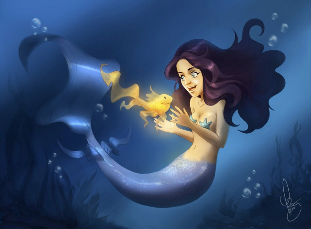
 NaurCalad — Magic Glow - WIP
Published: 2013-05-28 18:50:02 +0000 UTC; Views: 1583; Favourites: 34; Downloads: 0
Redirect to original
Description
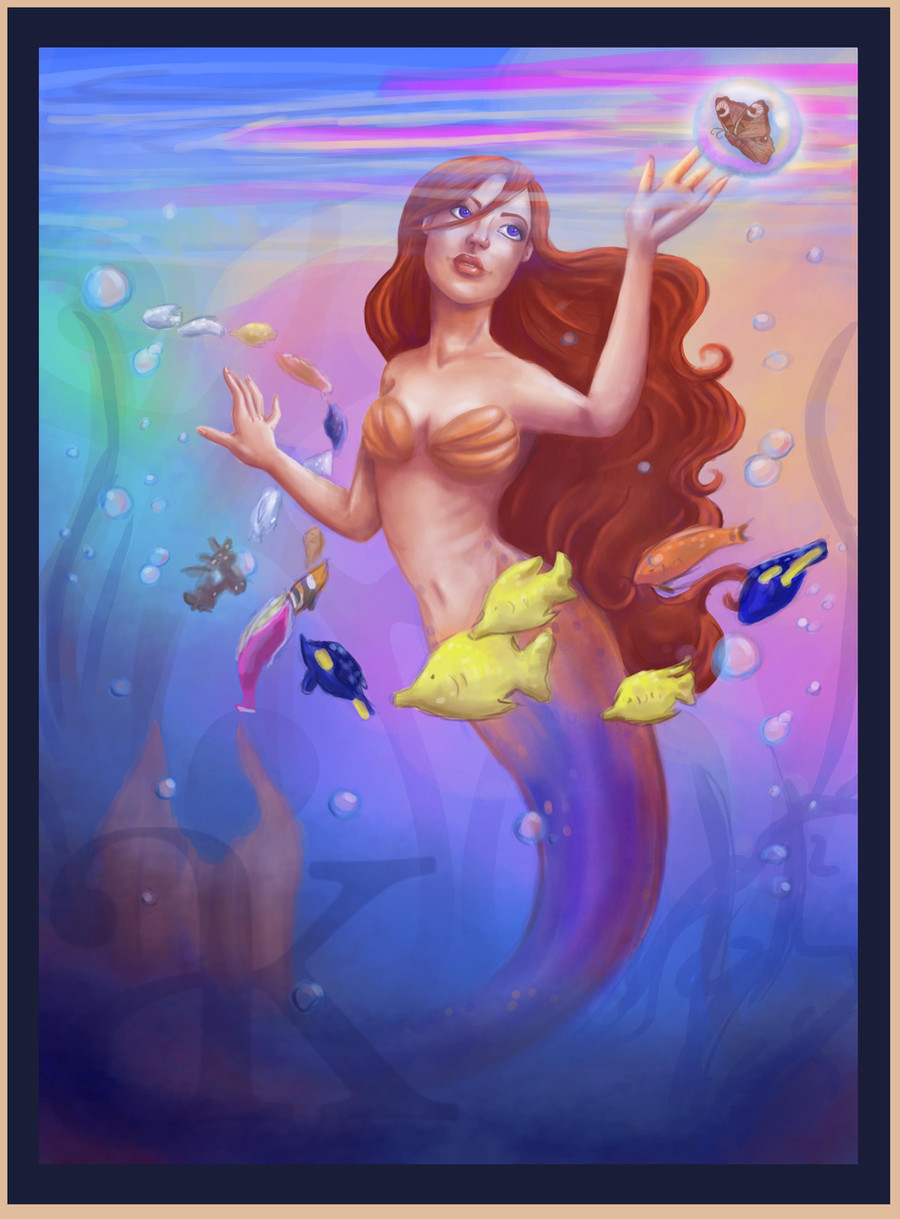
Mermaids are awesome! Just some practice with Photoshop. This was inspired by my very first digital painting: [link]This artwork © Liz R.B (Naurcalad)
Related content


Comments: 19


Haha, I never saw the resemblance, but she kinda does! Thanks.
")
👍: 0 ⏩: 0


esta muy bueno Liz! estas mejorando un monton che!! sigue asi!!!
👍: 0 ⏩: 1
Muchas gracias! A este debo hacerle varios arreglos, quizás pronto suba la versión mejorada.
👍: 0 ⏩: 0

Very pretty!!! The lighting and colors look so realistic and perfect
If you're interested, I have some similar works (feedback welcome!)  (Smile)")
[link]
Keep up the good work!
👍: 0 ⏩: 0


Thanks! Still gotta improve it a bit, but I like still it how it looks now!
👍: 0 ⏩: 0

Gracias! Debo hacerle unos arreglos, pero me gusta so far!

👍: 0 ⏩: 0

Pretty cute mermaid ^^
Though, I am going to give just a little critique, if you don't mind: The picture seems to lack color. I am not a doofis (or color blind) and can see that there IS color, but not a variety of it; It's all just blue. Blue here, blue there, some dark blue, BLUE.
Frankly, it's kinda boring to look at (after a while). Don't get me wrong, it looks great at first because the mermaid and the fish collide with the blue, but then you stare at it for a while and it's just "eh." My suggestion is to add a little bit more color into the mix; some baby blues, green blues. You know, other types of blues. Also, expanding the horizon a little bit more can help as well (you can show more foliage, which I like how you made it look). Show some ruins in the background, or a ship, some fish, anything really (well, maybe not anything). It will give the viewer more to look at.
All in all, it looks fantastic, but could use a little more.
(hope that you are not one of THOSE people who get all defensive when they see critique. I am just trying to help, tis all).
👍: 0 ⏩: 1
Hey, thank you very much! I totally agree with you actually, haha. I was thinking about that a couple of hours ago: "This looks so... Blue." XD
I always appreciate constructive criticism, it's not such a common thing among artists lately (at least in my case). I will definitely take your advice and improve this piece, hopefully I'll upload a better version of it in a few days!
👍: 0 ⏩: 0