HOME | DD
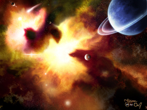
 negative-one — First Impact

Published: 2004-07-23 14:54:04 +0000 UTC; Views: 2679; Favourites: 19; Downloads: 1315
Redirect to original
Description
well... this is my first impact space pic. i think it turned out alright.. i spent a little more time on this one then i normally do, and i think it shows. I feel i still could have done more for this one though - but i'm just too damn impatient. myah well.. theres always next time.Comments n' crits greatly appreciated!!
 (Smile)") and faves too
and faves too ")
")
Related content


Comments: 51

this is a very good piece, and as you said in your description, the time spent shows. the impact is obviously the highlight of the piece, both when looking for a focal point and artistically. many artists simple have a comet impacting and no effect, using the excuse that this was the very second of impact, simply because they're too lazy. however here we see a detailed impact with some carefully placed debris and of course the shockwave. when ifirst saw the shockwave i thought it should have a blurred edge, which would've been more pleasing, but also more realistic. flying debris etc would make it look more blurred. however often a shockwave would be defined, have one smooth edge, so i'm not sure. the random mid space explosion offers another focal point, something else which entices you to look at that section of the piece, including the whole canvas in the viewers viewing (if that makes sense). it's very good, and well blended. radial blur? the explosive clouds leaving the planet also look great. a good opacityu chosen as they beldn in well instead of overtaking a piece which has more to it than just an impact.
the planet clouds are fantastic, but i would like to see more of a texture underneath for more realism. if i see a planet being blown up i want to see what life was like there. although the forground clouds are very good and well brushed a little more colour variation, loose areas and generally a more variated cloudy area they would look better.
the starfield in this piece could be improved. yes it has got good stars, but they could have more variation both in density and placement. they add such an atmosphere to a piece you can't neglect them. for your flares however it is the opposite. placement is great, they work really well, but if they were different, had different blending modes and had more of a variation than just size, the whole piece would feel more exciting. and on a slightly less artistic skill note, the left had edge of the exploding planet is very pixellated, just blur it a lil and it'll fit better.
overall this was a good piece and you can see the effort, some strogn points and some you can improve on for next time, and i'm sure you will.
👍: 0 ⏩: 0

the background looks very nice but the explosion on the planet could use some work. some of the things that could be improved are:
[] the impact itself, it doesn't seem to be attached to the planet, it looks like its levitated of the planet a bit.
[] the perspective is a little off, I'm not sure what gives it this feeling; it might be the placement of the explosion.
[] the abrupt change from the orange explosion ring to the planet surface, I think it would look better if it were blended some more.
overall a nice piece that needs a little more work on the explosion.
👍: 0 ⏩: 0

::blinks:: Ah gees.. Reminds me of a dream I had recently! First off, beautiful work... So much detail.. I'm gonna try photoshopping some planets soon... I've always been a huge fan of astronomy.... aaaand second off... fave!
👍: 0 ⏩: 0


👍: 0 ⏩: 0

nice work for your first impact, -1 (easier than typing out negative-one, heh). Detail on the impact is great, got a good effect on the double shockwave, and the impact point and power is just about right. I like the light/power effect on the near moon too. lighting and piece composition looks to be done well, as does colour choice. But some crits. Bottom of impacted planet looks a little rough, needs some smoothing. Starfield possibly needs some variation in densities.... you could make some localised areas with more stars than others. Not as sure about the top right planet as i could be, whilst i don't know what the piece would look like without it, it's just not doing too much for me. You could see what would happen if you upped the contrast a bit, removed that planet and increased that flare power whilst darkening some of the surroundings. But just a suggestion.
Anyway, for your first, it's superb. Keep it up.
👍: 0 ⏩: 0

fkn awesome. space pics are cool.
u live in wello pt? i live in redland bay. small word big space.
👍: 0 ⏩: 1
cheers man.. and small world indeed. i've found a few ppl that live around bayside actually
👍: 0 ⏩: 0

Hey man, i dig the design of this piece, although i think there are too many planets in this piece.
👍: 0 ⏩: 1
thx for diggin' the piece man 
👍: 0 ⏩: 0

HEY CHEIF..TAN.
Ok About the comment ehhhhh bro here goes:
..Detailed analysis in check...
... Stand By ...
\\.Initiating,//
Starfield:
Mmph this is something i think needs work bud, There seems to be needing more variation, there are alot of Same brightness/toned stars, I believe some levels, perhaps curves, some more multiply overlaying & brightness/contrast might work well.. Oh & if you want, adding many flare stars shows that time was indeed placed, & they can look good, like clusters of stars. Best Example of this would have to be Hameed.
Planets:
Textures seem to be in order, nothing wrong with them
Impact:
Very good for first impact eh, im yet to try an impact piece  (Wink)")
Suns:
Well they are good, but as i said, add many small ones for some more variaton, also, with all these lightsources, do you think these planets would even have darksides? just trying to think in the terms if realism.
Nebulous cloud:
Hmm.. Not bad, like how it covers the darkside of the planet, but it seems the colour is dull.. no nothing wrong with that, usually overlaying can bring out nice contrast though for this sort of event
Hope i helped

👍: 0 ⏩: 1
it helps heaps! cause now i know exactly what ppl wanna see and what i should work on! thx!
👍: 0 ⏩: 1


thats the gayest comment i've ever received... nice?
it is a pretty lame comment though
👍: 0 ⏩: 0

aw.. why thank you sweetie 
👍: 0 ⏩: 1


👍: 0 ⏩: 1
now why am i odd 
👍: 0 ⏩: 1
okay
👍: 0 ⏩: 0

very nice...maybe we can talk sometime and u could help me out with my brushing...if i want
👍: 0 ⏩: 1
hehehe... lol @ "if i want" - i assume that was a typo... either way its funny
👍: 0 ⏩: 0

Very nice man!
The colors ya used are pefect and I like the space dust(or what not) thats around the planet too
I'd say your first is much better than the last one I did...lol
Keep it up!
👍: 0 ⏩: 1
thx man! this is actually the first time i've used yellow/brownish colours. I usually use pinks, blues and greens. and i think the reason you "think" this is better than your last is because my comet is tiny and was easy to brush.. theres no detail on it, just on everything else.. hehe.. i cheated really
👍: 0 ⏩: 1
Well hey...no matter...theres a render I did sometime ago of a terragen and I placed a volcano in it and it had no detail but when I shrinked it down it came out great and thats what I see with yours...I think it was detailed enough to show whats goin on
👍: 0 ⏩: 0

hey dude. good work for a fist attempt. however, the explosion looks unnatural. even if u were aiming for fantasy, it still doesnt look right. u should add a crack texture to the planet, changing its hues and colors to make it red and lava'ish. then the fire behind the comet is weak. its dim. brighten it up more to add some spice and chaos to ur piece like it should be with an explosion piece. next is that there is no debris flying around and the shockwave is nearly to the middle of the planet. im not trying to put u down, im trying to help u to improve ur artwork. if all this stuff had been added, this would have been amazing. just one last thing, y not increase the size of the comet, and break away from the regular cliche of a comet hitting the earth from the top, and change it to the side or something? that would be more interesting. but remember, the comet's tail ALWAYS turns away from the sun. so... u might wanna keep that in mind. hope u dont mind me criticising ur work. im trying to do it as positively as possible.
now for teh beautiful parts of ur image. i LOVE the nebula/background. its awesome! the sun looks wicked. the planets r compeltely awesome!!(although more then 4 planets in a piece make it too crowded but this one looks good)
👍: 0 ⏩: 1
thx a bunch for the comment man! i mean it
When i was making this piece i was concnetrating more on the actual development of it, not the design. I didn't really think it through, so it didn't come out realistic. I really want to get my skills up to a much, much higher level before i go thinking really deeply about physics n' stuff. (though i didn't actually know that a comet's tail turns away from the sun so thanks for pointing that one out
I made the comet the size it is because i really couldn't make one any bigger and still make it look aesthetic. that's something i really need to practice - comets and meteors. and i guess debris comes under that category too... but theres always next time for that!
So yeh, i don't mind you criticising my work at all, 'cause i know it's constructive, and it helps me! So thx again for taking the time to look at this picture and give me some real feedback! 
👍: 0 ⏩: 1

Awesome man! But I would ass a flash by the impact and some cracks
👍: 0 ⏩: 1
yeh i was gonna put some cracks in.. but i got lazy
👍: 0 ⏩: 0

what an amazing sight. A VERy good first impact, better than I could prolly do. Nice work
👍: 0 ⏩: 1
wow, thx! but i doubt its better than what you can do; you gots some skills
👍: 0 ⏩: 1
well all have our special abilities, and urs blows me away
👍: 0 ⏩: 0

thx man! it could have been better... but im too damn impatient - damn impatience, damn it to hell..
👍: 0 ⏩: 0

thx! i havent actually seen any impact pictures from you... methinks i'll go look through your gallery for some/one now
👍: 0 ⏩: 0

Great sense of drama here... I especially like the "iris"-like appearance of the shock-wave. All the planets are very well textured - they look incredibly realistic. I think the starfield is a little back-stage, being kind of flat behind all the layers of gas and planets etc. but it doesn't upset the balance of this great picture!
Og.
👍: 0 ⏩: 1
thx for the comment. and yeh.. i got lazy on the starfield so it looks pretty lame in the plane space bits. i'm like that... i'll concentrate on one little bit and then just ignore the rest.. but like i said in the description - theres always next time
👍: 0 ⏩: 0

thats really nice dude, i think where the impact is how bright/atmospherless it is, i think u over did it a touch, maybe if u had some breaking land or somthing it migth look better (i havent made in impact so i wouldent know) but other then that this is a nice compisition, nice job +fav
👍: 0 ⏩: 1
yeh i was gonna whack some cracks into the planet, and maybe some debris. but i just wanted to post it.. hehe... i always post stuff before it's "really" finished. thx man!
👍: 0 ⏩: 1
heh, thats alrighty man, NP m8, keep up the good work
👍: 0 ⏩: 0

wow! this is absobloodyloutly awsome! I love it! +fav for sure!
👍: 0 ⏩: 1