HOME | DD
 Neoriceisgood — Vote and stop complaining
Published: 2009-09-14 10:18:42 +0000 UTC; Views: 3932; Favourites: 5; Downloads: 104
Redirect to original
Description
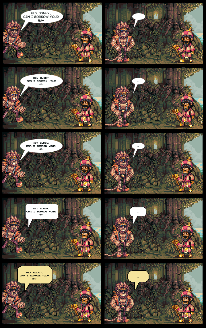
Okay for all those people who keep yapping about the text balloons, here's a number of possible options.Considering the fact that no matter what I do half of you will start whining about it anyway, I don't plan on changing a bloody thing unless it actually feels like almost every single person supports the same option [or nobody supports the status quo option to begin with]
Related content


Comments: 66

First or second maybe. The last balloon is quite nice, but it just does not fit there in my opinion.
👍: 0 ⏩: 0

<-- tard moment.
bottom or top are equal to me
👍: 0 ⏩: 1

[late] thanks for feedback.
👍: 0 ⏩: 0
very witty to make t a comic lol
👍: 0 ⏩: 1
Well, it shows how the speech bubbles look in-comic, which is kinda the point.
")
👍: 0 ⏩: 1
yeah I missed that the first time around and though it was a comic depicting the characters frustration of finding the right font himself... then I realized your real intention lol but hey, at least it entertained me.
👍: 0 ⏩: 0


I like the very last one personally
👍: 0 ⏩: 0

I think the pixelated font should be at least a bit larger for better readability. The speech balloon i am rasther indifferent about, but the tails should more clearly point at their respective character.
👍: 0 ⏩: 0

In my opinion the most readable and cool looking is the second
👍: 0 ⏩: 0

Visually, the yellow box looks the best.
The most readable pixel font is the 2nd box. But, it's too small...
👍: 0 ⏩: 0


yeah thats not that readable i would go with ether the first one or the very last one that work the best to my eyes
👍: 0 ⏩: 0

In my opinion, none of the pixelled fonts work well, they aren't very readable. However, the last balloon works very nicely.
👍: 0 ⏩: 0
<= Prev |