HOME | DD
 Neoriceisgood — Vote and stop complaining
Published: 2009-09-14 10:18:42 +0000 UTC; Views: 3932; Favourites: 5; Downloads: 104
Redirect to original
Description
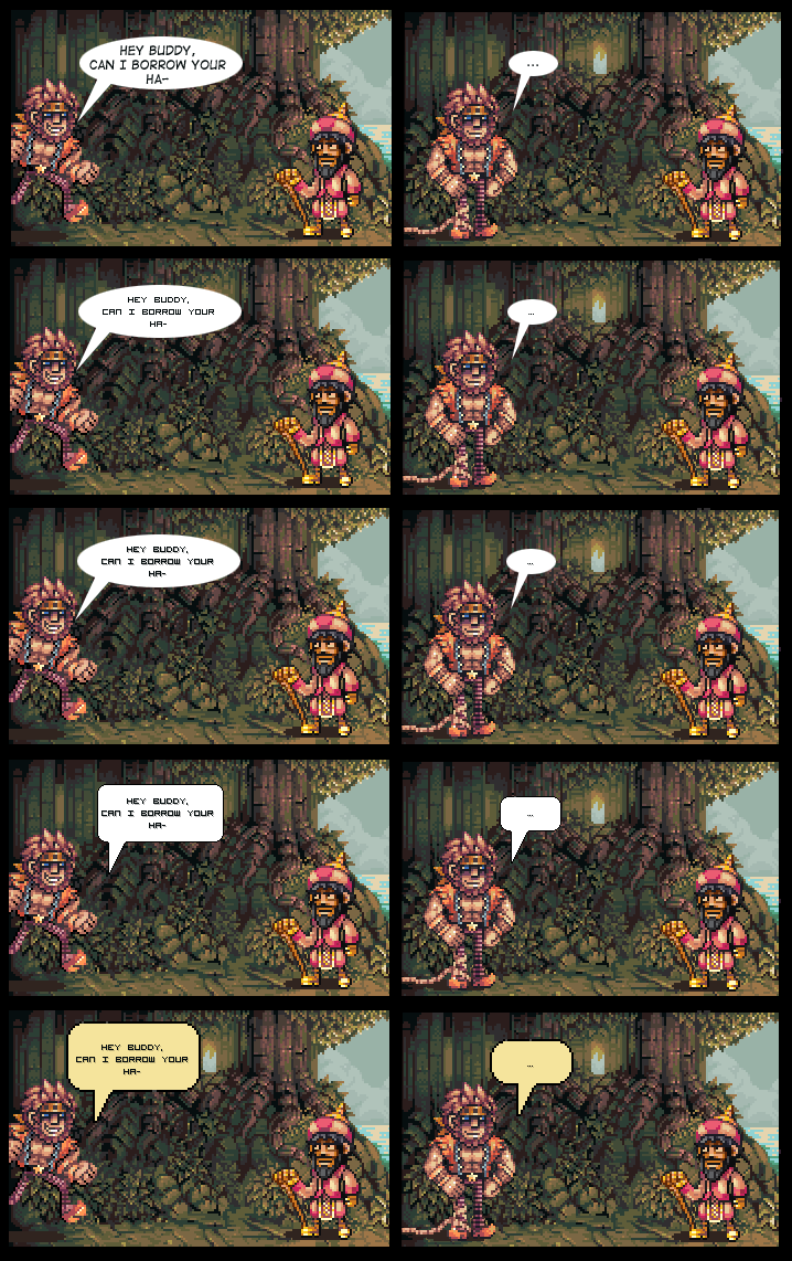
Okay for all those people who keep yapping about the text balloons, here's a number of possible options.Considering the fact that no matter what I do half of you will start whining about it anyway, I don't plan on changing a bloody thing unless it actually feels like almost every single person supports the same option [or nobody supports the status quo option to begin with]
Related content


Comments: 66

The shadow effect should be lighter, but I'm going with the yellow pixel balloon; no. 5.
👍: 0 ⏩: 0

Thanks for the feedback.
👍: 0 ⏩: 0
SpriterRogy In reply to SpriterRogy [2009-09-18 12:29:34 +0000 UTC]
Sorry, the "third", i'm spanish, hehehe
👍: 0 ⏩: 0


I support using a pixel font, but you need a better pixel font.
👍: 0 ⏩: 1
You're coming on too strong for me!
👍: 0 ⏩: 1
c: It is joek.
You're not my type.
👍: 0 ⏩: 1
Is 'female' your type?
👍: 0 ⏩: 1
No my friend Brittany
👍: 0 ⏩: 1

Nah, I think you meant Spears. XD
👍: 0 ⏩: 1
Well NOW YOU DO! >=U
👍: 0 ⏩: 0

Please, for all that's sacred, preserve my eyes and stick with the first. If you DO go pixel, use the 2nd, plane font, as the others just hurt :\
👍: 0 ⏩: 0


If I'm different and I like something else,
will you stay with the first one? |D
👍: 0 ⏩: 1
... Will you say yes if I kiss you? 8D
👍: 0 ⏩: 1
I d-don't know what you asked :T
And aren't you like, twelve?
👍: 0 ⏩: 1
I was kidding.
And I'm older than that. :[
👍: 0 ⏩: 1

May as well stick with the top. The pixelated font at 1x zoom doesn't go well with the x2 everything else.
👍: 0 ⏩: 0

I think the last one works best.
It just feels like it's a return to what the comic first started out as. Almost like it's a return to what made it special from the beginning.
It's pixelated, square-ish, and slightly colored.
It's perfect, methinks.
👍: 0 ⏩: 0

You haven't even bought be dinner first, shame on you.
👍: 0 ⏩: 1
if you wanna play, you gotta pay.
>: I
👍: 0 ⏩: 0

I like the first one, but they all seem fine to me.
👍: 0 ⏩: 0

I say go with #4, since it has that pixelated feel to it.
👍: 0 ⏩: 1

I agree 100%.
If people cant read it, then they might seriously need to get there eyes check. Granted, I'm wearing glasses, but I can see it fine.
Fourth from the top is the best option~
👍: 0 ⏩: 2
I re-looked at it, and I still perfer the bubble shape and the font for number four, but the speech tail should totally be fixed to make it point more at the seaking character~
👍: 0 ⏩: 0


I vote the yellow pixel balloon. [i'm not going to whine about what you do, that is just my opinion]
👍: 0 ⏩: 0

I like the first one but they all suck!
*whine whine* lol. First one plz. Follows the cartoony environment and isn't hard on the eyes.
👍: 0 ⏩: 1
| Next =>