HOME | DD
 nextmario — p-ubuntu.07
by-nc-sa
nextmario — p-ubuntu.07
by-nc-sa

Published: 2007-01-23 05:06:32 +0000 UTC; Views: 16172; Favourites: 22; Downloads: 3863
Redirect to original
Description
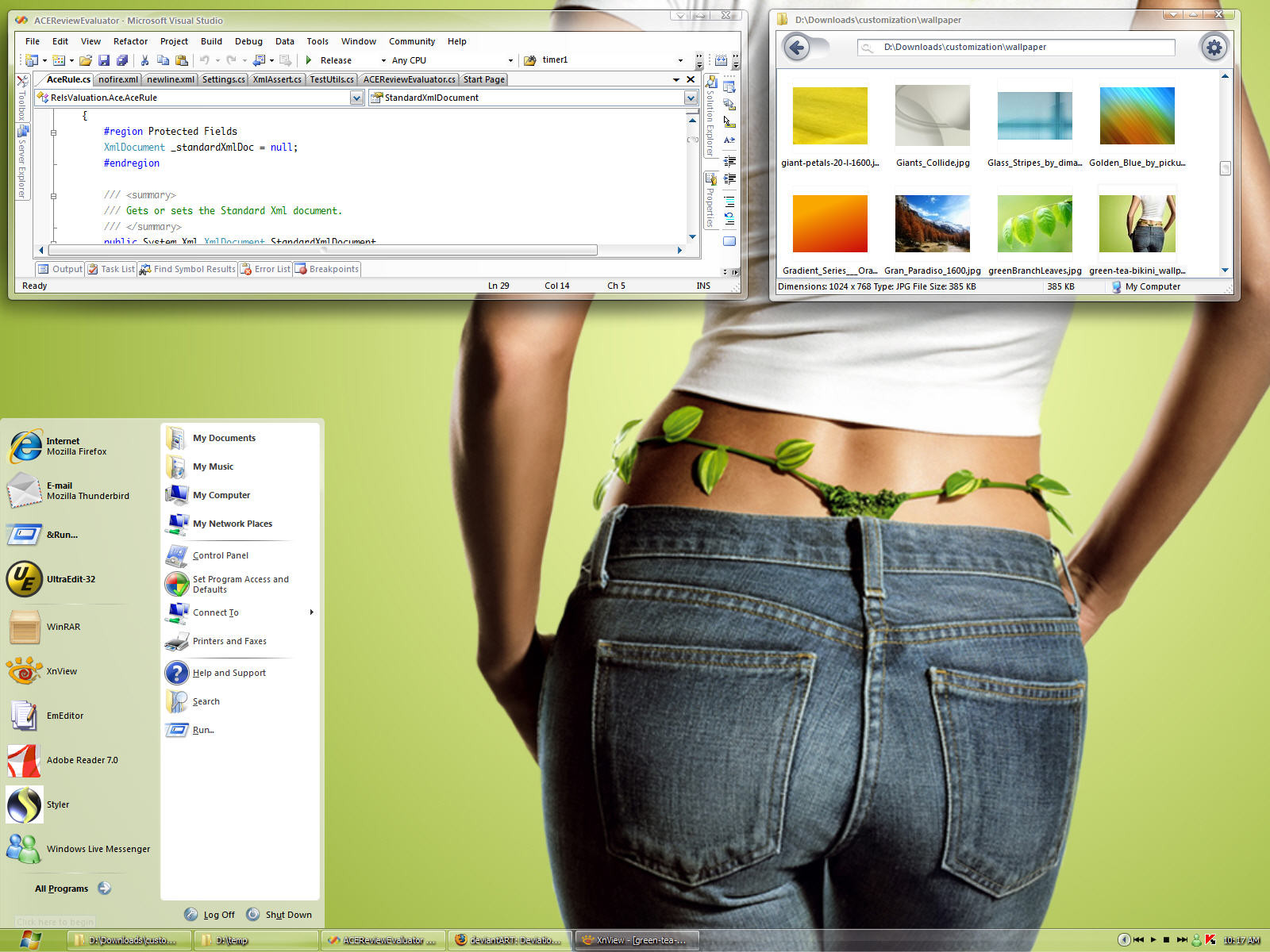
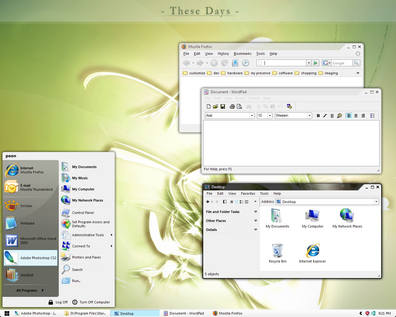
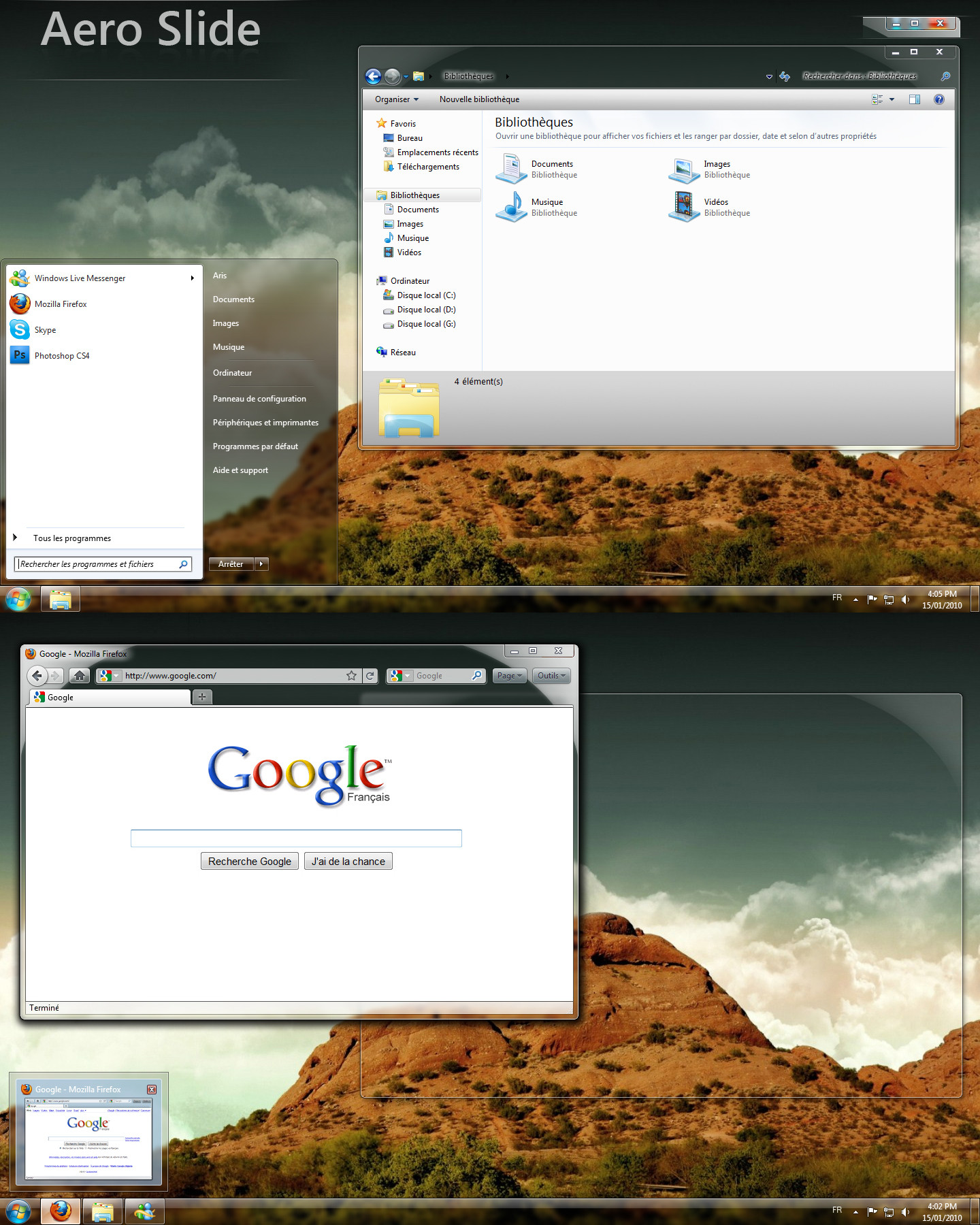
THIS IS USABLE BUT IT WILL CHANGE FREQUENTLY AS I REFINE IT!I decided to revamp pico gray, which has been in BETA for quite some time. I've been using pico gray for quite awhile, little things bothered me:
o min/max/close buttons fuzzy depending on caption color
o tabs were too bright
o highlight had too much gradient
o start panel too boring
o no name on start panel (i use several accounts when programming)
o task bar didn't highlight active window
o flash button not always readable (when using chat apps)
... and more
I'm concentrating on the Ubuntu flavor for now. Expect other subs (luna blue, black, xbox) like the other pico series.
[01]
+ trying different gloss and colors
* made some controls flatter
* changed a few higlights to be simpler
[02]
* shiny instead of 'bumpy' gloss on title bars, start panel
* fixed account name vertical positioning
* colored min-squares on windows, winflag
[03]
* set buttons back to default look
* slightly cleaner start panel
[04]
* combo boxes
+ added small scrollbar thumbs
* flattened spinner controls
[05]
* combo box glyph, border
* progress bar chunk color
* increased contrast of inactive window min/max/close and title text
* other tweaks to make disable colors more consistent
[06]
* reduced all borders by 3 px
* changed start panel, i thought it was a little too busy
* MDI windows consistent with main window but not same color (i hate how visual styles use the same active title bar for the main and active mdi child window)
and i'm sure little tweaks i don't remember. let me know if you like old start panel better
[07]
transparent sub preview. opaque styles will be in final version.
* new border
* partly transparent panel
* transparent window borders
Related content


Comments: 30

I really love your styles....looks awesome with google chrome!
👍: 0 ⏩: 0

 (Smile)")


that would be a nice minimal theme for beryl/emerald on linux..!
👍: 0 ⏩: 0

The wallpaper is the Jinmao tower in Shanghai ?
I was here 3 months ago
👍: 0 ⏩: 0


Looking good with the start panel like that and the border is sweet, oh and btw I like those icons you have now. Maybe some different colors on the selections and taskbar's active window, could be orange too to match the rest? I think I'm going to change my desktop to some orange looks, which is something I never thought about, but just looking at this really changes my mind
👍: 0 ⏩: 1

right. the cyan goes well with luna-blue and black, but to do ubuntu justice i need to go with orangish highlights. i use the same base for all these new skins and i dont want to make changes yet as it takes a lot of time to fix or change something across all subs if i start tailoring too early. you read my mind
👍: 0 ⏩: 1


Finally someone who actually cares about flashing buttons!
This theme looks awesome, as soon as I'm home I'll go and try it out
👍: 0 ⏩: 0

Just to add something I forgot, the buttons in the corner are nice too now but still I like more the previous ones also I know you will still develop some more color themes, but will you do one like the clear/glass ones in pico tea? I really love those, I think it would be a nice addition
👍: 0 ⏩: 0

Which Icons are you using on that prewiew?
I like you work too - clean and sharp.
👍: 0 ⏩: 1
It's an IconPackager theme, Pirate OS by treetog. I
👍: 0 ⏩: 0

Put a smaller titlebar on my wishlist.. otherwise your styles are on my fav list .. ")
keep on
👍: 0 ⏩: 2
//edit//
im interessting in your wallpaper too
👍: 0 ⏩: 1
uh.. fast repost! Thank you very much. Nice gallery. Looking forward to your next work. I like it!
 (Wink)")
👍: 0 ⏩: 0
smaller titlebar is coming. the diagonal makes it appear taller than normal.
👍: 0 ⏩: 0

i used your pico gray for quite a long time i was waiting for an update and here it comes so i'm going to try it out
👍: 0 ⏩: 1
i think you'll be a disappointed. it's just a bunch of tweaks and it's only the ubuntu sub without all the batch files. i'll add those back once i settle on the final style
👍: 0 ⏩: 0

i think it time to reinstall wb !!
good work keep it up
👍: 0 ⏩: 0

Hmm, I've got to say, I'm not really liking the half-stripe, diagonal thing. As far as I'm concerned you reached perfection with pico gray 64 gloss with the square glyphs. Maybe you should leave pico gray as is and make something completely different. What happened to the alpha preview that was in pico gray beta? Keep up the great work, nonetheless.
👍: 0 ⏩: 1
as always, thanks for constructive criticism. at first i didn't like the slash style but it has grown on me. one advantage, min/max/close buttons are clear regardless of the caption color. this is a WIP and i'll try not screw up those things you liked with pico gray.
i'm slowly working on pico vader. i haven't found a nice dark color scheme that works with the apps i use. i tried using gray 64 as a base for menus, toolbars, etc and it's too dark. icons and text fade into the background. not giving up though.
👍: 0 ⏩: 0

I'm a big fan of your work. Everything is simple and crystal clean. May I suggest making the taskbar duo colored as well just like the caption? Yes please, a luna blue and black version!
Please change the logoff/shutdown dialogs. They haven't changed since pico tea.
👍: 0 ⏩: 0