HOME | DD
 nextmario — pico tea RC22
by-nc-sa
nextmario — pico tea RC22
by-nc-sa

Published: 2006-09-09 18:01:34 +0000 UTC; Views: 43597; Favourites: 61; Downloads: 8760
Redirect to original
Description
thanks to everyone who offered feedback. this thread is now closed. please see the FINAL version here:[link]
my next project will have a little more bling, but not too much! pico reflect is in the works
Related content


Comments: 132

luna blue didn't look good, too dark. compromise. tint of medium blue.
👍: 0 ⏩: 0
HOW TO CHANGE TASKBAR:
1) Browse where the skin is installed. For example:
C:\Program Files\Stardock\Object Desktop\WindowBlinds\pico tea BETA 007
2) Double Click the appropriate batch file. Inside the folder you'll find these batch files. (see main description for more detail about this batch file):
use-taskbar-gray.bat
use-taskbar-green.bat
use-taskbar-orange.bat
use-taskbar-white-3c.bat
use-taskbar-white-3gl.bat
use-taskbar-white-3gr.bat
use-taskbar-white.bat
use-taskbar-yellow.bat
3) Reapply the skin in WindowBlinds.
👍: 0 ⏩: 0

I really love this and it keeps getting better. I's both sunning and usable. The warm gray is amazing.
👍: 0 ⏩: 1
Thanks. I noticed that about the gray. I was surprised too. I hope someone expands on the warm gray when I make this open source. My favorites are the defult white, warm gray and candy apple.
👍: 0 ⏩: 0
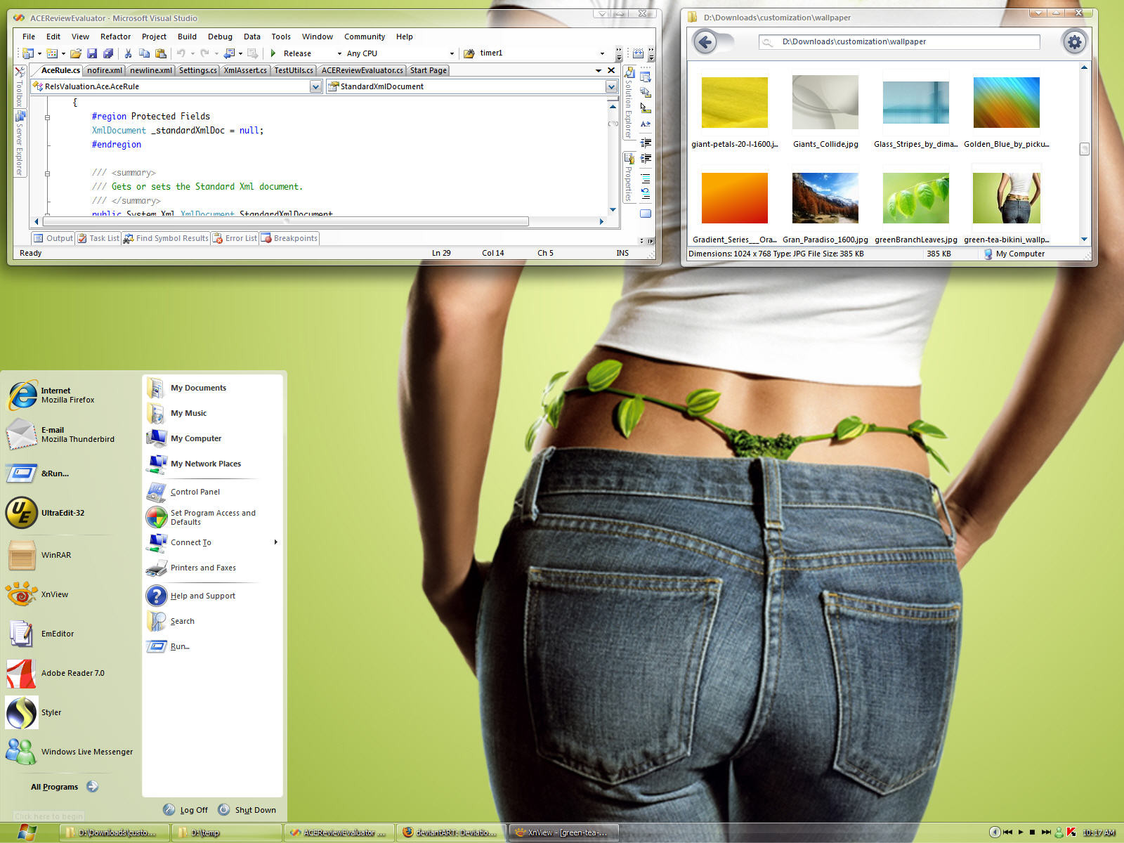
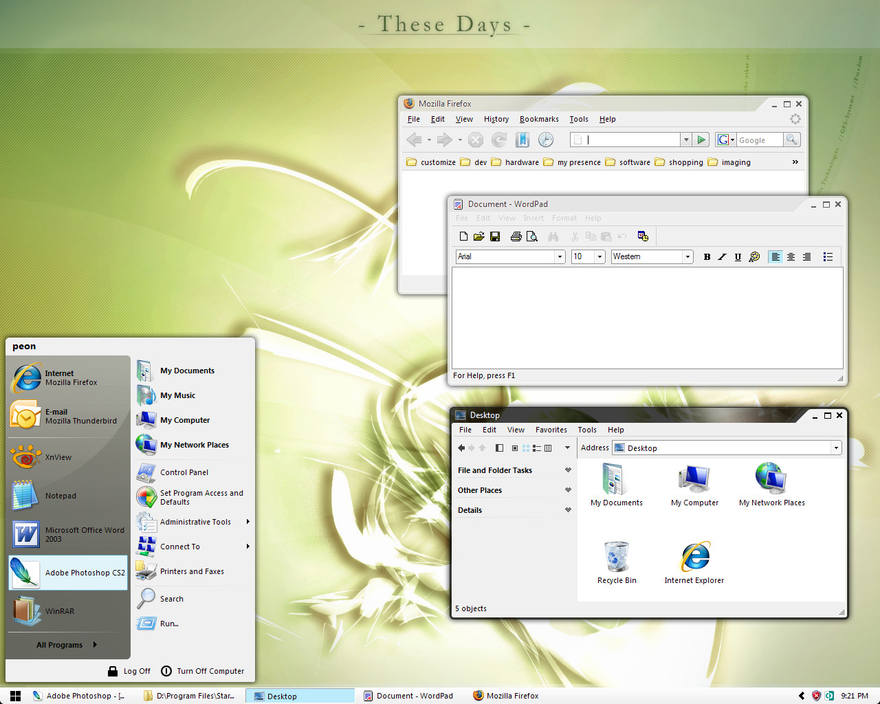
I agree the orange and yellow could be enhanced. The theme is pico tea---flatter than nano and green. The base was a color from a green tea wallpaper. I threw in some harmonious colors based on simple color theory algorithms for some variation. What you see is as far as I'll take it.
👍: 0 ⏩: 0

I'm going to actually try this (once I reinstall Windowblinds - new computer)...
It's Light, and I usually hate Light, but for a minimalistic style, I like the idea. It's simple and as you say, very easy to use. I would think for a presentation in mind, this would be amazing.
My only problem is that green seems to ALWAYS be used. Orange and green, etc. I understand the base of the theme, but I think maybe making it monochromatic could make it even simpler.
Keep it up. I'm marking this as a favourite.
👍: 0 ⏩: 0

I like 3px green very much,but in Beta.002 I can't see it....
👍: 0 ⏩: 1
")
👍: 0 ⏩: 0

Great stuff!!!!!
Is there any chance you could send me the dock software and icons by mail??
👍: 0 ⏩: 0


That's odd. I'll postfix the BETA number from now on. Make sure you delete the old one. Uploaded again
👍: 0 ⏩: 0

Hrm, seems the download is exactly the same as your last submission. I don't see the drop start button or the skinnier task bar...what gives?
👍: 0 ⏩: 0

You can only use this in windowblinds or can you also use it in StyleXP?
👍: 0 ⏩: 1
Only WindowBlinds. Does anyone know if I have to buy StyleXP if I want to just use StyleBuilder?
👍: 0 ⏩: 1
No, you don't HAVE to buy StyleXP. You can use StyleBuilder w/o it. But, it is recommended that you have it so you know everything works properly.
And, there are "other" ways to get it w/o buying. But, I doubt you're into stuff like that.
👍: 0 ⏩: 1
I'll buy it. I want to do plain visual styles. I thought SkinStudio created both WB skins and plain visual styles. I'm fed up with Window Blinds.
👍: 0 ⏩: 2

It would be easier and cheaper to just patch the uxtheme.dll file. This will allow you to view visual styles without styleXP. Plus it will not be a resource hog; All StyleXP does is patch the file in memory.
[link] -- there's the link to the patcher
👍: 0 ⏩: 1
StyleBuilder flashed a dialog saying it needs StyleXP installed. I have my uxtheme patched and it works well. I agree, if you're just using plain visual styles, I don't see the point of StyleXP.
👍: 0 ⏩: 1
Oh, I see. I've not had much experience with Style Builder. I didn't realise it required StyleXP installed.
👍: 0 ⏩: 0
Yeah, I started off with Window Blinds, and moved to StyleXP. I like it better. I'm just not technical enough to create my own stuff. Tried once, felt like a 1st Grader playing with Quantum Physics. Didn't go well.
Anywho, from your work, I'm DEFINITELY gonna be eagerly waiting your creations. Good stuff, man.
👍: 0 ⏩: 0
Active windows are opaque. Inactive are transparent. You're seeing it backwards. I know you don't have WB to try it
Constructive criticism is good.
👍: 0 ⏩: 1
Aah I see, I am seeing it backwards. The four squares for the start button are good, but the top-left and bottom-right squares are say 1px bigger.
Maybe you purposely did this? It does not look good on such a small scale.
👍: 0 ⏩: 1
The offset is intentional. It's an abstract wavy flag
 (Smile)")
👍: 0 ⏩: 1
Maybe because the screenshots here are not at the original resolution. I looked at previous versions and it looks OK.
👍: 0 ⏩: 1
OK, enough is enough  (Wink)")
👍: 0 ⏩: 0
On a more critical note, I think the start button looks a bit odd. As well as this, I think the colours could perhaps be toned down a touch on the multi-cloured one.
Also, if you were going to use transparency at all, I would have used transparency for inactive windows as well.
And finally, grey text for the title on active windows with transparency looks hard to read.
Overall however, it is very good. Sorry if this is not the kind of critique you would like
👍: 0 ⏩: 1
The multi colored you refer to was created to aid finding the active window for usability not aesthetics. White on white everywhere is confusing. It's the complementary color of the base green I use.
👍: 0 ⏩: 1
No, I was refering to the multicoloured start button.
👍: 0 ⏩: 1
It's the Windows logo colors, although I'm not sure if the lower right color is supposed to be yellow or orange. You only see it when the start panel is active, otherwise it's simple green.
👍: 0 ⏩: 0
")
<= Prev |