HOME | DD
 nicholaskole — Back on the Front
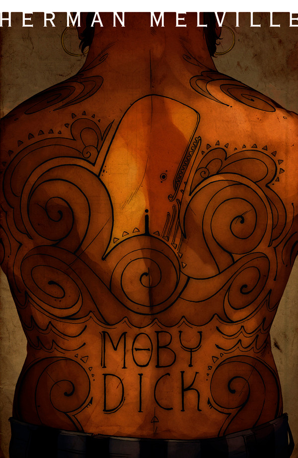
Published: 2009-03-19 04:40:41 +0000 UTC; Views: 16048; Favourites: 465; Downloads: 420
Redirect to original
Description
"Back Cover"...hur hur.Please pardon my punnery.
This is my latest entry for Jon Foster's Cover-to-Cover class. This week's assignment was to give him a cover for Moby Dick. He liked the Queequeg tat idea best, and while I was not so jazzed at the beginning, I'm actually really pleased with how it came out. (for those not in the know, one of the main characters of Moby Dick is Queequeg...a cannibal harpooner with tattoos all over his body)
I know most people watching me are probably hoping for something a little less dry and more fantastical. I'm sorry this isn't it
")
I am doing comic work and other less academic work, but unfortunately it's nothing I can post at the moment. Hopefully there's an audience out there for Book Covers
 (Smile)")
Enjoy!
More chatter and news on my blog: [link]
Related content


Comments: 86


This is just =fantastic=, I love the skin tones and the 'ink' it really looks like a tattoo to me. I could really see someone getting this. And the textures! Just wow!
👍: 0 ⏩: 0

Anybody can paint anthropomorphised animals and fanciful dragons with unicorns and scantily clad women.
I think it's something else entirely to be able to paint quality and descriptive illustrations.
PS - I see little Ahab, I think that's my favorite part. Very subtle, and yet the fact he's front and center helps draw the eye.
👍: 0 ⏩: 1

I was wondering if people were catching that little stick-figure. It's obvious enough, but it was never mentioned in crit. Thanks, I'm glad you like it!
👍: 0 ⏩: 0

this is really an awesome idea - it manages to be eye catching and intriguing, while still tying in elements from the book. nice. also, i love the mostly sepia-toned look.
👍: 0 ⏩: 0

this is such an awesome cover!!! great job!
👍: 0 ⏩: 0

Can't see why this is less fantastic than anything else in your gallery.
👍: 0 ⏩: 1

This is absolutely gorgeous, I would buy the book solely on the basis of the cover if it was this beautiful <3
👍: 0 ⏩: 0

I watch you because of your many talents!
Amazing job, I would really notice this cover in a book shelf, an interesting work where graphic design admits the strenght of the illustration and steals the less attention possible.
Good thing you didn't saturate the title part.
I fear I can't remember Moby Dick, I read it such a long time ago...
👍: 0 ⏩: 1
There was some in class debate about the clearness of the title, but I'm glad you like the more muted approach...I'm more happy with it that way myself.
Thanks!
👍: 0 ⏩: 0

Those tattoos are SOOO on his back it's ridiculous. Especially those swirls on the top HOMG so niiice. I also love that the whale is lighter than everything else but it's super subtle. *A*
👍: 0 ⏩: 0


I love book covers, probably (but not entirely) because I love books. So yay, keep them coming!
👍: 0 ⏩: 0

Awesome work, Nick... Good job making it feel like the tattoo is actually on his back. The design of the tattoo itself is really awesome as well... definitely feels like a combination of aboriginal/maori tattoos and pacific northwest indian art (potlach masks and such). Nice paper texture, too!
👍: 0 ⏩: 1
Dude: thanks a bunch!
And it is my very favorite paper texture ")
👍: 0 ⏩: 0

This turned out really well- sincerely, I think you need to give yourself some credit. When you do some more designed work ("dry" isn't quite the right word), it actually injects a lot of power into the piece- gives you a chance to focus more on composition and design that more traditional Nickish forms of illustration.
-C
👍: 0 ⏩: 1
Thanks! It's always a pleasure to hear you chime in ")
👍: 0 ⏩: 0


Beautiful job, this makes me want to fall asleep partway through chapter 3 a lot less
👍: 0 ⏩: 1
Ha! Well, that's mighty nice o'yeh to say. I've never really tackled the ol' girl m'self. I really would like to give it a shot some day, when I have some time and it's not mandatory
👍: 0 ⏩: 1
Well... good luck D: I'm an avid reader and have failed to get through this book repeatedly.
👍: 0 ⏩: 0


this is really great...it really gives an atmosphere of old maritime...i have to say i moby dick is the number one book i have always wanted to read but never get around to reading it
👍: 0 ⏩: 1
I hope you do! But make sure you are prepared for a lot of "being on boats" and relatively little action.
👍: 0 ⏩: 1
yeah but that is generally the way with classics hey...but i generally just add in my own action in the boring bits lol. like someone has just released a re-do of pride and prejudice with zombies! pure genius.
👍: 0 ⏩: 1
Just started reading moby dick and i have to say im really enjoying it!! I'm in love with Queequeg now and im only like 1/12th through the book lol. its nice to look back on this drawing whenever im reading about him
👍: 0 ⏩: 0

Thanks, ma'am! Glad you like it!
👍: 0 ⏩: 0

Awesome!!!
Very nice .. all my fav colours are in there... and simple designs are always more powerful...

👍: 0 ⏩: 0

Funny you should mention it...I looked into it and generally the majority of depictions of Queequeg that I could find were with Maori or Maori-inspired tattoo designs...so that's where I went as well!
👍: 0 ⏩: 0

Wow, that is a tat to be proud of! I like it, how you mix the character with the title, it's lovely!
👍: 0 ⏩: 0

You've got some beautiful colour planes on here-- those golden yellows make me happy!
The tattoo design is simple yet satisfying wee!
Quite a modern take on an old book! <3
👍: 0 ⏩: 1
Nice of you to say so...it was part of the assignment to try and make it appeal to a young and current audience!
👍: 0 ⏩: 0