HOME | DD
 NikolasBrummer — path

Published: 2011-03-13 13:18:47 +0000 UTC; Views: 2597; Favourites: 101; Downloads: 78
Redirect to original
Description
Horribly noisy and over-sharped on DeviantArt.")
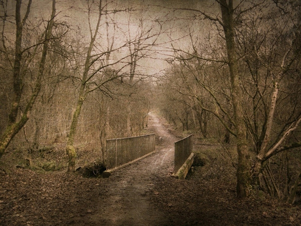
Quite unsure about this one. I tried to accomplish some new tones I saw on deviations here on dA, but I didn't get what I wanted to get.
And it's not as magical as the two deviations below, bear with me.

photography & edit (c) me
Related content


Comments: 42

I love the contrast between the leaves next to the two sides of the path....Right side is red with a few hints of green and Left side is green with a few hints of red...

👍: 0 ⏩: 1

Das ist sehr toll! Ich liebe die Farbe und die Kontraste zwischen das. Ich will wo fuhrt der Weg zum kennen!
Entschuldigung fur die furchtbar Deutsch!!
👍: 0 ⏩: 1


Es hat potential, der Kontrast macht es glaub ich zu fad. Etwas mehr Rot vs. Grün würde glaub ich etwas mehr Spannung reinbringen (:
Aber es gefällt mir auch so (:
Vielleicht lässt sich auch noch etwas mit dem Licht spielen, bzw. dem Grau der Bäume ^-^
👍: 0 ⏩: 1

Ja, da hast du total recht!
Nur inwiefern 'Mit dem Licht spielen'?

👍: 0 ⏩: 1
Ich dachte daran vielleicht das Licht etwas heller zu machen und den Kontrast runterzusetzen,
oder das Licht etwas wärmer zu machen (:
👍: 0 ⏩: 1

Was solls, dass es nicht so magisch ist
Die Leute mögens!

👍: 0 ⏩: 1

Warum laedst du es dann hoch?
👍: 0 ⏩: 1
Ich weiß auch nicht, ich lade alle Bilder hoch um Feedback zu bekommen.
👍: 0 ⏩: 1
Aber 5000 Deviations sind auch nicht gerade das Beste oder?
Soll nicht heißen, dass du zu viele Bilder hochlädst
👍: 0 ⏩: 0

I'd think it's not so alive as the other ones. The meandering path and the light makes those pictures in an other way, so you know were to keep your eye. You cant find anything that special in this picture, I'd think thats "the problem".
👍: 0 ⏩: 1


Did you change the color on the right side or was is really brown? Either way I like the color contrast.
👍: 0 ⏩: 2
I actually wanted to make both colors less saturated to not have this difference because to me, it was disturbing.
But thanks!

👍: 0 ⏩: 0

I have the same question ")
However, it's really nice
👍: 0 ⏩: 0

i love it! aw it reminds me of my home in east texas <3
👍: 0 ⏩: 1
Does it look this way over there?
I thought it was more ... sandy.

👍: 0 ⏩: 1
HAHAHAHA
no all of texas is normal,the west is kinda like a desert,or dessert idk i get them confused
east has alot of trees
but the rest is like cities.
i was born in palestine texas,which is east texas,and there are alot of trees,and this picture reminded me of a park i use to go to as a kid ;3
but then i moved to dallas texas
👍: 0 ⏩: 1
Oh, I see.
Guess I confuse it with cowboys and stuff.

👍: 0 ⏩: 1
HAHAHAHAHAHAHAHAHA! no no no no
HAHAHAHAHAHAHAHAHA OH NO NO NO!
well there are a few cowboys XD
👍: 0 ⏩: 0

i love how the left and right sides look like 2 completely different places becoming one. lovely effect!
👍: 0 ⏩: 1

links schauts bisschen verwackelt aus.. aber die anderen beiden fotos haben mir eh besser gefallen!
👍: 0 ⏩: 1
Hm.
Da muss ich zustimmen, die hatten was magischeres.
👍: 0 ⏩: 1
 (Smile)")

Schön! (:
Es passt nur gerade nciht zu meiner Frühlingslaune.
👍: 0 ⏩: 1


Mhmm... ich erkenne dein problem. was mir auffällt (jedoch erst beim 2. hingucken) ist links ist es grün, rechts rot. Vllt lässt sich damit was anfangen?
👍: 0 ⏩: 1
pfff... keine ahnung. Vielleicht von links sonnenstrahlen und generell grüner und frühlingshafter alles machen, und rechts noch dunkler.
so nahm de motto: die sonne geht auf der frühling kommt
👍: 0 ⏩: 1
aber so sahs da nicht aus.
und ich kann keine sonnenstrahlen bearbeiten.
👍: 0 ⏩: 1
echt? xD mist XDD
das sit auch eher ne Malsache D:
👍: 0 ⏩: 0

Hm... das Motiv gefällt mir. Ist ein schöner Ort und so.  (Wink)")
👍: 0 ⏩: 1
Also unscharf ist es definitiv wegen DeviantArt weil in GIMP war es schön scharf.
Aber ich weiß was du meinst, es ist ziemlich fad.
👍: 0 ⏩: 1