HOME | DD
 nisht — grace

Published: 2008-05-22 15:46:35 +0000 UTC; Views: 3900; Favourites: 104; Downloads: 206
Redirect to original
Description
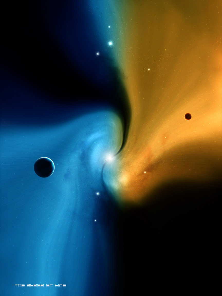
hi!heres my latest piece like it very much,hope you guys feel the same,cheers!")
update:changed the texture of the smaller planet. enhanced the shadow transition in the lower part of planets
added some more gassy parts to the neb and sharpened it a bit.
Related content


Comments: 49

Nice! Space themed pictures or artwork are just awesome!!
👍: 0 ⏩: 0


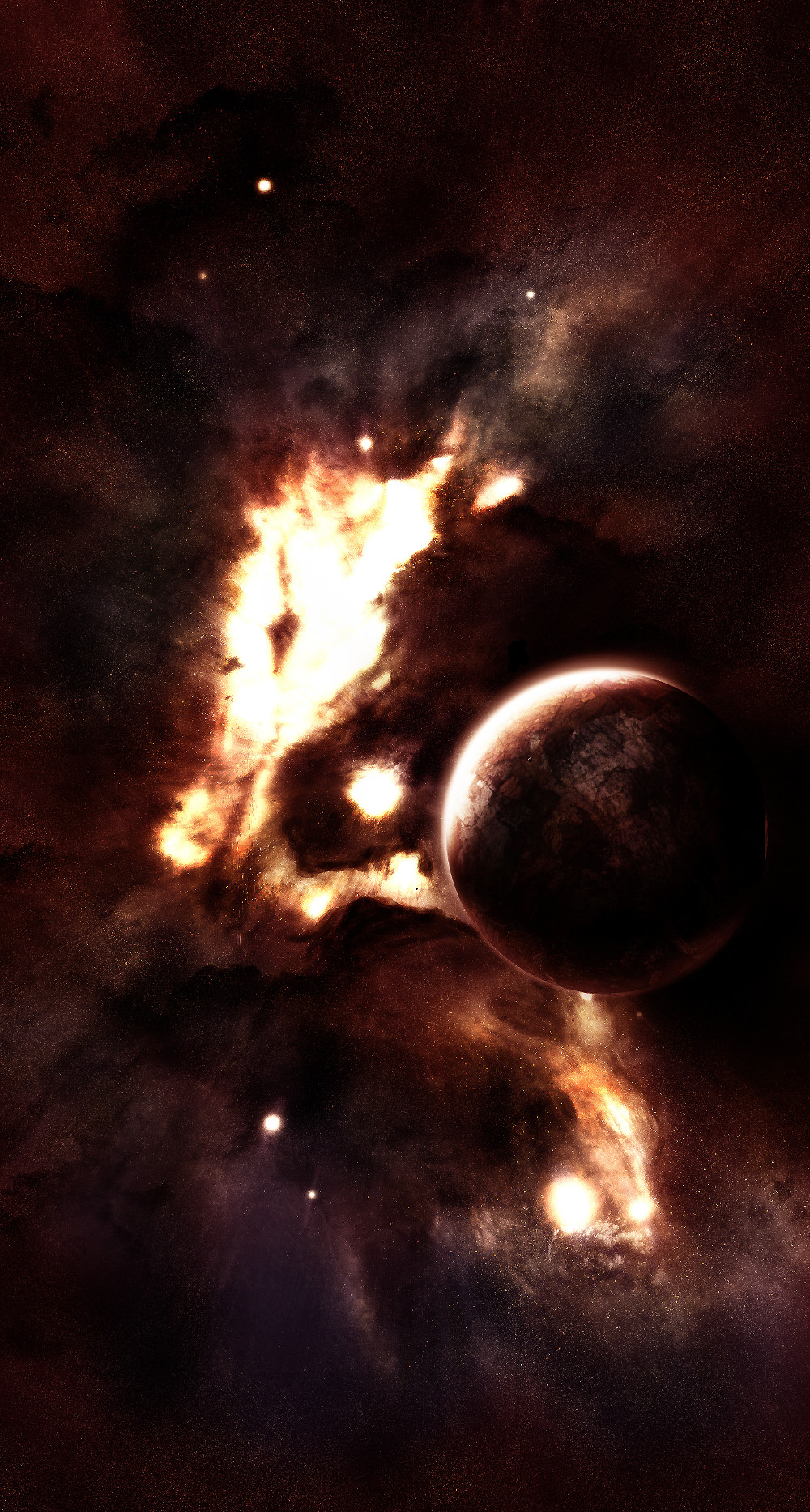
The colors on the nebula are beautiful, my favorite part - I don't see any problems with low detail anywhere!
Not so sure about the main planet - the part where it's completely black seems a little odd, maybe not quite as dark?
Other than that, this is one of my favorites. (and that's just constructive criticism)
-David
👍: 0 ⏩: 0


Would be amazing if you could provide a tutorial to create this kind of nebula. Looks stunning and way more detailed than I've ever examined.
👍: 0 ⏩: 0

oh damn im serching for good space and star drawings just like this one!
[for my tatto.so if ill take some ideas from your muse it will be ok?]
👍: 0 ⏩: 1


I highly approve of your edits.
👍: 0 ⏩: 1

hey man!yeah i like it to (the avatar) its from this scene,and the addon is great!
👍: 0 ⏩: 0


Great piece here! I love it.
Remember when I gave that bigass comment about shadows?lol
well i forgot to add something; the shadow slowly gets darker the farther away it is from light, so in this piece the darkest area would be around the bottom center of the planets and moons(like where the biggest asteroid is), especially since the shadow is well defined and strong.
But make sure it is very VERY transitional and it shouldnt be so obvious-just a tad bit darker there and it'll give it the last touch of spherization.
The gases are great, as well the textures, but I do not think the asteroids are working, especially the biggest one. Composition-wise, the asteroids kinda clatter the planet and subtract from its beautiful texture. It wouldn't be as bad if you maybe moved the big asteroid to the bottom right corner, cropped.
Also, the lighting of the asteroids is way too dark compared to how bright the planets are.
Hope this helped  (Smile)")
👍: 0 ⏩: 1
hihihihi you you do have the capacity to write a book mate,maybe you should!!i did some changes to it
👍: 0 ⏩: 1
hehe
okay now it's looking much much better. The asteroids now do not take up the attention and the big planet does. The only thing I think is left is to lower the dark shadow you added; it's too dark and a bit obvious, so I think around 10-20% fill opacity will do. You'll want it to look like it's part of the overall shadow and not a separate shadow.

👍: 0 ⏩: 2
Example:
[link]
Should explain it
the opacity varies depending on the base shadows so don't do 10-20% unless it fits with your shadow base.
👍: 0 ⏩: 1
wow thank again mate,i have all the images you uploaded in a folder,need to check them out with more precision thou!
👍: 0 ⏩: 1
hehe I might make a tut with them all some day lol
👍: 0 ⏩: 0
actually disregard the 10-20% opacity. Im going to upload an example soon.
👍: 0 ⏩: 0
swimming in beer sounds awesome. the next morning sounds not so awesome.
i like it man, a lot. composition, textures, especially the asteroids. and i think what they mean by the low res neb is that its not sharp enough and doesnt have enough detail, nothing to do with dpi or anything. or i could be talking out of my ass.
but yea, how the hell did you do those asteroids? those are sick
👍: 0 ⏩: 1
ops..forgot to mention this,they re made by they are a part of our collab,he gave me the files he did so i decided to add them,cheers!
👍: 0 ⏩: 0

Looks like they are swimming in beer lol 
👍: 0 ⏩: 1

👍: 0 ⏩: 1
wasted and then you drown since you get clumsy and drunk lol
that would be a good idea for a cartoon
👍: 0 ⏩: 0

Wow, excellent work, and very nice asteroids... and its loook ok too on my pc :S
👍: 0 ⏩: 1

Very nice. Love the way you did the lighting! ^^
👍: 0 ⏩: 1

Your planet is lovely as always... and I think your nebula is fine too. I don't see what all the fuss is about.
But the asteroids, they seem to kind of be in the way a bit...
👍: 0 ⏩: 1
oh thanks,well im still practicing with asteroids,so..but i really wanted them here!!
👍: 0 ⏩: 1
Well, your asteroids are still 10 zillion times better then what mine would look like...
👍: 0 ⏩: 0

very sexy space art
👍: 0 ⏩: 1
thanks mate,but i dont get the low resolution,it looks ok on my pc...bla
👍: 0 ⏩: 1
maybe thats just my noobie mind ")
👍: 0 ⏩: 1
👍: 0 ⏩: 1
👍: 0 ⏩: 0

You used the same planet texture twice, but otherwise its awesome.
👍: 0 ⏩: 1
well yeah,i might change that,it was supposed to be to see how it looks with two planets and i forgot to change it,thanks for looking!
👍: 0 ⏩: 1
 (Wink)")

Double time
Nebula is low res
It's a pity because composition and idea are very good
It could be very good work if not those little mistakes :/
")
👍: 0 ⏩: 1
hey,low res?i dont usualy work with bigger resolutions cause my pc dies,but its at 300 dpi and i think that 1000x1600 aint that small.
👍: 0 ⏩: 2
No no, Work is good, but nebula is low res. Or at least it looks like in download :/
Yea, i know that pain... My every smudge takes about 5min :/
👍: 0 ⏩: 0