HOME | DD
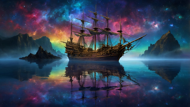
 nisht — serpantine nebula

Published: 2008-03-05 22:47:10 +0000 UTC; Views: 2890; Favourites: 62; Downloads: 224
Redirect to original
Description
hi there,this is my latest deviation,im very satisfied with the outcome,so if you like it fav it or leave a comment,id really like to know what you think about it,cheeers!


Related content
Comments: 13

Minus the typography and planets I really like this one, there's a decent amount of variation in the stars and the nebulae has a nice softly textured, atmospheric feel to it with great colours. 
👍: 0 ⏩: 1

hey thanks for the comment!!well ive been trying out stuff to blend planets better in scenes,and id really like if you could take a look at this and tell me what you think!thanks in advance
[link]
👍: 0 ⏩: 1

no problem, my only issue in that piece for the planet is that its darkside is darker than even the backdrop, and that makes it out of place a little. I'd try to blend the same lighting to the darkside, with it being only slightly darker so you can distinguish it as a darkside. This could be harder though since you've gone for a front on view of the planet, so it could hurt depth to just lighten it (although better than it is now I think). The best thing would be to have the texture still visible on the darkside while still having it lit a little more. Hope that helps.
👍: 0 ⏩: 1

thanks for taking a look!!certainly does help!! ill try to light up the dark side,think i have the whole planets psd file somwhere!!
👍: 0 ⏩: 1

it's good stuff. the nebula is great. the only problem I have, and I've noticed in everyone of your pieces, how the atmosphere around the planet edges looks so artificial. what I mean is that is that it always looks as if the light is coming straight on and the viewer is directly behind the planet.
in this piece, for example, the planet's are off the right with the light source on the left. therefore the left side of the planet needs more atmosphere exposure than the right. and the planet shadow should be off to the right of the planet not dead center.
look at [link] just to give an idea of what i'm talking about.
👍: 0 ⏩: 1

nebi mogao naći bolje riječi !
to napravi i jebes im majke svima
👍: 0 ⏩: 1

i unfortunately don't speak your language. i would really like to know how you reply
👍: 0 ⏩: 1

i told him (nisht) that i coudnt find better words - u perfectly touched the point
👍: 0 ⏩: 0

Awesome! You do a great job with the light and color! ^^
👍: 0 ⏩: 0


