HOME | DD
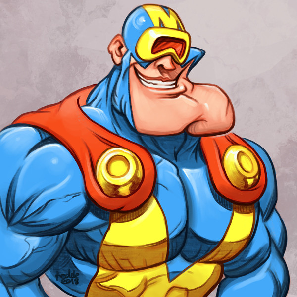
 NMRosario — Spaceman - 2009

Published: 2009-03-28 00:25:34 +0000 UTC; Views: 5598; Favourites: 47; Downloads: 121
Redirect to original
Description
A more recent drawing of the Spaceman character (the previous drawing is about 4 or 5 years old). This one was drawn in pencil on paper, then scanned in and redrawn in Illustrator. However, the original drawing wasn't a full body (I ran out of paper at about mid-thigh) and didn't include the Spaceman uniform. So the legs were drawn separately and added on later and the uniform was drawn completely in Illustrator.Related content


Comments: 11


 (Cool)")

May I have permission to make a 3D version (well an attempt at least) of your wonderful character? Full credit and links to your original image as well as to your gallery are customary.
Wowzers! You're a superb artist!
👍: 0 ⏩: 1

Sure, I'd be interested to see a different take on the character. If you need any additional information, just send me a note. Thanks!
👍: 0 ⏩: 1
I hope I don't become your new obsessive fan but your muscle guys totally rock my socks. Dude, the attention to detail, the musculature, it's fantastic. So If I seem a little weird it's only 'cause my gallery will show you why. Muscle characters are my specialty. And apparently they are yours even more.

👍: 0 ⏩: 1
Thank you I appreciate that.  (Smile)")
👍: 0 ⏩: 0

The lines on the legs do seem a little thicker, but it you hadn't mentioned them being separate I would not have noticed!
I see Spaceman's uniform has evolved as well. The blue does work with the white number better. It also seems to have got more shiny.
Spaceman certainly fills out his uniform well *grin*
👍: 0 ⏩: 1
I always felt like there was something missing from the uniform. That blue chest portion was a last minute addition that really tied the whole look together, so I kept it.
Like I mentioned earlier, this is actually one and the same with my Stump character, which is why he's so short and stocky.
Thanks for all the comments, it's much appreciated!
👍: 0 ⏩: 0

He's well built. And good job at drawing it in separate parts.
👍: 0 ⏩: 1
Thanks! I actually spent a lot longer on this drawing than I normally would and I ended up with several different versions. I might post a few of the other variations at some point.
👍: 0 ⏩: 0