HOME | DD
 NullVoiD — Archit

Published: 2005-05-22 08:48:55 +0000 UTC; Views: 5586; Favourites: 130; Downloads: 1124
Redirect to original
Description
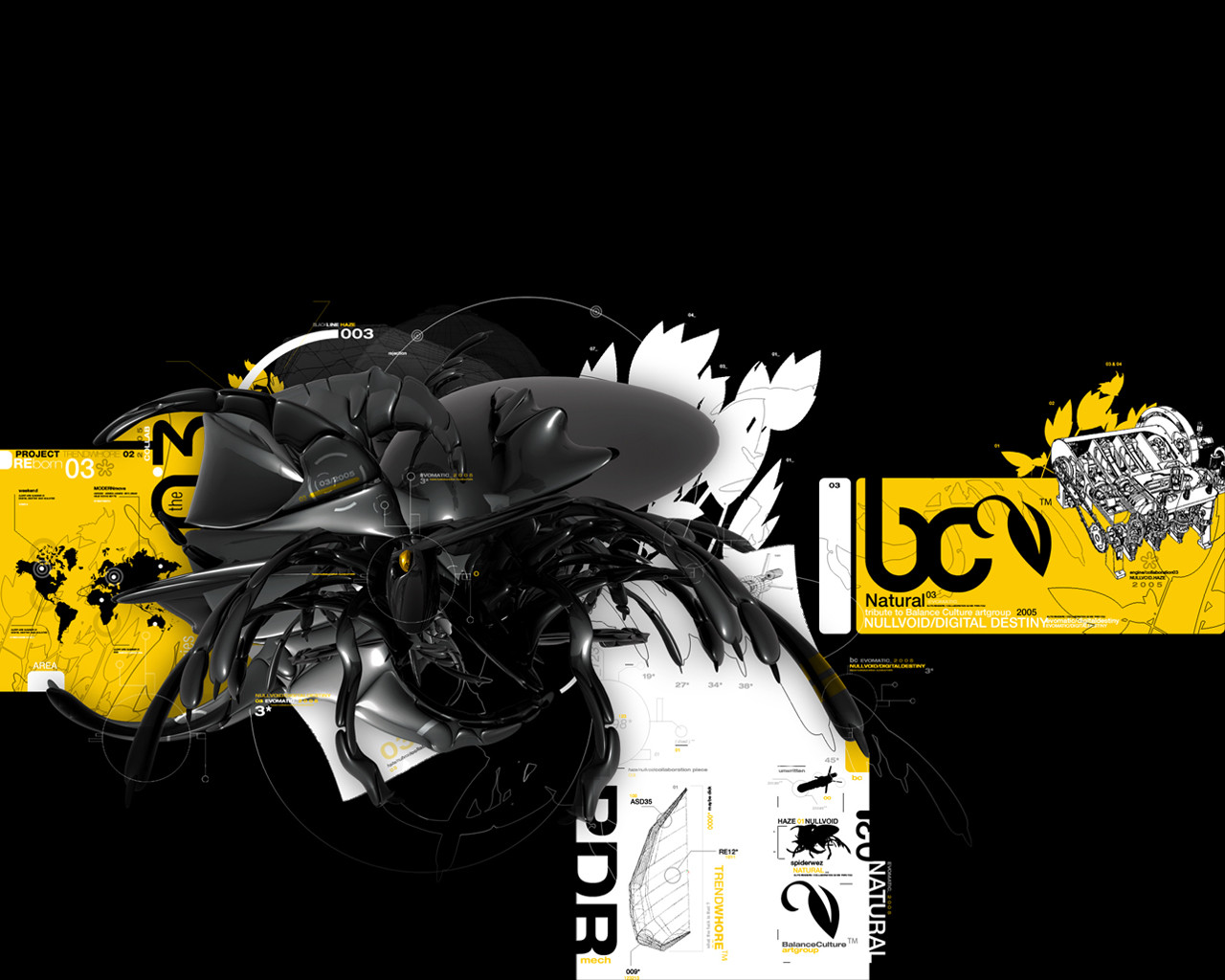
Archit_______________________
Architectural structure.
depthCORE : XVIII/XIX
This render is part of some old render that my friend ~criminalart send to me sometime ago.
Related content


Comments: 43


blue and grey - the colors that I´ve come to associate with you ;D
👍: 0 ⏩: 0

Fantastic, and I love the colors and the way everything flows together. The soft gray adds so much abiance to the overall piece. Great work!!!
👍: 0 ⏩: 0


bom trabalho  (Smile)")
axo k falta algo no background, mas tá fx anyways
👍: 0 ⏩: 0


model is great and the colours are very good
👍: 0 ⏩: 0


")


Bem loco cara, já tinha visto na depthcore...muito bom mesmo...
adorei a composição e o modo que você aplicou as cores na render...
👍: 0 ⏩: 0

Amazing. But its really only the render in the piece, which you didn't make, so I dunno. Looks good, though.
👍: 0 ⏩: 0

")


My personal favorite from the pack. THecolors that is the most amazing part.
👍: 0 ⏩: 0

The techy feel is real nice, and so are the colors. Interesting choice of colors, the gray with the turqouise blueish color. Very clean looking, I love it.
👍: 0 ⏩: 0


Awesome, eye-catching and favworthy. A slightly different take on abstract. Lovin' it.
👍: 0 ⏩: 0

thats a beautiful piece man
👍: 0 ⏩: 0


Nice job, i like the render and it blends well with the overall design.
👍: 0 ⏩: 0

really nice work
i like it
nice coise of colors
the depth is amazing
👍: 0 ⏩: 0

Does something like this take a long time? It looks like it sure does, the render doesn't look "computer generated" it looks like you went through and placed each.
👍: 0 ⏩: 0

very tech render! love the little blue parts! nice job
👍: 0 ⏩: 0

not bad...but im thinking,theres missing sum effects or so....dunno..
👍: 0 ⏩: 0


great contrasting of the colours but not enough detail.
👍: 0 ⏩: 0


This is dark, but still it is detailed
What can i say here ? Really great use of the contrasting blue to make the structural render more obvious, by the way that color really fits your style. Real good positioning of the typo (i'm still an newb in typo) according to the orientation of the render. But somehow, it would be better if it was a little bigger so we could at least read what's written there and not having to guess the words.
As i said before, the image is dark but there's a lot to see, thanks again to the contrasting blue that you've knowingly used, it give a sharper appearance to the render. I personally think that instead of simply leaving these blocks in blue, you could have transformed some of them in a blue mesmerzing glow. Anyway, this structure seems to be posed, in total serenity and if you added some glows here, you'll add some dynamism and the viewers will think that something [bad] is going to happen (that's my impression).
As conclusion, i'd say that this work is some of the good examples for great modelling skills and an awesome use of colors to attract to viewer's eyes.

👍: 0 ⏩: 0


Looks great the colour really contrasts well with the dullness of uniform grey.
The postioning is perfect
👍: 0 ⏩: 0

very nice colors and all over...a great img...love the render!
👍: 0 ⏩: 0


The added colour adds excellent contrast. Very natural look to the render settings, and the structured positioning of the forms is cool... kinda toned down Oz Maia style if I could draw comparisons with anyone.
👍: 0 ⏩: 0