HOME | DD
 nymphont —
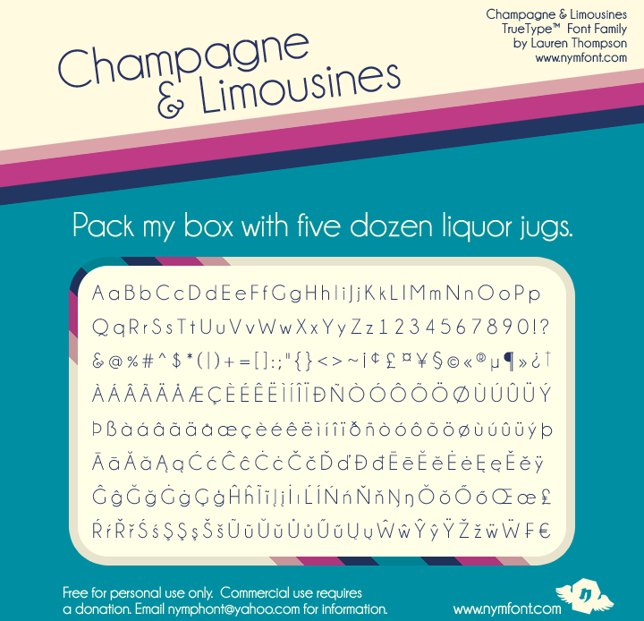
Champagne and Limousines -NEW
nymphont —
Champagne and Limousines -NEW
Published: 2009-06-14 15:13:59 +0000 UTC; Views: 71444; Favourites: 654; Downloads: 18854
Redirect to original
Description
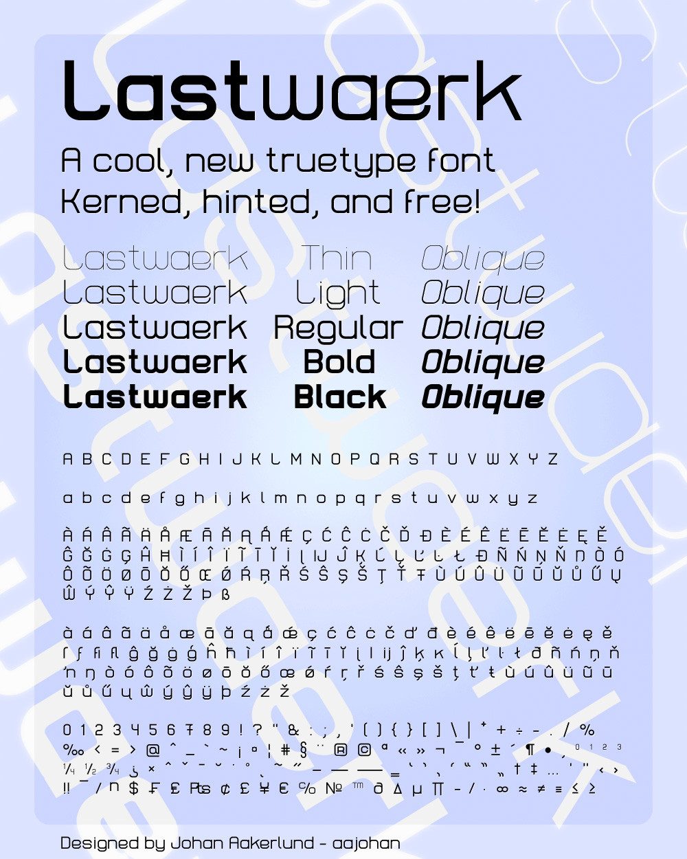
Champagne & Limousines Font Family (Regular, Bold, Italic, Bold Italic)TrueType Font Family By Lauren Thompson (Nymphont)
Free for personal use / Commercial use requires a donation
Donate: [link]
Donations can be made through PayPal to nymphont@yahoo.com as well
Updated May 17, 2012: Formerly consisting of 381 characters, the version 3.0 release of the font family now contains 631 characters in 21 ranges. This includes the addition of many Greek and Cyrillic characters.
Some existing characters have also been redesigned including the following: @, £, €, and ß. I hope you like the new updates and improvements.
.:*~*:._.:*~*:._.:*~*:._.:*~*:.
Thank you so much for the Daily Deviation! I am so stoked, your kind words on this font mean so much to me. I am so glad to hear that this font is enjoyed & useful to you all. Really, I can't tell you how wonderful that is to me.
.:*~*:._.:*~*:._.:*~*:._.:*~*:.
<3 Lauren
Read more about these fonts here: [link]
Email nymphont@yahoo.com if you need assistance/have any questions.
Related content


Comments: 184

ah ah, I am sure to nominate many more
 (Wink)")
👍: 0 ⏩: 0

Oh! XD I am so glad to hear that XD That is so awesome! Thank you XD
👍: 0 ⏩: 0


Looks great! Did a great job on it!
I saw other comments about the 'g' letter, well, but its not only the 'g'. the problem is that the eyes seem to bounce a little bit because of the 'different' shapes. As you might know, our eyes are atractted to the geometric shapes and forms, and they are easily distracted by this.
great job though!
Keep it up
👍: 0 ⏩: 1
The comments about the 'g' were complimentary actually.
I am not sure what you meant by 'different' shapes either. But thanks for your insights.
👍: 0 ⏩: 0

I love this!!
I used it here: [link]
Beautiful font!

👍: 0 ⏩: 1
Thanks so much  (Smile)")

👍: 0 ⏩: 1

Thank you so much, it was quite a pleasant surprise.
👍: 0 ⏩: 0

I downloaded this font in I think it was july last year on a free font downloading site, and used it for a school project. I had NO idea that you are the creator of this amazing font, so thank you for providing it!

👍: 0 ⏩: 1
I hope you got a good grade on your project! Sometimes teachers can be real sticklers about fonts. <3
👍: 0 ⏩: 1
We didn't get grades for it, I had to create posters for a party of my class. I still call it project, though, because I really needed a lot of time and the help of a lot of people
Thank you again

👍: 0 ⏩: 1
Oh sweet ")
👍: 0 ⏩: 0

You are very welcome, thank you
👍: 0 ⏩: 0

Thank you, you are very welcome
👍: 0 ⏩: 0


lol.. same

👍: 0 ⏩: 0

i LOVE LOVE LOVE this font, downloaded it a while back and i'm still using it, along with my ultimate favorite...gotham...<333333
thanks for sharing!
👍: 0 ⏩: 1
Yay! Thanks so much
👍: 0 ⏩: 0

Beautiful! I can't wait to use it, thank you!
👍: 0 ⏩: 1
You are very welcome, I do hope that you are pleased with the font when you do! <3 Lauren
👍: 0 ⏩: 0

Thank you, I am so glad to hear it! <3
👍: 0 ⏩: 0

Yes! A sans-serif font that looks gorgeous~
I especially love the lower-case "g"
👍: 0 ⏩: 1
The lowercase 'g,' some might say it's kinda squashed by some standards, but I am glad you like it. I made each character according to my own tastes, not according to tradition. I also like the sorta-squashed g, and I knew I wouldn't be the only one! Thanks so much
👍: 0 ⏩: 0

this for looks a lot like century gothic! coolio
👍: 0 ⏩: 1
Yep, they are both light round geometric sans serifs, they do seem very similar (and I love that style!). Thank you
👍: 0 ⏩: 1
oh yes i notice!!! >< coolio again!!!
👍: 0 ⏩: 1

I absolutely LOVE THIS FONT and I use it all the time, because of its clear architecture. I didn't know it was yours. Happily now I can keep the reference

👍: 0 ⏩: 1
Thank you so much
👍: 0 ⏩: 0

This is my favorite font of all time, I use it all the time, its beautiful.
👍: 0 ⏩: 1
Awww! That is so rad! Thank you
<3
👍: 0 ⏩: 0

Grats on the DD, only thing is that as soon as i saw it, I thought that it was a font that came with a computer, as I have that same (or almost the same) font on my computer, but I didn't get it from any website....
👍: 0 ⏩: 1
It's a round geometric font, as is Century Gothic, standard on most computers.
👍: 0 ⏩: 0

Overall I really like this typeface, it has kind of a condensed Century Gothic feel, with elements of Gotham and Futura. That said, a couple things I noticed, the width of the r and k are very small compared to the rest of the font, and it really breaks up the rhythm when you have the tight kerning (especially on re), so words like read or there become less legible. The bold variant has a couple problems where the weight of the character dulls the contrast (very visible in the 'g'), and the tags on the 'n' and 'm' become just an uncomfortable asymmetry. On the italic variant the weight of the curves appears to be higher than that of the straight lines, I'm not sure if this was intentional or not, but I noticed it was stronger on the characters 'e' 'p' 'b' 'o' 'a' and a tiny bit on 'q' and 'c' (I understand that curves should break the x-height a little, but these are way higher).
Anyways, I hope my observations are of some use, and I hope I didn't come off as too harsh, I really do think this is a very nice typeface.
Take care!
👍: 0 ⏩: 1
Truth be told, these "flaws" you point out are of but a few that I am dissatisfied with about this font. Making it was quite a learning experience, as I have learned quite a bit from making it. I do plan a future round geometric to compensate this/ hopefully wont contain said characteristics, tho I am sure I'll discover a set of flaws all new to it. But eh, what can you do? I do not mind your observations at all, looking back, it's a wonder this font came out decent at all, as I had so much to learn!
👍: 0 ⏩: 1
yeah...that's most of type design for you in a nutshell. There are always those stupid imperfections that are a pain to get out, but that's part of why we love it.
It's no wonder that this font came out decently, it's a well thought out geometric sans typeface, you should be proud of it. All the flaws I point out (and I'm sure you harbor) are trivialities in comparison to the overall style. Keep working at it and keep learning.
👍: 0 ⏩: 1
My main issue with the font myself, is a characteristic given, that turned out to be an enormous mistake, and only accentuates the uneven-ness to this font, which is the round overshoot. The round overshoot on this font is extreme, I did this in an effort to further differentiate the font from fellow light-round-geos, and boy did I ever.
I tell you what, had I not done this, even the flaws you point out would be minute and some of them even would be eliminated.
Sigh...
Thanks so much for your insight and kind words. Have a super one.
~Lauren
👍: 0 ⏩: 0

Nice clear font - distinctive yet highly legible.
👍: 0 ⏩: 1
Thank you
~Lauren
👍: 0 ⏩: 0

| Next =>