HOME | DD
 obiskus — The Knight

Published: 2008-05-04 16:45:06 +0000 UTC; Views: 9563; Favourites: 125; Downloads: 89
Redirect to original
Description
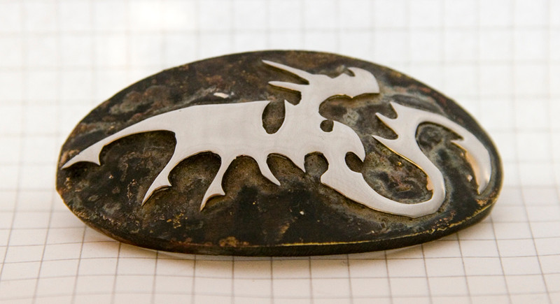
The Knight from my chess set of dragons.[link]The best way to represent a knight was to put a rider on the dragond back. In the same time the dragon became more like an animal, to separate it from the more 'human' pieces. I actually used the same figure on Knight's and Pawn's boby, Knight is only larger. Knight also has wings to show he is one of the officers.
And again, I meant to rivet the wings but had no time so soldered them instead.
Hand fabricated; sawed, hammered and soldered. The riders also, I only glued them on the dragons back.
Copper. 2mm and 1mm sheet. Riders: heads sterling silver balls and bodies 1,2 mm bronze wire. half silverplated. Black and white felt. ~4,5 cm high. Base 4 cm in diameter.
Other pieces:
King [link]
Queen [link]
Bishop [link]
Rook [link]
Pawn [link]
Related content


Comments: 13

You have been featured in the following article: UnseenArtists Feature - Vol. 6 - Dragons
👍: 0 ⏩: 0


I like the man because it takes the art that's all like "look at all this time and effort and how wonderfully crafted" and says "Oh, look! A stick-man!" I like it

👍: 0 ⏩: 0

I think I would like it better without the rider, or if the rider followed the same style as dragon.
👍: 0 ⏩: 0

i really like the change in design that makes this piece look less human-like, to make it seem more like the horses used in some chess sets to mean the knight.
and i also like that it is bigger than, and has wings unlike, the pawns, so that there is also that differentiation.
that being said, i have to agree with the others who commented- i don't really like the man. he is made of lines instead of planes like the rest of the figures and features (the toothpicks notwithstanding), his craftmanship doesn't look as good as on the rest of the figures, the metal doesn't even look the same color, and you can really see the glue used to attach him to his mount.
really, in an overall outstanding piece, this detracts.
👍: 0 ⏩: 0


I loved all the other peices except for this one. I find the little stick man on the back to look very poory done. Other that that the pieces are excellent but I think the board outdoes them.
👍: 0 ⏩: 0

i think the little man is humorous. maybe not as clever as the bishops scroll, but still funny. i do agree with gacek though when he says that it's unnecessary. its still fun nonetheless.
👍: 0 ⏩: 0

I think that this little fella on it's back is totally unnecessary. That little adds, like scroll in your bishop's paws sometimes are very accurate. But here - I don't think so.
But except that little guy, you made excellent and outstanding thing. really impressive
👍: 0 ⏩: 0

I like everything about the knight except the rider. I agree with the concept, but they almost look a little last minute. They definitely don't match up to the craftsmanship of these elegant beasts!
👍: 0 ⏩: 0

Hi... I absolutely love your chest, all the pieces. But in this one, I'm not a fan of the little man on the back of the dragon. I think it substracts strengh and elegance to the dragon.
👍: 0 ⏩: 0

I disagree, I like the stick man.  (Smile)")
Perhaps he could use a little sword-like piece to complete him?
👍: 0 ⏩: 0

I like all of the pieces but this one looks a bit odd with a stick man on it! Just giving my opinion. Don't be offended. Please!!
👍: 0 ⏩: 0