HOME | DD
 object000 — 0 . 9 n

Published: 2009-11-17 03:44:39 +0000 UTC; Views: 1353; Favourites: 29; Downloads: 91
Redirect to original
Description
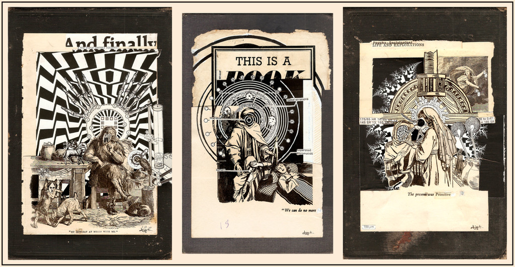
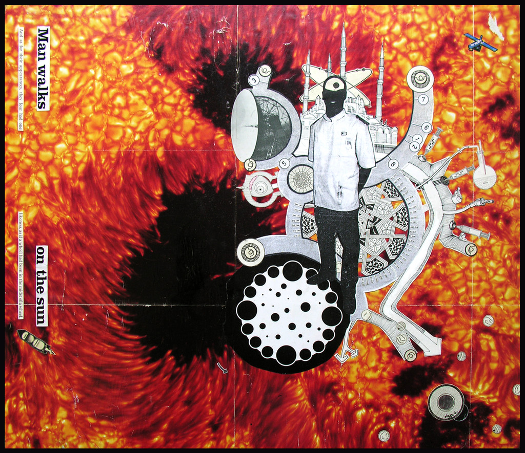
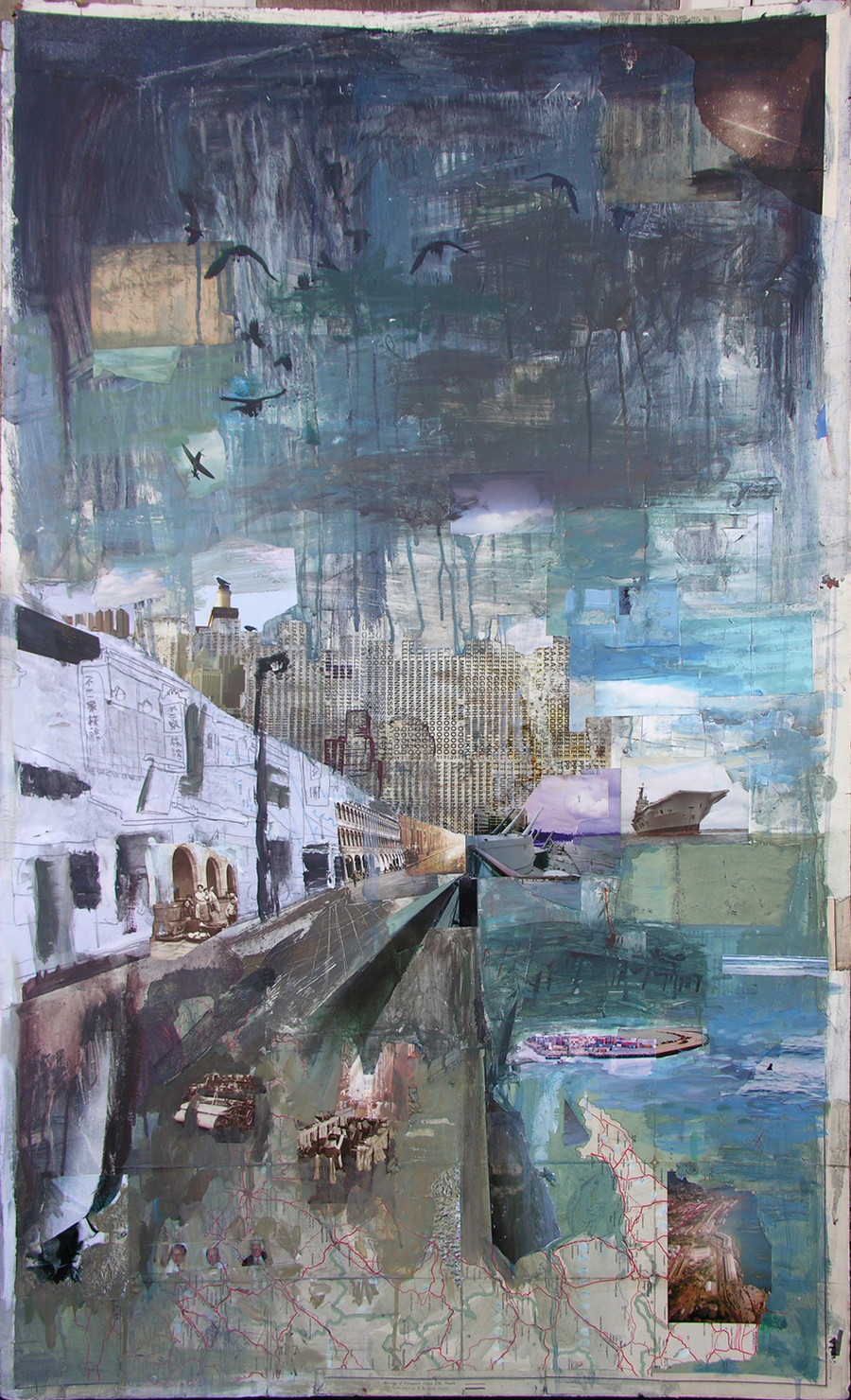
Another book...Was going to leave the back of each page clear, make tho focus more on the typographic forms on the right, but got carried away...
There is a page missing, to be found in : [link]
Lots of the pages are day-glow, which doesn't show up on the scanner really. The pink is all glowy, and you can see some bits are off-white, and they are actually day-glow yellow in real life...
which page do you thinks crap, and why?
 (Smile)")
Related content


Comments: 11


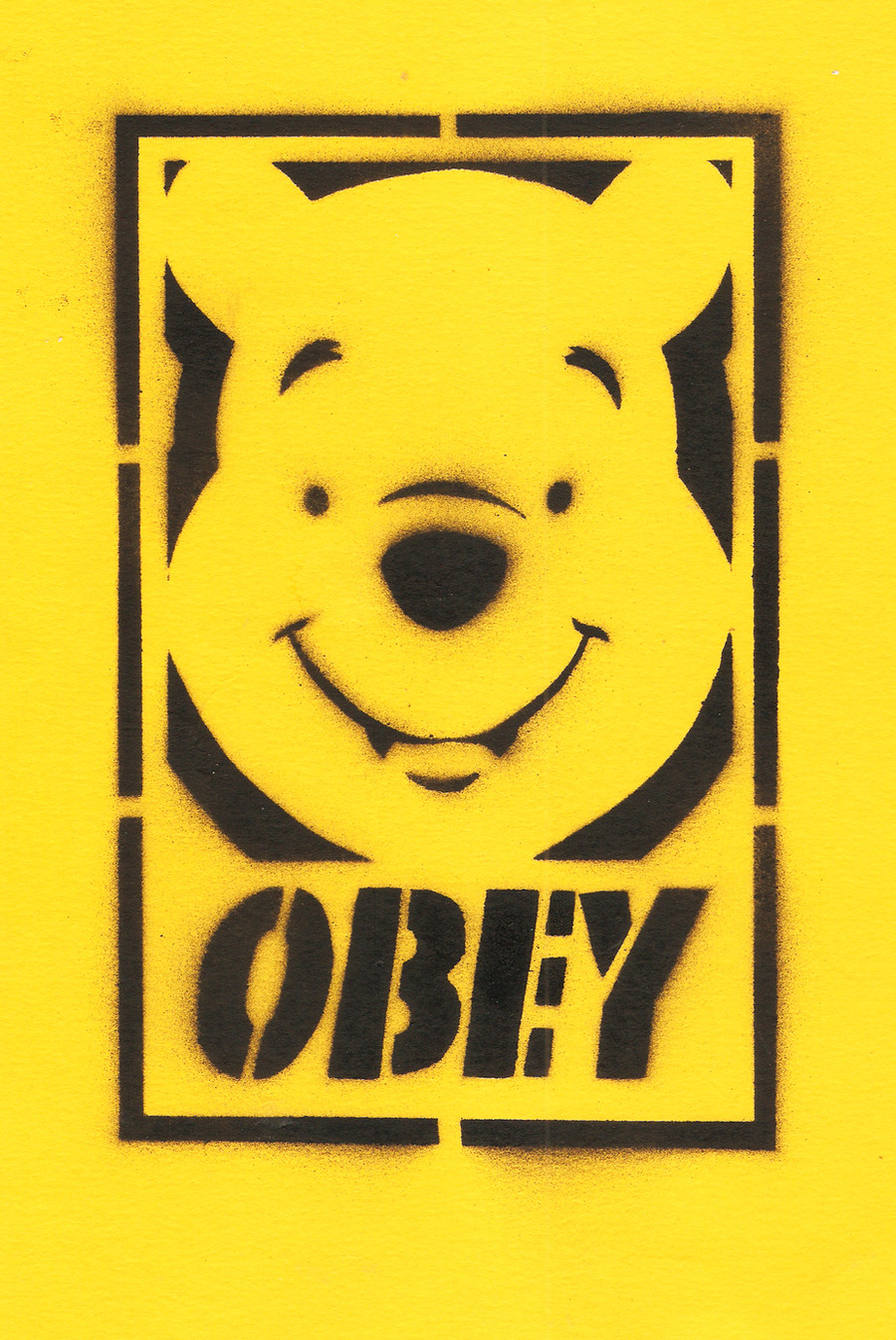
What about the
CK
ESE
page? Pretty boring at least
Thanks for the fave...
")
👍: 0 ⏩: 0


No crap here! But I am particularly fond of the little blue face, the CK ESE, the torpedo - and a couple of those pink ones, too. Great work.
👍: 0 ⏩: 1
Thanks... The CK ESE one is one of the few I just left as I'd intended for most of them...
👍: 0 ⏩: 1
I really enjoy the sense of freedom in your work on books - I'm quite happy with my Mother Goose project, but I feel pretty tight when I begin each page, takes quite a while to loosen up. I don't know it actually feels to you, but it looks like you put these together with abandon.
👍: 0 ⏩: 1
Yeah. You said somewhere you look at pages for days before you start work on it. I plan pages in a book which already has intrinsic value (like Letterboek II or your Mother Goose), but here I put the pages togeather and the cover on, and was sticking stuff in and drawing in it before the glue had dried...
👍: 0 ⏩: 1
Nice. Thanks. I'm going to do one like this, as soon as I find time.
👍: 0 ⏩: 0