HOME | DD
 oboe-wan — Key to Time poster
Published: 2012-08-31 13:16:56 +0000 UTC; Views: 1403; Favourites: 42; Downloads: 15
Redirect to original
Description
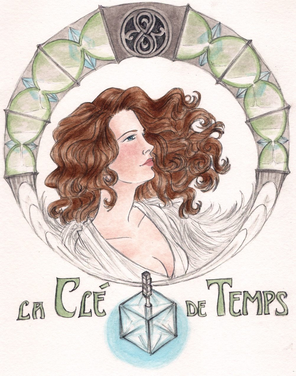
Here is an Art Nouveau style poster for the "Key to Time" arc in Fourth Doctor era Doctor Who.I did a sort of art nouveau-esque Romana picture right after Mary Tamm so sadly passed away last month. While I was pretty pleased with the picture, I still had this alternate design stuck in my head and decided to give it another try.
I will gush a bit about Romana again because I just love her so much. I love her wit and her grace. I love the contrast between her and the Doctor; Romana plans, Romana reads the manual, Romana plays by the rules, and the Doctor RARELY does any of the above if he can help it. She's the top of the class, and he's the genius who can't be bothered to do his homework. They make such an excellent team.
I recently got to share Ribos Operation with a WhoFriend, and was delighted that her response after Romana's first 30 seconds of screentime was "I love her."
(I don't speak French, so if I translated the title incorrectly, my bad. Let me know, and I will fix it!)
Also, I'm pretty sure my puny brain cannot even fathom the seal of Rassilon. I spent way more time than I want to admit trying to get the darn thing to look right.
pencil, acrylics, and Mucha-fangirling on watercolor paper.
prints on Society 6 society6.com/spectralmusette/K…
on Tumblr spectral-musette.tumblr.com/po…
Related content


Comments: 19

Your Doctor Who things are all great. Wonderful to see Romana-
👍: 0 ⏩: 0

LOl this is really awesome! btw, it's 'La Clé du Temps' ;D
👍: 0 ⏩: 0


Honey, this is just beautiful. You did a fantastic job, her complexion is gorgeous, the hair is amazing, and the whole composition is artfully done. I'm really astounded by how 'real' she looks and how well you pained her. I can see her personality as you describe it in her face. I'm so sorry we lost her so suddenly :c
👍: 0 ⏩: 1

Thanks, lovely.  (Smile)")
👍: 0 ⏩: 0

Thank you, I'm glad you think so! Her profile is just too gorgeous, but I did my best.
👍: 0 ⏩: 1

Just reading that description of Romana makes me really, really want to watch this now. If only I could find it again - I can barely remember anything from the time I saw it, and certainly none of what you described. She's the top of the class, and he's the genius who can't be bothered to do his homework. <-- That setence alone means it sounds like something I'd *love* to see - it'd be downright hilarious! ")
What did you use to draw her skin tones - pencil or acrylic - because it's beautiful! It's realistically varied and shaded and beautiful -- and, above all, it's SMOOTH, which is something I can somehow never achieve with my pencils. TELL ME YOUR SECRETS, OH GRAND MASTER!!!
👍: 0 ⏩: 1
You know, sometimes I think Four may give Eleven a run for his money in the crazy department. But that might just be Tom Baker's crazy eyes and hilarious expressions.
All My Secrets:
The coloring is all watered down acrylics (sorry if that was confusing, the pencil is just boring ol' graphite for the line art).
Paint: Basically the same idea as watercolors; I mix a small amount of Liquitex acrylic paint with a much larger amount of water on a watercolor palette. I have about nine basic colors that I mix to get the particular color I want. Here the shading is mostly adding additional layers of the same color, so it's kinda just getting more saturated instead of "darker" (if that makes sense?), but there's some very dilute pink in her cheeks as well. Overall I really like the versatility of acrylics, that if I want to use the paint thick and not watered down for some effect, I have that option.
Paper: I flipflop between mixed media paper (very absorbent, but thin, and tends to curl and tear easily) and watercolor paper (thicker and sturdier but sometimes it doesn't quite suck up my paint they way I want it to). This particular piece is on cold press watercolor paper. Because cold press paper is rough, I have a hard time drawing directly on it. I also tend to erase a lot, which sometimes leaves shadows and grossness. So usually I draw my initial line art on copy paper, because I really like the smooth texture. Plus, it's cheap, so I don't feel pressured to get things right on the first try. Once I have a drawing I like, I scan it, mess with the black levels, and clean up any incomplete erasing in photoshop. Then I print the scan onto the watercolor paper, and paint that. The printer ink doesn't run even with the very watery paint, and I am terrible at inking, so this has been a pretty good system for me.
Brushes: I use various sizes of angled shaders for everything. I have other brushes. Sometimes I set them out. Sometimes I think about using them. But I just keep going back to the angled shaders! I like the fact that you can get a thick stroke, a very thin stroke, or a small point all with the same brush.
So that's the current status of my trial and error (with lots of error!) coloring process. I had a flirtation with colored pencils a while back, and while I love them dearly, I'm not terribly good with them. Certainly nowhere near the magic you work with the things!
👍: 0 ⏩: 1
Ah. Paint. I’m terrified of the stuff. I’ve never been able to get using paint and a paintbrush quite right - and for that reason I’ve never practised much, so there’s that vicious circle effect for you. I’ve got a set of brushes and some watercolour paint, but I’ve never used them. They just sit in my cupboard and mildly intimidate me whenever I reach in for any art supplies.
Ah yes, I know well the old trick of converting graphite drawings to printer ink to prevent smudging.
👍: 0 ⏩: 1
Aw, don't be afraid of paint! It can be a lot of fun. Though I can't really talk, because I'm pretty much the same way about ink. While it makes me feel a little better that I'm not the only person who's afraid of my art supplies, maybe we should try to overcome our fears? Or... just keep doing what we're doing?
Interesting that you actually lighten the pencil lines before you color! I usually try to hold on to my black lines, probably longer than I should. If I decide to give colored pencils another try sometime, I'll definitely remember that tip.
👍: 0 ⏩: 1
I expect so. Guess I wouldn't really know, would I? 
I guess that all depends on what "look" you like - if you like your coloured drawings complete with lines, then you pick up the contrast instead of the brightness.
 (Wink)")
👍: 0 ⏩: 1


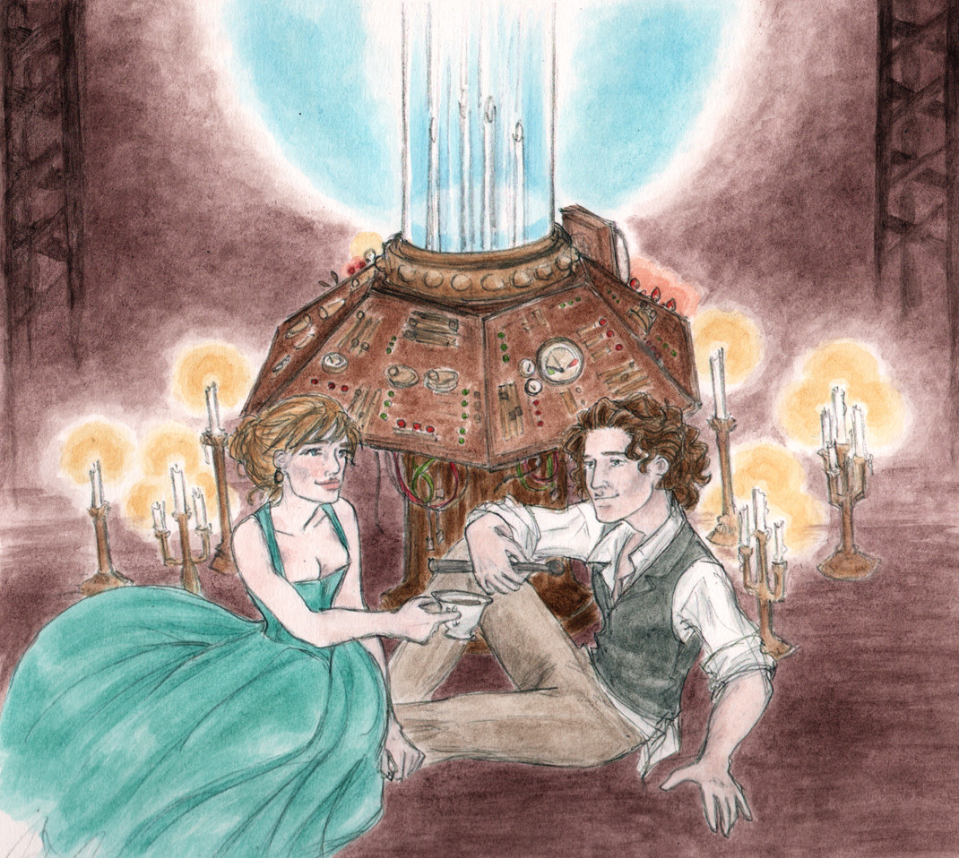
Lovely art as ever. Mary's Romana seems to have had such lovely costumes but her original is pretty darn awesome.
👍: 0 ⏩: 1
Thank you!
Okay, you got me... I really love the Ribos Operation dress! I probably should've mixed it up a little and picked a different costume, though.

👍: 0 ⏩: 0