HOME | DD
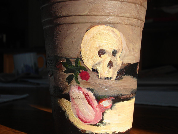
 ObsequiousKid — Cup Skull
Published: 2007-03-09 21:57:13 +0000 UTC; Views: 92; Favourites: 0; Downloads: 0
Redirect to original
Description
Okay, I'll be deleting this pretty soon but I need some help with an assignment. I want to do better on this one then I did on my cats so I thought I'd try and get recommendation from you guys. I need to re-create [link] that on a cup so could you check out what I've done and check out the picutre and tell me what i need to do to improve my cup while still reflecting the original piece somewhat?Anyway the orignial is by cezanna and this is done in acrillic, please comment.
Related content


Comments: 8

this image that you have created so far is very good but you need to look at the original image more carefully and for a bit of time to take in each single detail from big to small to be able to improve your work as you'll be able to recognise what part need to be added to and what else you may need to include. From what I've seen i have managed to compare your image with the link and I when i saw the original image i was draw to the skull and so you should make it more noticeable and bigger so it attracts peoples eyes and that should be the first part they see. The rest of the cup needs to be more darker and you need to add more detail like on the skull.
👍: 0 ⏩: 1

Thank you for your comments.
👍: 0 ⏩: 1
i hope they help you btw i didn't mean to sound rude if i did.
👍: 0 ⏩: 1
No! Not at all! Most of the comments on Deviant Art are compliments, which are great for building a supportive community but not so helpful for improving work. I really appreciate that you took the time to help me and comment even though I'm a stranger.
👍: 0 ⏩: 1
kk well i hope what i said helps you even if it's just a little. Well i guess now your not a stranger. lol x
👍: 0 ⏩: 0
Yeah, it's too small for the brush stroke and there is more stuff on the other side but that's not uploading... but I'll add more grey thanks.
👍: 0 ⏩: 0

Hmmm... I like this. The original has a more antique feel.. yeah, like Schmedderling said, you probably can tone down the colours with more dark and grey tones and suchlike, and if you're aiming to recreate the brush strokes too, you could go for a more impressionistic stroke instead of the smooth one you're using now (which I happen to like anyway...")
👍: 0 ⏩: 0

Well, the orriginal image is much darker, as well as there being this lighter area around the skull. The skull also has some thin lines on it in the orriginal peice, adding detail to it. You could put those in. I also don't see the book anywhere, but it should be hear the skull and roses. I hope that helps, and I still disagree with your teacher's mark on the other peice. *glares at teacher*
But anyway, it definnitely needs to be darker.
👍: 0 ⏩: 0