HOME | DD
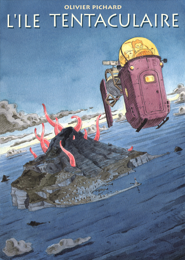
 olivier2046 — First contact

Published: 2007-11-28 09:44:31 +0000 UTC; Views: 2417; Favourites: 47; Downloads: 40
Redirect to original
Description
A quick and funny drawing.I made it because I wanted to use a new kind of ink.
Result : great inks! It is expensive inks but very good quality. I like it.
I will buy lot of these inks!! (and Xmass is near...)
Related content


Comments: 15

I like his expression and the comopsition of this piece! The perspective on him works really well to give the impression that he is really towering over them. I like his design and the way that his legs go really skinny  (Smile)")

 (Wink)")

👍: 0 ⏩: 0

You know already all the good I think about this picture. Again a big whoooooch in ma face!!!
👍: 0 ⏩: 2
Salut à toi!! Grand représentant de l'art délicat du crayon parcourant un long voyage en terre hostile!!!
")
👍: 0 ⏩: 0

Oh! un graphicksoapien!
Salut à toi, compatriote exilé !
👍: 0 ⏩: 0


Oh this is beautiful! The gradations in the shading are just marvelous, and to echo leftyfro you've got a beautiful line in this. I keep looking for something to suggest for improvement (your comment box tells me "Advanced Critique Encouraged") but I really can't find anything.
👍: 0 ⏩: 0

So fun, I love your colors and compositions. I love your line quality, it is blocky and fun. Nice!
👍: 0 ⏩: 0

Heh, it kind of reminds me of Gulliver's travels.
The color scheme is great- it really emphasizes how the astronaut is a foreigner in a strange land.
The shadows and shading are amazing, so subtle. How are you making such even colors with ink? Is it the paper, are you using a paintbrush? In any case, your "quick and funny drawing" is very impressive.
👍: 0 ⏩: 1
That's the result of inks + paintbrush + paper...
I use my colors with lot of water and put lots of layers of ink on the paper until I get the good result.
👍: 0 ⏩: 0

What kind of inks are they? I mean the brand or what you call it... the name, I suppose. Heh, they seem to be very good.
That is a good drawing. I think that some of the shadows in the city could be darker to give it more depth. I like the guy's face, because it's almoust popping out from the helmet. It gives the visor that magnifing effect.
👍: 0 ⏩: 1
It is acrylic inks.
Yes there is no enought deph in the city...
👍: 0 ⏩: 0

