HOME | DD
 OneSheepArmy — Tgsid003 001

Published: 2013-07-30 13:53:04 +0000 UTC; Views: 507; Favourites: 6; Downloads: 0
Redirect to original
Related content


Comments: 9

It depends. This one is on a 24x33 cm paper (9,44x12,9 inches). Now I work mainly in a sort of fanzine/minicomics size,
around 15x24 cm (5,9x9,44 inches).
👍: 0 ⏩: 1

Wow!! That is really small and impressive! There's no way I'd want to make full page comic drawings that size.
More power to you!
👍: 0 ⏩: 1
I started because of AC Comics. it was a challenge the first time, but now I consider
this my favourite format! It forces you to consider only the important stuff in a page,
it eliminates the temptation of filling the panels with elements that can compromise
the storytelling. It helps you balance drawings and words.
It's an anti-virtuosity format, and for me virtuosity is PURE EVIL!
👍: 0 ⏩: 0

 (Smile)")

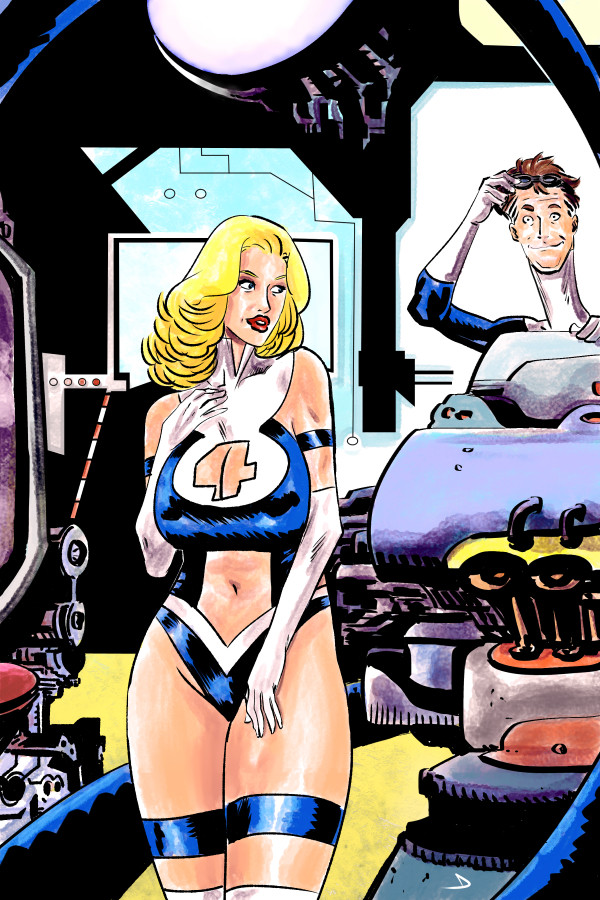
This page puts a lot of elements together. My only two storytelling comments involve the first panel and also three and seven. Without having the words/text or seeing other pages, the first panel which is exquisitely drawn is facing off the page and not leading the reader in toward the story. Panels three and seven have a lot of detail and become a bit too busy which actually confuses and slows down your narrative. As a general rule of thumb, use higher contrast for areas you want to pop out and dilute the rest. I might have liked a closer shot of the girl in the last panel so we could read her body language. The further you put her from the camera, the less important or interesting she becomes. I really like this page however and have liked a lot of the other pages you have posted. The style is organic and fluid with well designed characters. RICK
👍: 0 ⏩: 1
I agree for 3 and 7: I exagerated with the inks for sure (less grey, in particular); in 3 I should've chosen another solution, it would've been better with more "room", I think. 1 I think works better with words, because it prepares the action (all the first strip prepares, to be precise).
👍: 0 ⏩: 0