HOME | DD
 Opheroth —
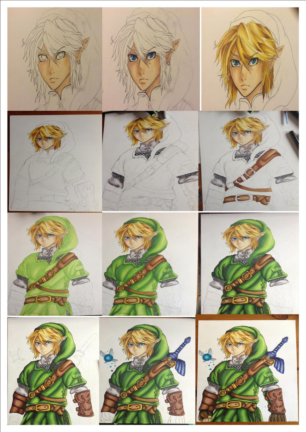
Colored Pencils Shading Tutorial
Opheroth —
Colored Pencils Shading Tutorial

Published: 2013-08-20 06:56:13 +0000 UTC; Views: 45811; Favourites: 1142; Downloads: 365
Redirect to original
Description
This is a tutorial of how I make gradients blending colors, and since asked for some tutorial like this and later more people asked for a tutorial, I've made this, hope this gets useful to you and every suggestion is very welcome, since this is my first tutorial here (Smile)")
Edit:
Thanks for the Daily Deviation and for all the favs, There are a lot to thank each one, but I'll answer all the comments, maybe it will take some time, but I'll answer.
Related content


Comments: 212


you're welcome, hope you find it useful
👍: 0 ⏩: 0

It's nice to know I've got these pencil crayons down!
")
I do basically the same as you, but I use a clear blending tool after.
👍: 0 ⏩: 1
I've seen over internet that the blending color works great, but it becomes very expensive for me to buy it over internet TT.TT that's why I use the white color insted.
👍: 0 ⏩: 1
Yeah I used to do the same thing before I got a job. The only thing is you have to make it darker.
👍: 0 ⏩: 0

Wow, this is a great tutorial; your blending skills are amazing! This tutorial was very helpful, and it looks like you've pretty much mastered the wind waker style!!
..... And there's a new wind waker coming out? Is that the "link between worlds" game for the 3DS I've been hearing so much about? (I still haven't been able to get a hold of wind waker to play it, but I have played Spirit Tracks, which is kinda in the wind waker "family"... it's just that one awkward cousin....XD)
👍: 0 ⏩: 1
Thanks, and I don't feel like I mastered the wind waker style but thanks
I think that game is a continuation of "The legend of Zelda: A Link to the Past" since the place is the same but it's supposed to be 6 generations later.
👍: 0 ⏩: 1
Yeah, that's what it seems like. Or at least that's what they said on ZeldaDungon. there's also gunna be a wind waker HD too. Either way, I'm excited for both! :3
Oh, and congrats on the DD! :3
👍: 0 ⏩: 1

Finally a great color pencil tutorial!! i find them hard to find xD <3 i love color pencils!! ;w;
👍: 0 ⏩: 1
Thanks 
👍: 0 ⏩: 0

This is really helpful
👍: 0 ⏩: 1
Thanks, I hope you find it useful
👍: 0 ⏩: 0

Thanks! I'm really bad at coloring, so you really helped me out here!
👍: 0 ⏩: 1
You're welcome, I'm glad it helped you
👍: 0 ⏩: 0


wow awesome thanks that helped so much!!!!
👍: 0 ⏩: 1
Thanks, I'm glad it helped you
👍: 0 ⏩: 1


Thanks, hope you find it useful
👍: 0 ⏩: 1
 (Wink)")

Really useful tutorial! My only suggestion, which is kind of unrelated to the tutorial, is to use complimentary colors instead of black to add more contrast in the shading. But that's more of a personal preference, I guess.
👍: 0 ⏩: 1
Thanks for the suggestion,
👍: 0 ⏩: 0

Leaving the white part?? I did that to my coloring too! Good job!
👍: 0 ⏩: 1
Yes, I mean I'm not coloring that part, sorry if it's wrong written, I'm from México and maybe I have some errors while writting in English
👍: 0 ⏩: 1
Oh no, I didn't see it as an error and I completely understand what you meant. I'm from Borneo, so English isn't my first language either. XD
What I meant to say is that I am surprised that this technique is used because I usually colour traditionally this way. And I have learn a few things from this. So I applaud. Congratulations on your Daily Deviation.
👍: 0 ⏩: 1
Don't worry, and Thanks I'm glad it was useful to you
👍: 0 ⏩: 0

Oh yes, thank you for the idea of blending with white color !! *o*
👍: 0 ⏩: 1
you're welcome, and it works with some colors, if your colors don't allow to blend, maybe it will be a bit harder to archieve this, Hope this help you anyway
👍: 0 ⏩: 1

Great tut! but i was feeling pain for that tablet you were coloring on X_X
👍: 0 ⏩: 1
Thanks, and Don't worry, I didn't draw over it, Only used it because I hadn't something to take the picture on, and the tablet seems to work well as background because is dark colored, it adds contrast to the drawing. You can see my desk in some pictures behind the tablet, and is almost white, and it was not very good at the moment of the picture
👍: 0 ⏩: 1
Alright if that so <3 Thanks for explaining bro ^o^
👍: 0 ⏩: 1

I love this- I'll refer to it in the future :3
Toon Link is proud. You gave him lovely hands :3
👍: 0 ⏩: 1
Thanks
Hands are my weak spot TT.TT
👍: 0 ⏩: 0


I made a colored pencil pic a little while ago. It ended up looking too light, even when I'd added quite dark colors. I think it's because I didn't leave any white or very light areas (so all the coloring in the pic was medium vs dark). :/ When you have the white areas on that left edge here, it doesn't look white when you're done. I need to remember to try doing it that way next time.
👍: 0 ⏩: 1
Maybe you're not using the correct color brand for the kind of drawings you make, I have a "Prismacolor Premiere" set, and the colors are very bright and saturated, and dark colors are very dark, but I also have a cheaper color set, they're a mexican brand "Mapita" and with these, even if I Literally pierce the sheet with the pressure aplied, they do not get as dark as the Prismacolor, les say they have a 50% of opacity, and I use them for parts where I need light colors, because is harder to archive these almos white tones using the prismacolor, so I suggest to have different kind of colors, depending of your needs
👍: 0 ⏩: 1
I think I just have a small pack of Crayola right now. A few years ago, I'd gotten several, I think it was, Prismacolor ones, but I had avoided using them because they were so expensive, and now I don't have them (or the large pack of Crayola I used to have). The main thing is probably just that I'd made the light places too dark, and messed up the contrast. I'd colored some stuff with colored pencils years ago, and I think those pictures turned out better, and I'd forgotten how to do it from not doing it for so long. I think I had probably used lighter light areas, though I don't think I'd ever left places white. Thing is, I think I'd made the colors darker in my last pic because I'd colored everything too lightly in some pics I'd done a bit earlier. I've always been bad with contrast.
But, maybe I'll get a small set of Prismacolor sometime and try them on something, and see how they do compared to Crayola.
👍: 0 ⏩: 2

Can I see the piece in question? (I have experience with a variety of color pencil brands so I could probably offer you a few direct suggestions)
👍: 0 ⏩: 1
asjjohnson.deviantart.com/art/… I'd tried to get the colors somewhat finalized on the computer first, because I think I tend to do better with something easily referenceable, but it still ended up looking a bit flat.
For this sketch, though, I didn't make things dark enough: asjjohnson.deviantart.com/art/… and I had done this one years ago with the same brand of colored pencils (referencing the TV for the colors), but it looks better: asjjohnson.deviantart.com/art/…
👍: 0 ⏩: 1
First one actually looks very good; the only thing that's a bit "flat" is the hair since there's no shading to indicate the shiny parts & did you use a single color for the pants?
That's true although for the 2nd piece-what type of paper did you use? (there's some types of paper that crayola has issues with)
👍: 0 ⏩: 1
<= Prev | | Next =>