HOME | DD
 oreog — KEEP MOVING

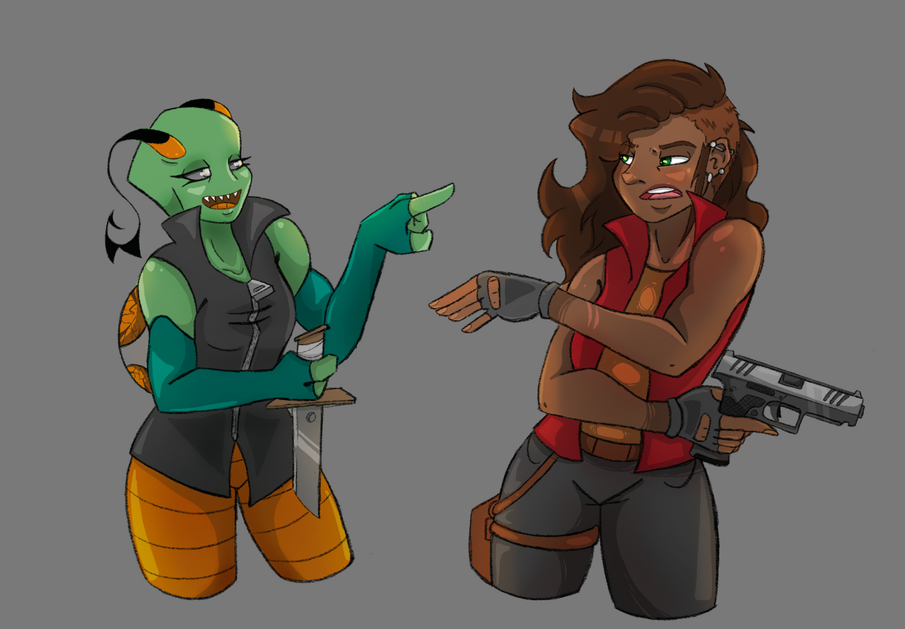
#city #cityscape #graffiti #gunfight #kroe #ocs #scifi #tunnel #oreog #pfosh #futureearth
Published: 2016-11-08 00:21:39 +0000 UTC; Views: 1134; Favourites: 27; Downloads: 1
Redirect to original
Description
"K-Kroe!! We have a problem!""YOU DON'T SAY?!"
---
Soooo, I actually started this back in September...
I got distracted by Inktober! But I didn't want to scrap this, so I finished it up over the last few days. Phew! Back on track with producing more Kroe world stuff. I will make a journal outlining some of my plans for these characters soon.
Who's blondie? Welllll...anyone remember Pfosh ? No? Cause I never drew him often? Oh yeah...
More art of Kroe:
WIP gif over on my tumblr!
Related content


Comments: 19


Technique
I really love this drawing ! The perspectice and the character's poses have a dynamic and epic feeling. You draw the expressions very well ! I especially like the green-eyed one, she looks so badass !
Your shading technique is good, I think... But there's a lilttle problem with the light effects : the inside is lit with neons and the outside is lit by the sun. But since the sun is supposde to be a 'important' light source, they must be some light rays in the inside. Oh, and there's a problem with the yellow-haired one : her (his ?) gun has almost the same color you used for the buildings ; so it seems 'camouflaged'.
Anyway, I really love the way you drew the gun of the green-eyed one, it looks really realistic, as well as the 'shooting" effect. The graffitis on the wall are well-done, too.
And more generally, I find your cartoon-ish art style really lovely ! <3
👍: 0 ⏩: 1

This was really helpful! Thanks! I hadn't even noticed the pistol blended too much with the cityscape, but looking at it now, I see what you mean. My lighting techniques are really weak, so I will definitely work on getting light rays to be stronger like you suggested. Thanks again! ^^
👍: 0 ⏩: 1
You're very welcome ! I hope you'll improve on ^^
👍: 0 ⏩: 0

Originality
Aaahhh, the classic Critique.
Hope you got a spear pair of pants, for we are going on a ride.
Let's start with the Pros:
~The lighting, for the most part, is great. the lighting does not conflict with each other and make sense for location.
~The designs are easy to follow up to. We can easily distinguish who is from where and who is who. It makes it easy to tell that the girl in red does not come from a business developed areas as the guy on the right.
~backgrounds do not conflict. The backgrounds go well, as showing the two sides of the city. The wall facing the red girl shows the most impoverished areas where she is most likely from. In the distance, stands the clean business area that the guy in white is most likely from.
~Orginization is good. We can clearly see that they are running from a situation and that we can assume it is bad.
The Cons:
~Some of the lighting is way too dark. Where the shadows are between the gun and her shoulders, there is too much light being blocked out. It should be lighter. The white one's back has the creases that are way too dark. It stands out way too much.
~The gun would emit much more light. Given where the flash is happening, the ground would, in fact, have a much larger area that it would illuminate. Here is an example: www.thenug.com/sites/default/p…
~Herd Productions
👍: 0 ⏩: 1
I'm so, so happy you caught on to the slums vs upperclass city motif and applied it to the characters! That totally makes my week! Exactly what I was going for. <3
I am totally kicking myself for the muzzle flash mistake. One of my gun nut friends mentioned exactly what you did and I still didn't make the flash big enough. I'll keep this in mind for future pieces. Really appreciate that gif!
I was afraid of the piece being too dark. I think the multiple light sources threw off my shading and I could've gone lighter in places like you suggested.
Thanks so much for the critique!
👍: 0 ⏩: 1

Vision
Impact
Wow this is a pretty neat artwork. I love the expressions on the characters faces because it would be pretty accurate to a real world situation.
The "Blondie" (I read the description and might i say i love how he looks :3) looks completely concerned and scarred but has just enough bravado to keep going (he's basically me in that situation).
While Kroe is focusing on whatever is following them (I haven't seen anything else of your artwork, i literally just thought to myself "welp, imma go critique something" and this stood out from the crowd. but that said, i think i may look at more of the things this is from :3). so all in all solid 8.5/10 have a wonderful day my friend!
👍: 0 ⏩: 1
I really appreciate it! ^^ Expressions were definitely a big focal point in this, so I'm glad it conveyed those feelings appropriately. Thanks for the critique!
👍: 0 ⏩: 2
I am going, to be honest here lad:
I feel that your critique could have been a wee bit more specific. An example point to areas on the picture instead of saying "it is nice".
Make it so he knows WHERE he got things right so he knows what to continue on for the future.
👍: 0 ⏩: 0
no problem! keep up the good work!
👍: 0 ⏩: 1
I am going, to be honest here lad:
I feel that your critique could have been a wee bit more specific. An example point to areas on the picture instead of saying "it is nice".
Make it so he knows WHERE he got things right so he knows what to continue on for the future.
👍: 0 ⏩: 1
well first off: i honestly don't mind, be as brutal as you see fit
secondly: I honestly couldn't find anything wrong with it so yeah, if you want to point anything specific out then by all means, go for it.
")
👍: 0 ⏩: 0

Here via Project-Comment . I really like this a lot! It's a very cool snapshot that leaves me wanting to know more- what's attacking? How did they get here? What happens next? 
 (Smile)")
For things that could be improved on: The left side of the image is pretty dark, on my screens I have a hard time seeing the gun, Kroe's hand and her knee. You mentioned in another comment you had a bit of a hard time with the lighting because of multiple light sources, I don't feel like the lighting as is detracts from the current image, but really nailing it would definitely make the image stronger. Though I really like the detailing in the cityscape I actually find it kind of distracting because it's an area of high contrast in an otherwise dark image. Pfosh's gun also gets a little lost in the detailing. Maybe having the city be out of focus, though still distinguishable, would help keep the focus on your characters...and whatever is after them 

👍: 0 ⏩: 1
I was afraid of making the image too dark, so I appreciate the input! Next time I'm definitely going to play with highlights a bit more to try and make sure everything is visible. You're the second critic to point out that the pistol blends with the cityscape and I'm surprised I didn't notice this while drawing!
I really appreciate you taking the time to check out the other thumbnails. Excellent advice, too! Thanks so much!
👍: 0 ⏩: 0
Kroe's character is 90% sass. Even in life threatening situations, there will be sass. XD
👍: 0 ⏩: 1

She's like Percy
Or is it the boy who said it
👍: 0 ⏩: 1