HOME | DD
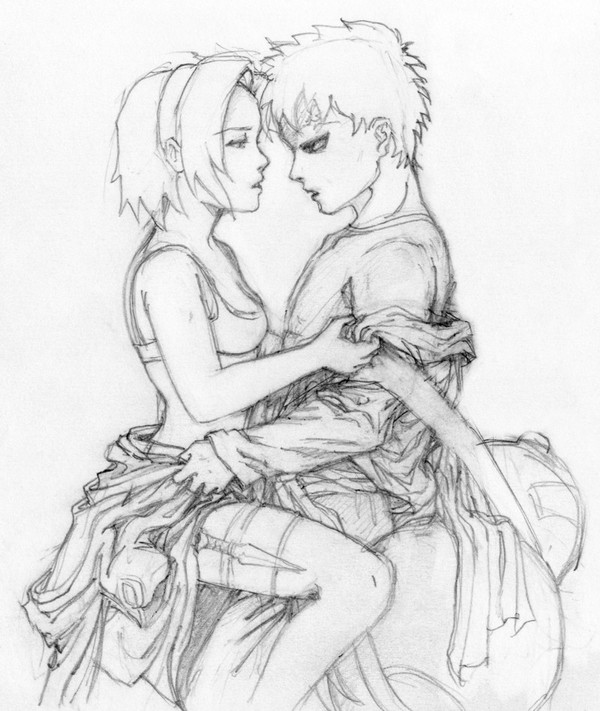
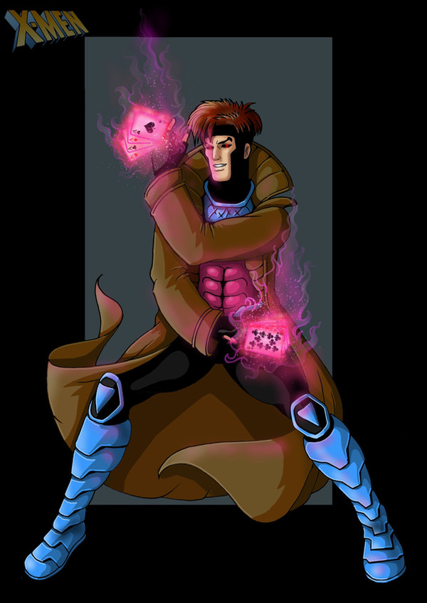
 Oshouki — Gambit

Published: 2009-01-05 05:08:44 +0000 UTC; Views: 34794; Favourites: 925; Downloads: 0
Redirect to original
Description
Edit:With some advice from !Jaala and brilliant insight from `ctJemm , I've fixed some of the things that were bugging me about the original colours.
`ctJemm suggested I up the drama by creating some visual contrast -- engulf his back side in shadow to make the playing card pop! This advice alone improved the image ten-fold, imho. (Thanks again, Lil' Grasshopper!)
Both !Jaala and `ctJemm pointed out that the "Gambit" text from the previous version was drawing waaaay too much attention away from Gambit himself, so I've embossed it and faded it into the bg.
---------
Gambit....
Comments and critiques please...
Gambit (c) Marvel Comics
Related content


Comments: 174


Seeing the card, you just think "Ah, now that's Gambit!"
Great job on the shading and I think the name is good now
 (Smile)")
👍: 0 ⏩: 1

Thanks. It just wouldn't be Gambit without his "calling card," so to speak.
👍: 0 ⏩: 0

Sweet coloring! Love the fiery pink color you chose for the card's flame. I like how it brings attention to it - especially since it's like having an Ace up his sleeve.  (Wink)")
Also, like the way you kept in mind to reflect the glow off the rest of his body and weapon. Your coloring just ROCKS. Period.
👍: 0 ⏩: 1
Aww...thanks! Such kind and uplifting words you always bestow on me...
How have you been? You haven't been very active on dA lately.
👍: 0 ⏩: 1
Pleased to give you such uplifting feelings! ")
Things from my end have been pretty crazy. I thought I was busy before but now I am just MORE busy. After work, I have karate everyday except Wednesday. Then I'm also working on a side project for someone, make that two. Then there's this lil' project my sister and I have been working on. Lots of fun, but it leaves me with little time to do anything else. I still keep up with peeps on here but not as often as I'd like. Well there's a good tidbit of news! Now you know more than a lot of peeps what's going on. XD
👍: 0 ⏩: 1
wow, that does sound busy! Better busy, I guess, than being bored. Even better that it's fun!
👍: 0 ⏩: 0

Gambit has always been such an amusing character... I love how you made the beam of the card look smokey! And the hair is, as usual, the perfect texture!
I'm so sorry Osh, I stink at critiquing, sometimes.... ^_^;
👍: 0 ⏩: 1
Thanks. no prob, this one's been crit to death already (on here and at digitalwebbing.com)
👍: 0 ⏩: 1
Yeah, I don't get very many good comments or critiques on my art, only "he's hawt" and "cool!" and stuff like that, which disappoints me especially when I submit a piece I've worked on for hours. So it's refreshing to have someone thoroughly compliment, comment, or critique my work!
👍: 0 ⏩: 1
okay, from now on, I'll try to cc more on your work. But be prepared for some hard crit. I won't pull any punches. How's art school, btw?
👍: 0 ⏩: 1
O_O You scare me when you say that, Osh! =_= But I had one girl who was always critiquing me about everything when others were saying "cool" and "hotness," so I shouldn't be afraid. DOO EET!
Art school's alright, for the start. We're not going into any of the actual, you know, art, yet; but I'm hoping that will change in a little while. ^_^;
👍: 0 ⏩: 0

By far my favorite X-Man and one of the coolest superheroes
👍: 0 ⏩: 1

OMG this is so hot!!! I love the way you drew his stance, how he holds his staff and definitely the card he's holding behind his back, the colors you picked for that is especially perfect not to mention the rest of how the art came out.
👍: 0 ⏩: 1
Thank you!! I'm glad you like it! Your comment has made me very happy.
👍: 0 ⏩: 0


great work as always,its awesome, gambit is a really cool character
👍: 0 ⏩: 1

Gambit! <3 Awesome work as per usual. I hate to say it but I'm never really good with giving crits lol. I love to get them but can never give them.
Either this looks so good. I love the pose and the proportions looks so good. The colouring is just as amazing as ever. <3
👍: 0 ⏩: 1
Thank you! I find giving critiques is a very important aspect of the learning process. Finding where others can improve their work is a great way to improve your own. Even if it's something minor, there must be something that doesn't look quite right or to improve upon that you can see.
👍: 0 ⏩: 1
You're welcome. I completely agree with everything you say. I used to give crit and still down on the rare occasion(only if they really want it). People would flip out like it's the end of the world even when I was also always make sure to give some position feedback to. Ugh..it caused like this huge war on a I website I go and yet it was just help critique. Either it's a little off topic. I wish people would do the same for sometimes, lol.
👍: 0 ⏩: 1
I don't think people who freak out at critique can really call themselves artists. Art is an evolving experience -- to reject critique is to be stagnant. All critique, whether friendly or harsh, represent a window of opportunity to improve. Critique might make you feel lousy, but flipping out over it is just plain dumb.
Feel free to critique me anytime! And in return, I'll try to do the same for you.
👍: 0 ⏩: 1
Thank you and I would gladly love for you to critique my work anytime.
👍: 0 ⏩: 1
okay! so I'll be devwatching then.
👍: 0 ⏩: 2
Wait..I just realized what you mean, when it comes to mornings I am not really all there.. Thanks!
👍: 0 ⏩: 1
lol....I'm not a morning person either...
👍: 0 ⏩: 0

Dude....that turned out b-e-a-u-t-i-f-u-l
👍: 0 ⏩: 1

i also forgot to add that i think that toning down the contrast in the background a tad would help bring your gambit more as your figure is full of high contrasts.
if that made any sense.
👍: 0 ⏩: 1
Makes perfect sense. There's too much contrast every, thus minimizing the effect of using contrast to attract the eye, and gambit gets lost in the bg. You can always tell when I get lazy and thoughtless with something like this bg.
Thanks for your insight!
👍: 0 ⏩: 1
take a break from it. Or plan EVERYTHING out from what you are going to draw to HOW you are going to do it. test everything else out first.
it's a major pain in the arse when you first start out but i figure with practice and time you'll develop a sort of an instinct for it.
👍: 0 ⏩: 0
the illustration is good but i do think that the Typography detracts from the illustration as it is a little to varied (and clunky) in with.
Perhaps a simpler and thinner type would work better so that the type isn't fighting for attention with the illustration.
👍: 0 ⏩: 1
You're right. Subconsciously, I knew this -- because anytime I find myself constantly adjusting the positioning of text (or anything), it's a good sign something is wrong. Thank you for pointing it out.
The idea was to use the recognizably official gambit typeset. Do you think it would help if I just muted the colours of the word into the bg, or does it really need a totally different font?
👍: 0 ⏩: 1
a new cleaner font with less drastic variations in width. Perhaps a similiar font or the same font (drawn in illustrator) but a lot more streamlined (and the with the bars thinner in width).
when making a piece of art make sure everything you put in there is there for a good reason (by good reason i mean it works well with the other elements in your artwork)
i figure with enough time and projects you'll develop this mental library of reliable techniques to work with.
👍: 0 ⏩: 2
I forgot to ask...please let me know what you think of the update?
👍: 0 ⏩: 1
just brilliant mate. just brilliant.
👍: 0 ⏩: 1
good advice. I don't usually plan my art very well, but I really should get into that habit. I am taking a life drawing class starting next week, so we'll see how that goes.
👍: 0 ⏩: 1
cheers! heh. planning art is a tricky business. I'm learning that too.
👍: 0 ⏩: 0

Very nice! But there's something about the colors.. you're in a safe zone o-sensei.. and for the XMEN not always does that work. ^^' if you come online i'll explain it further, dun wanna spam your deviation xD
👍: 0 ⏩: 1
no, don't hesitate to spam my deviation! Not only will it help me, but also those who might read it.
I regret not seeing this comment before signing off msn yesterday. I'm itching to hear what you have to say!
👍: 0 ⏩: 1
LOL i shall tell you offline as well xD
well what i gotta say about it is that american comics are surreal.. full of drama and the coloring really helps that along if done well. What i mean is that the glow from the cards gets a LOT whiter from the inside and need to be more saturated at the ends. To be honest I know you like muted colors, but vivid ones are the ones that will sell (if you are interested in prints). The more drama, the better. It also looked like there was a little discordance seeing the values in the blue parts have greater contrast than that of the effects. it should be the other way around honestly.
and that's all i guess : D
👍: 0 ⏩: 1
<= Prev | | Next =>