HOME | DD
 osowyn — until the world stops turning
Published: 2014-04-27 17:15:25 +0000 UTC; Views: 2992; Favourites: 147; Downloads: 32
Redirect to original
Description
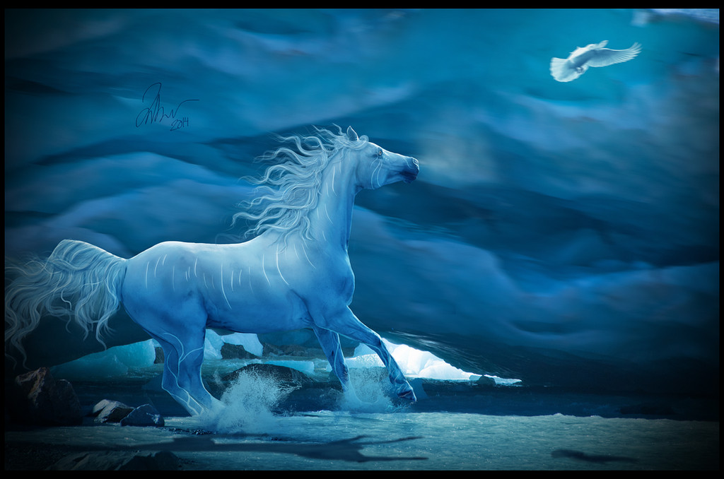
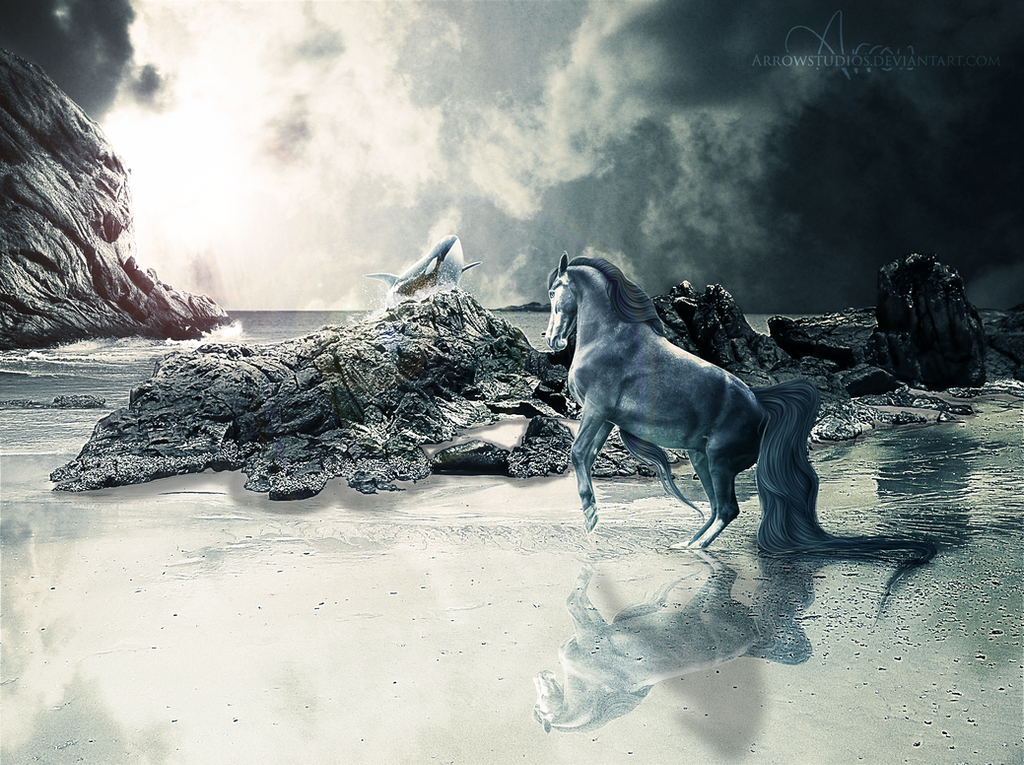
please download for full size, this is only small because it had to be this way to go on my profile page
This is my 1/2 of an art trade with the super amazing hearttosoul and her character Eurulissë (air-oo-lee-say). fav.me/d78oho1 She was such fun to work with, I looove working with blue hues! I'd also been wanting to use BG for a while, and originally started out with a desert which wasn't working e.o. I'm pretty proud of the hair... but I'm learning still haha! overall, extremely happy! 
 (Wink)")
hope you enjoy! <3
time: around 10 hours
tools: PSE 9 and a wacom create tablet
stock:
fav.me/dx3prm
fav.me/d3jsn0c
fav.me/d77ac00
fav.me/d4henl0
comments/favs/critiques greatly appreciated 
Everything else
© amberrsome 2014
Do not use this image. My work may not be reproduced, copied, edited, published, transmitted or uploaded in any way without my written permission I have various watermarks hidden in my images.
Related content


Comments: 56


Originality
Impact
First thing I have to say about this manip is just how stunning it is. Truly, a lot about this is just beautiful.
VISION;;
I gave you a high rating for this simply because I love the design and the concept of the image. The dove is a brilliant addition to the piece and I just love the idea behind this manip.
ORIGINALITY;;
I marked this as a low rating because, as another critique says, you tend to see a lot of manipulations of horses running along the beach. Despite this, however, I think the blue, cold tone you have added does actually make it somewhat original, hence why the rating is no lower.
TECHNIQUE;;
The lighting, markings, hair and extra details within this manip are pretty much down to a tee. I especially love your style of mane and tails and the splashes look very realistic. The only thing I might say about the splashes is that they seem too full, in a sense. But that's only me really picking the manip apart - I do really like the splashes ^^
IMPACT;;
The overall impact of this manip is superb. As I've said previously, the blue tone gives the manip a new edge in my opinion, giving it a big impact. The markings also draw a large amount of good attention to the manip.
Overall, it's a truly stunning manipulation so well done on producing such brilliant art! <3
👍: 0 ⏩: 0

Overall
Vision
Originality
Technique
This is my critique as requested on equinspiration.deviantart.com/ !
Vision
I really like the motion and placement in this piece. I think that the image shows a very clear story and does not contradict itself in any noticeable way. The only overall comment I have is that even though the blue and white scheme is beautiful and crisp, it leaves something to be desired. If you look at the "popular" manipulations, usually it is a blend of colors or at least a complimentary color gradient. For example, if the horse was a red bay or a palomino then you would have a complimentary brown to your blue and would add more dimension to your piece.
Originality
I really like the horse chasing the bird. I think that this is a beautiful addition and adds a unique aspect to the piece. This is not just a horse stuck on a background - I can tell that there is a story here, which is what most equine manipulations lack.
Technique
The lighting I think is the area in which there is the most problems. Now, lighting with manipulations is incredibly tricky. You want the most bright and influential sources on your main subject, however, the brightest points of light are actually on your white snow in the back and the bird. Where is the white light on the bird coming from and why isn't it hitting the horse (at least as brightly)?
The main and tail painting are good, but I get see where the base layer is showing through on your details, particularly in the tail. Make sure that you go back and finish off the ends! Also, make sure that your shadows are a gradient. The mane show slowly go from darker underneath the lighter on top according to the flow of light. You managed this better on the tail than on the mane!
Impact
I think that overall this piece has great impact. The motion is what really makes it complete, to me.
👍: 0 ⏩: 2

thank you so very much for the critique! ! thank you so much for all the sweet complements, and constructed support!
I love the idea of the complimentary color... maybe it could be a red bird, or something like that. maybe purpleish brown... or I could even figure out how to get some green in there too.
aha, and yes light was troublesome... i should have taken the time to take away the light on the front of the horse, and i totally see what you mean about the dove as well. thanks for pointing that out c:
okay so the whole gradient idea is just amazing. I LOVE how you put that, it makes so much sense and will help me tons! i'll work on finishing the ends as well :'D
thank you very very much for taking your time to write such an amazing critique!
👍: 0 ⏩: 1
If you ever, ever need any help, just poke me! I'll be more than happy to help. <3
👍: 0 ⏩: 1
aww I will! thanks so much for the sweet offer

👍: 0 ⏩: 0
thank you so very much for the critique! ! thank you so much for all the sweet complements, and constructed support!
I love the idea of the complimentary color... maybe it could be a red bird, or something like that. maybe purpleish brown... or I could even figure out how to get some green in there too.
aha, and yes light was troublesome... i should have taken the time to take away the light on the front of the horse, and i totally see what you mean about the dove as well. thanks for pointing that out c:
okay so the whole gradient idea is just amazing. I LOVE how you put that, it makes so much sense and will help me tons! i'll work on finishing the ends as well :'D
thank you very very much for taking your time to write such an amazing critique!
👍: 0 ⏩: 0

Overall
Vision
Originality
Technique
Impact
Wow, beautiful manip!
Vision: 3.5
I awarded you 3.5 for the Vision section because this piece gives me a serene heavenly feeling when I look at it, but If you zoom in a bit you could find some flaws.
Originality: 3
Alright, I gave this a 3 star for the originality because I see Allot of manips with a horse running on a beach with dove following or leading it.
Technique: 4
I really, really love the technique you're using, it almost looks like a painting and I have always been fond with painting-like manips. The tail, the hair, the prepping is stunning. But, could use just a little practice to make it flawless.
Impact: 4
This art piece has a great effect as it almost tells the story of the horse. the eyes the hooves, the tail all indicate that something is happening and make me interested and want to know more about this beautiful creature.
👍: 0 ⏩: 1
thank you for the very lovely critique! <3
👍: 0 ⏩: 0

Thank You from the G2 Forum, G2 Portal, G2 Networks and the G2 DA Group.
We Appreciate your Contribution as your work has been nominated and entered into our
Daily Tag Competition: 533 [24HR Voting] at the G2 Forum DeviantArt Group :
Click Here to Visit the DTC Poll.
Please Visit Us at the G2 Forum:
Click Here to Visit the G2 Site.
Julia x
👍: 0 ⏩: 0


 (Smile)")


Here's my critique, as requested by your submission to equinspiration
Technique specific:
As far as I can tell, your cutting looks very good, and the perspective of your stocks all seem to mesh fairly well, so there's good blending there.
For the most part, your hair painting technique seems really solid, but I think you could refine some things. For one, I see some really transparent, thick strands. Sometimes transparency works really well with hair painting, and yours does work in some places, like on the edges of the strands that have some opacity in the middle. However, you have some strands that look like you took about a 20-30% opacity brush and did one brush stroke and just left it, in particular that strand above the back. Also, some of the motion of the hair is awesome, and some doesn't really fit. Take the tail, for example. The back half of the tail looks superb, but then you have strands closer to the hindquarters that are just falling mostly flat - since they're shorter, they'd likely be getting blown more by the air, not less.
The lighting (oh yes, always a struggle in photomanips) isn't very consistent across the different elements in your image. The rocks have really strong lighting, as you can see by the high level of contrast, but the ice-wall-background-thing is really muted and diffuse. The horse, too, is quite diffuse, to the point where I'm not sure if it's the coloring of the character or a shadow that you're adding. Then, the shadow is extremely strong. While it might be this strong if the sunlight was that strong across the entire image and not just the rocks, it wouldn't have that sharp of an edge, and it wouldn't take that particular shape. Judging by the rocks, I would say that the light is coming from higher above the horse and to the left. The shadow would only stretch out like that if the sun were straight ahead, as seen from the viewer's perspective, and about midway between noon and late afternoon. For this reason, I'm generally not a fan of the whole "color the horse shape a solid color, flip it and skew" trick. In most cases, it doesn't give you the proper orientation of the shadow. Additionally, think about the ground the shadow is on. Since it isn't flat, you wouldn't get flat edges - the water has tons of little ripples that would distort the edge of the shadow.
Finally, kind of in a lighting/grounding group, watch your splashes! As they are, yours look really flat right now because there's no depth of value. Splashes have shadows and highlights too!
Stylistic:
First, the submission size. This is a personal preference, but I really like to see larger images submitted. It allows you to see more of the details that you put into a piece. I understand if there are specific reasons for you keeping it small, however - I just wanted to note that!
Color-wise, the blues are beautiful, but it's leaving me wanting for something else. It's not necessary, but a contrasting, complementary color would bring a lot more visual interest to this. It would also help focus the viewer's eye on your subjects, because as it is right now, my eyes are almost more drawn toward that bright patch of white from the ice in the far background.
I have borderline feelings on the vignette you added. Vignettes can be a lovely addition to some images, but they're also easily overdone. My personal, gut feeling is saying that this is just a bit overdone. Vignettes should, imo, be something that you don't really notice unless you're looking for it. If you toned this one down a bit more, it would still achieve your goal of bringing some focus to the image, but wouldn't be distracting. Either way though, I'm not really a fan of it combined with the black border, especially since the border is not even (which works sometimes, but I don't think here is one of those places). The border and unequal vignette make the image feel a little off balance.
I think that otherwise, your composition is pretty solid. There's a line upwards and across the image that suggests a rising feeling, some kind of empowerment, and it's contrasted with some subtly downward lines in the background, which almost makes me think the character is aiming to break out of stagnation, or rise above a difficult situation. I think you could have (if you noticed it!) taken this theme a bit further with lighting and color, because the blue monotony almost brings a calm or depressed feel to it, and you could have really emphasized a kind of power, if that makes sense. The crop, too, is a tad bit boring - I think a wider image would have conveyed more of a sense of movement or adventure.
Even though I feel like I've kind of slammed this image, I do like it overall! You did a pretty good job of combining multiple stock pieces and make them look cohesive.
👍: 0 ⏩: 1
ooh Kait! :') thank you very much for taking all that time to critique! <3
it's truly amazing to be receive help like this, as you go into depth and explain just so much. and actually, i'm going to start taking notes. seriously. to help me remember all these important aspects.
I do see those transparent thick strands. they were on my nerves since the beginning (and still are). this is me: "Hi, i'm amber and i have trouble with my hair painting style." now let me bore you with my problem.
i'll go about painting the tail, it comes out horrid, then i erase and paint the mane to get a break from frustration. the mane turns out crappy, so I go onto something else. then, I go back and switch stock and paint a fairly good tail for my own personal judgment. so i'm like "okay, now the mane will be easy" well no. the mane comes out looking like puked up spaghetti strands. so i try making it softer, lowering opacities, adjusting layers, re-sizing brushes, and so on. so that my friend, is how you end up with all those transparent strands. i should have gone in and detailed more, as you said, and tried to fix some. but the more strands i put in, the worse it got.
one of my main problems with hair is following contours. if i can remember that, and paint carefully, it seems to turn out much.much better. but aside from all of this, do you have any suggestions about my mane and tail styles not matching up? it may be size sometimes, but it looked bad without the large strands. maybe i should develop a solid route? sorry, i'm just rooting around here. and the part about the tail flow, yes, totally makes sense! i'll need to focus on flow as well.
light: it's interesting to me that you say the shadow is strong, because i originally had it lighter, but then kicked it around too much because i noticed the darker shadow behind. now that i look, it is too dark. and the sharpness as well, needs to be a bit more fuzzy as you pointed out. The white on the horse is the character, not the light from above. I forgot to link the character, and should have so people understood why the horses back was so light. sorry about that! but yes, light doesn't match, the front of the horse has light and it shouldn't.
splashes: okay so i totally agree. i really didn't know how to go about doing those, i think it was my 2nd or 3rd time :I i put some splashes behind in darker tones... and it didn't work out LOL. somehow i'll learn though. and i'd really love to start hand painting splashes. tried once a long time ago, but then gave up... today may just be the time to try again :'D
submission size: I wanted the bigger size for display on my profile, and it had to be smaller than 900px. however, i noted in the description to please download. but you're right. i should probably not do that, so people can zoom, it's actually a large file.
vignette... okay to be honest i'm not going to say "oh yes i see what you mean about the vignette" because i had NO IDEA what that even was x''D I just was messing around with light and then well it happened. i also put white soft light on the dove... but *now* i see what you mean! i'll stick with one or the other, and keep them toned down.
the rising feeling... AAHHHH that would have been so cool! ")
HA SLAMMED!? not at all. please. my dear friend, slammed in my opinion has a much different meaning. slamming is to downgrade someone's art while being totally crude an not knowing anything about what their talking about. (i've had this happen many a time) bahaha. haven't we all?
you listed so much that needed to be said, backed it up, explained how to do so, and opened my eyes to a completely new world of art it's literally a new world for me now. i used to think merely about simple stock choices, but now I have so much to consider and it'll give me so much freedom.
i thank you. so. so. much.
don't ever be afraid to slam my art. ♥
-amber

👍: 0 ⏩: 0

more you you stop being so good
thanks

👍: 0 ⏩: 0

Omg why haven't I been watching you before?? This is so beautiful!
👍: 0 ⏩: 1
awww thank you so much, it means a ton! !!
👍: 0 ⏩: 0
this is a little late but HEY
👍: 0 ⏩: 1

this is late too kinda so HI
👍: 0 ⏩: 0

Ahh, this is so beautiful! I love the bluish tinge and the sense of motion
👍: 0 ⏩: 1

Re-Dies again and again and rolls around on the ground again and faints again and screams again and hyperventilates again.
Sorry i know that was a little well.....over the top, but it's even MORE amazing now!
👍: 0 ⏩: 1
ah no don't die! there is plenty of more amazing art out there, stay alive!
thank you very much!!!!
👍: 0 ⏩: 0

This is beautiful!! I especially love the lighting. Your hair keeps getting better too! Just one thing, since it's water the shadow should be a bit more like a reflection, but that could just be me. I know it's night, so it's be darker.
Other than that, it's amazing!
👍: 0 ⏩: 1
thank you so much evie! c:
yeah, i actually was thinking about that... i based it off the shadow of the glacier and didn't see a reflection so was a little confused in whether i should or not :I but i think a tad one would look well, but it'd have to be dark and i was thinking the shadow darkness would over-power that.... i really don't know what to think on it! :3
thank you so much for the thoughtful feedback!
👍: 0 ⏩: 1
Haha I'd be confused too, I haven't done many or any water manips now that I think about it...
You're very welcome!
👍: 0 ⏩: 0

I'm so happy I started watching you because it's been so cool seeing you progress, even in this short time! The pose, the splashes, the mane and tail, love love love.
Blue's a blast to work with and you pulled it off superbly !!

👍: 0 ⏩: 1
aw thank you so much for the meaningful heart filled comment! it means so much to
me to hear those words ! ! ~
you yourself have been improving as well!
thank you again c:
👍: 0 ⏩: 0

euru looks so perfect...
okay okay
Q-Q
just stop this is amamamazing
i cant
i love you
i need to up my game...
👍: 0 ⏩: 1
whoo i'm so glad i could portray her well!
she was so much fun :'D
bahaha your's will be much more amazing shush
👍: 0 ⏩: 1
oh yes
...you see because of my detective abilities mentioned earlier yesterday i am able to see into the future >:'D
not
you're an amazing artist and each time you submit art i just stare in awe over it ")
👍: 0 ⏩: 0

That hair is absolutely amazing to look at. Dang.
👍: 0 ⏩: 1


WOWOWOWOW This is so stunning!!! I love the blue so much and the horse looks so gorgeous.
👍: 0 ⏩: 1
eeee why thank you very much Kayla!!! n v n it so much ! !
👍: 0 ⏩: 0

This is stunning
I love the hair and the colors
wanna do an art trade?

")
👍: 0 ⏩: 1
ahh thank you so much!
sorry, no I'm really booked with icons, and collaborations to start x.x
maybe later or something? c:
👍: 0 ⏩: 1
| Next =>