HOME | DD
 out-0f-the-c0ld — JMB Lecture Series : Board 2.4

Published: 2004-12-05 10:23:37 +0000 UTC; Views: 24685; Favourites: 406; Downloads: 775
Redirect to original
Description
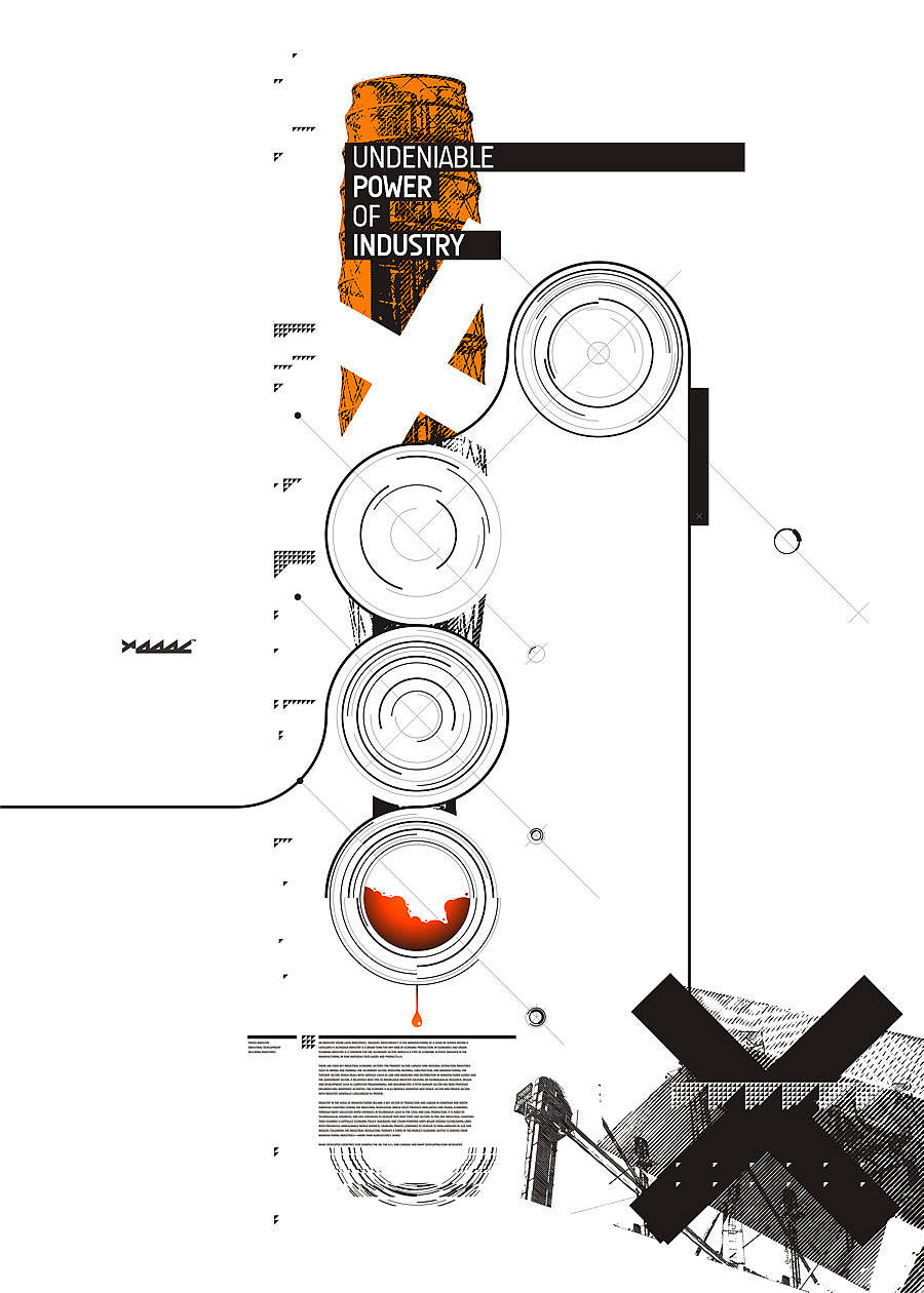
Ok so this is board 2 out of 4.This is an infamous poster by JMB for a concert of Beethovens music at the Zurich Tonhalle for which he made a good size chunk of his career work, and is famous for. I personaly love this poster, ( i cant find it anywhere on the net
") ) so i kept his layout but made it more complex due to the abundance of information.
) so i kept his layout but made it more complex due to the abundance of information..
")
Related content


Comments: 25

Can I use your work 4 realysing my design idea? I am very inspirated now for making the interesting work.
👍: 0 ⏩: 0


Featured here [link]
👍: 0 ⏩: 0


 (Smile)")

This is so much better than all those other trendy advertisements; —you have no idea! Things like this [link] and this [link] are just so fucking clichéd, it's a real refresher to see yours.
👍: 0 ⏩: 1

Thanks.
It's so ancient for me haha.
👍: 0 ⏩: 1


nice but i dont like ripped design work, inspired work is great but no offence but this is a little...too similar to the original
👍: 0 ⏩: 1

I agree with sardge.
But I like the typography-work you've done here.
👍: 0 ⏩: 0

i found the original one pretty big on the web... [link]
👍: 0 ⏩: 0


ha i knew i have seen this design before somewhere
👍: 0 ⏩: 0


yea ive been on there a while back during my research stage.... i was thinking of ordering the catalogue but its somewhat expensive. its a totaly cool site tho
👍: 0 ⏩: 0

maybe this link will be interesting for you: [link]
I like how you used JMB's designs, to create your own posters. This design is actually on of my favourites of JMB.
👍: 0 ⏩: 0