HOME | DD
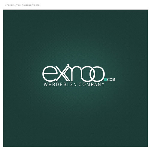
 painsworld — eximoo.com - logotype
Published: 2007-08-07 11:20:55 +0000 UTC; Views: 6901; Favourites: 29; Downloads: 0
Redirect to original
Description
Logotype for a new project. I hope you like the simplicity of this logotype...//UPDATE: The first "o" is no closed
")
www.just-flo.net
Copyright © 2006-2007, just-flo.net - official showcase
Related content


Comments: 59

Mach das o oben zu, so offen siehts nach nem u aus aber nicht nach einem o. Damit würde der Schriftzug auch gleich nen ganzes Stück besser aussehen.
👍: 0 ⏩: 1
Ja, mach das so zu wie das andere. Oder muss ich dir erst ein Beispiel machen?
👍: 0 ⏩: 1

Am besten ne richtig dicke Anleitung ")
👍: 0 ⏩: 1

geil^^ bis auf den übergang zwischen dem m und dem o... den hätteste etwas eleganter machen können
 (Wink)")
👍: 0 ⏩: 1
Mhh joa, hab ich mir auch überlegt - aber so fand ichs noch am besten
 (Smile)")
👍: 0 ⏩: 0
<= Prev |