HOME | DD
 palmaay — Death of Espio Colours

Published: 2012-02-21 17:48:39 +0000 UTC; Views: 3472; Favourites: 23; Downloads: 0
Redirect to original
Description
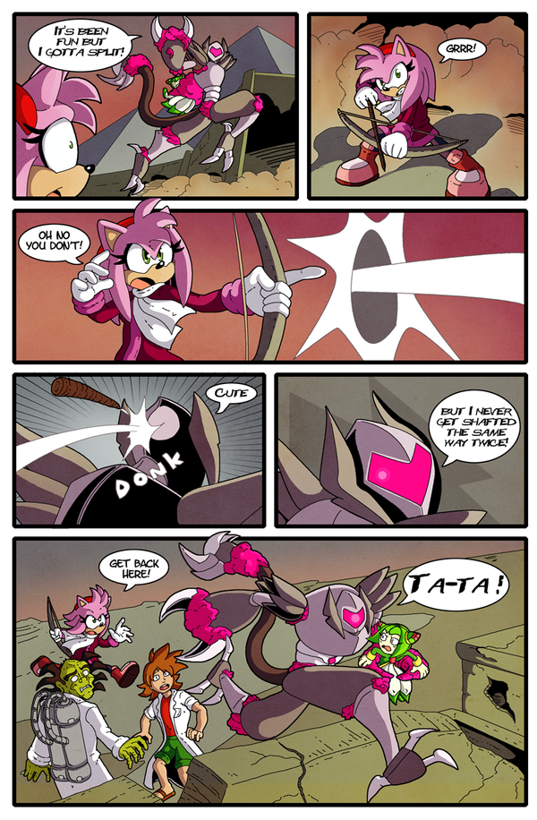
*EDIT* I've rendered some more of the background in panel 2, as it was looking a little flat before.*Another piece for the portfolio, this time centered on the current Sonic kick I've been experiencing since I bought Sonic Generations!
This is a sample page from the linework portfolio of the ever awesome Kingoji, who was nice enough to let me colour it for my own portfolio!
I tried to get a sense of atmosphere with the lighting, trying to show the sense of claustrophobic doom Espio is experiencing! Lots of yellows, soft brushes and colour overlay layers, but I think it stands up.
Lines by Kingoji [link]
Colours by Me.
See you at LSCC!
Related content


Comments: 11


This is awesome. ")

Poor Espy.....
I have one page comic called The Death Of Espio, but this happens quickly. Unlike mine.
FYI -- I LOVE ESPIO! IM NOT A HATER!!
👍: 0 ⏩: 0

EGGMAN!!!!!!!!! get ready to meet all of espio's fan girls and my ak47 now egman....DIE!!!!!!!!!!!!!!!!!!!!!!
👍: 0 ⏩: 0


Looking good!
I'll admit that when I drew this I put absolutely no thought into how it would be coloured. The original version of the page was very flat and bright, especly for the death of a major character.
👍: 0 ⏩: 1

Yeah, I wanted the last panel to be very dramatic, you really want to be shocked when a major character is killed off, so I tried to give it impact. The other panels I wanted to have the gaunlet thingy as the only light source, but not to completely wash everything out in yellow!
I might tweak it further, add some more background detail in.
I tried searching the internet for the original page, but couldn't find it, but in a way I'm gad because I didn't want it to affect my version.
👍: 0 ⏩: 1
I'm not certain that it would change how you did yours very much if you did see it... It was rather uninspiring.
👍: 0 ⏩: 1
Far enough! Haha!
I've added some detail in to panel 2, makes it pop a little more now I think
 (Smile)")
👍: 0 ⏩: 0

Getting better at your rendering however the background is quite bare. If you decide to work further on the page try giving the metal plates(?) some shadow down the sides. One last thing, I know you'll have my head but was it intentional for his eyes to have no colour in the last panel?
👍: 0 ⏩: 1
I actually agree with you about the background Astra, I might go in and add some shadows and a few highlights just to make it pop, I still want the focus to very much be on the characters.
As for the eyes on panel 3, 100% intentional
👍: 0 ⏩: 0