HOME | DD
 pAnAi5 — The Four Elements-Abstract Way

Published: 2005-11-06 11:07:57 +0000 UTC; Views: 7259; Favourites: 28; Downloads: 884
Redirect to original
Description
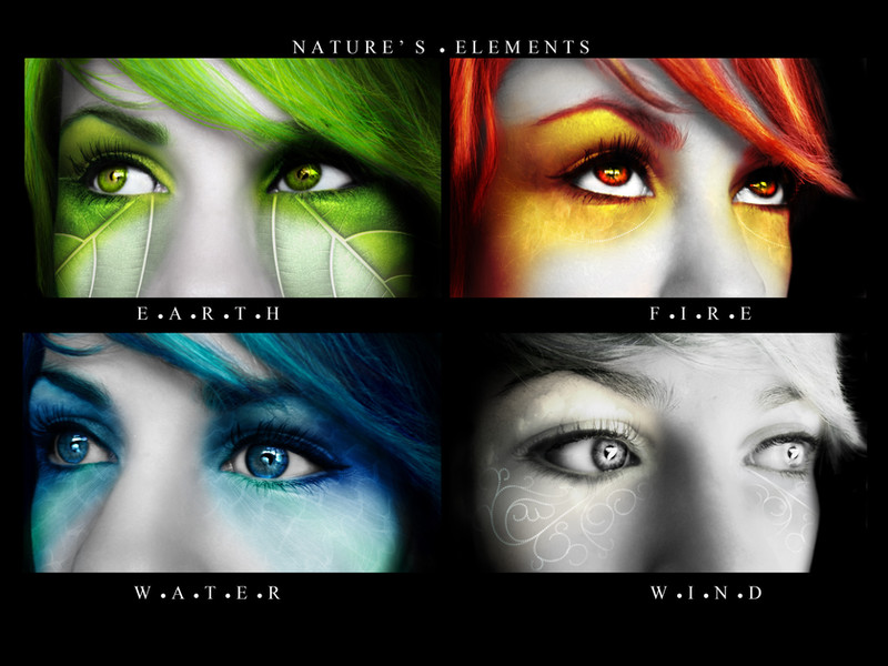
Enjoy!!!The four element in an abstract way!!!
Hope u like it!!!!!!
Favs and comments are welcome
Related content


Comments: 22


 (Smile)")


dude.. that's it.. I'm just watching you now.. nothing you do sucks.
👍: 0 ⏩: 0


hmmm intersting, like the colours u used, good stuff man!

👍: 0 ⏩: 0


")


the idea is so nice , and the effect is so great!
but i think that the text is not as good as the pics ,but it still rocks

👍: 0 ⏩: 1


")

I like the effects, looks very cool. I think it could be greatly improved with a better use of typography - something not so rigid (anti-alias it too) and maybe better placement?
👍: 0 ⏩: 1

ok..i'll think about it...what do u mean about placement? category?
👍: 0 ⏩: 0

 (Wink)")