HOME | DD
 pancake-waddle — coloring progress + tips?
Published: 2010-09-20 20:01:12 +0000 UTC; Views: 10564; Favourites: 317; Downloads: 222
Redirect to original
Description
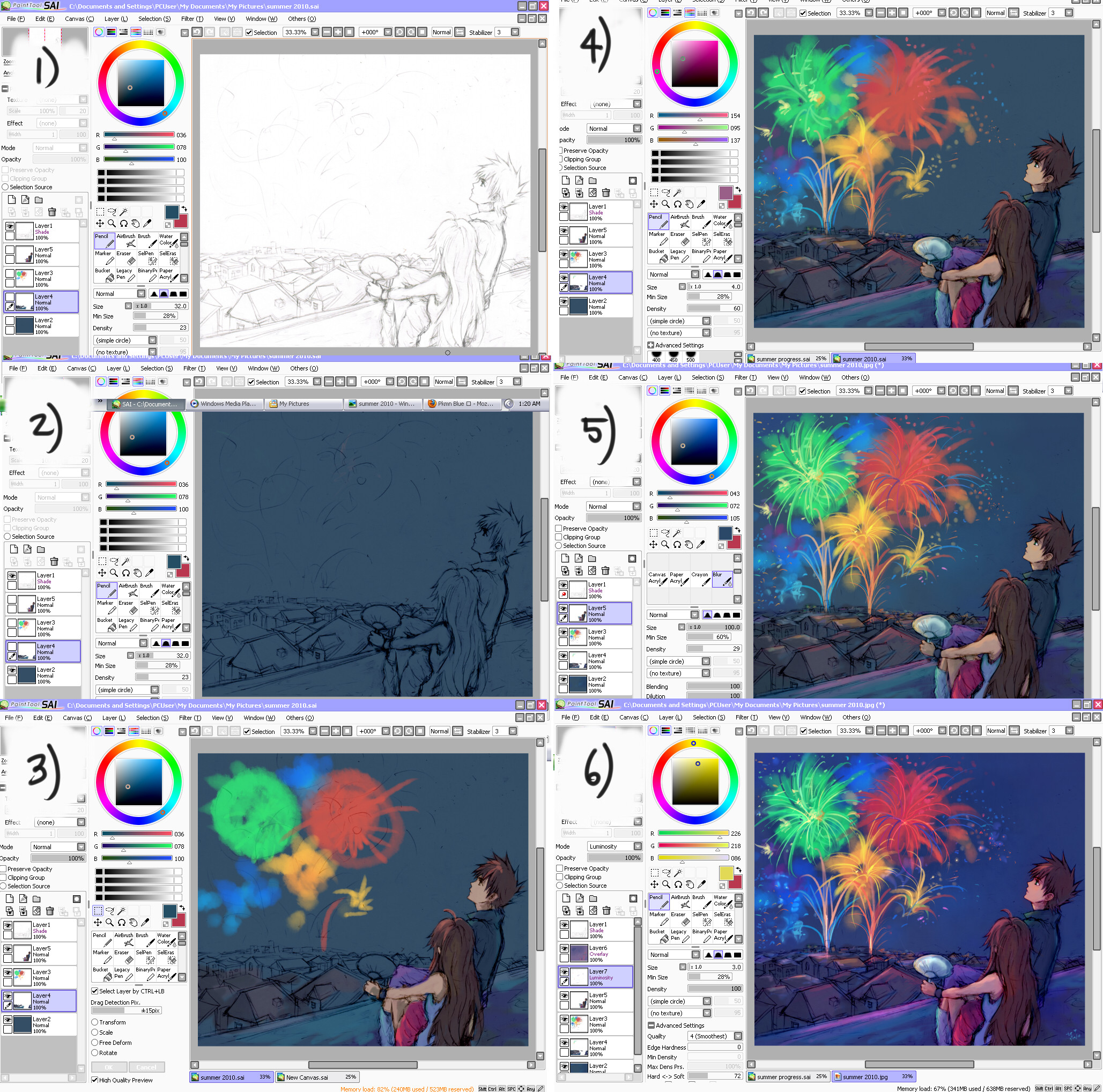
so a few people have been asking for some sort of coloring tutorial...and since I fail don't know how to make a bona fide tutorial (or do any text-editing for that matter), I said I'd just post some screenshots of my coloring progress. LOL orzyeah....so I guess a little explanation for each step?
1) scanned sketch
- clean up your sketch with the eraser tool and tweak until you have your desired lines. usually with scanned sketches, I don't reline much cause I'm lazy and I kinda prefer way the real graphite lines look as opposed to the digital pencil tool. however, it is up to you! (if you don't make a separate line-work layer, set your line layer to "shade" so your colors will show underneath)
2) main base color
On the bottom-most layer, I usually lay down a main base color first. Think about what kind of scene/setting you want to portray. The main base color is important b/c it helps set the overall mood of the pic. Also, you want all the rest of your color choices (ie skin, clothing, etc.) to "jive" with this dominant color.
3) rough base colors
Basically I just roughly fill in all the main colors that I want in the picture to see how all of them fit together, adding the major highlights and such. I will refine these later. Keep messing around until you're satisfied. Remember to make use of layers...usually things more in the foreground of the pic will be on the layers on top (ie characters, etc.) Don't be afraid to experiment with colors!!
*note about choosing colors: I typically don't use "gray" tones too much...when I do shadows/shading, I like to go for more saturated tones, because when you do color altering in the last step, it makes for a nice contrast. but that's just my personal preference
 (Smile)")
4) refining
Gradually start to zoom in and fix the smaller details, adding more hues and highlights as you see fit.
5) refining (cont.)
lol basically just continuing the process from step 4. Once you think you're about done....
6) color alteration (er...not sure what else to call it)
this is why I love having SAI!! lool. fun part for me.
yeah so...all your main color layers are going to be on the layers below. above those layers, you can see that I added another layer set to "overlay" --> this setting sort of washes over the whole pic with whatever tint you want to without altering the bottom color layers. (when I color on this layer, I usually lower the opacity of the brush quite a bit). I use it to deepen and saturate my hues as opposed to using the "saturate/deepen" option, I suppose. so compared to the #5 pic above, you can see that #6 pic gains a deeper blue color. In this pic, I also created a "luminosity" layer to make the fireworks more...luminous lol. basically this part is about bringing out more contrast from the colors and stuff to make the colors/lighting appear more "vivid."
And...tada! you're done. LOL gosh this was such fail. sorry if it didn't really help much~ ahah
Done using SAI paint tool.
-
will move this to scraps very soon x); sorry for the inbox flooding lol
Related content


Comments: 41

What options did you get the smooth airbrush like stroke? :3
👍: 0 ⏩: 1

Hmm.....I'm not sure I totally understand your question, but usually if you want smooth air brush...I think you would lower the opacity/density of the brush? It helps with blending
👍: 0 ⏩: 1
Oh I get it now its just I haven't used sai that much and I'm starting to use it a lot XD
👍: 0 ⏩: 0

How Do you get your pictures to look so "soft"?
And The color of the skin?
But everything else is AMAZING ^^
👍: 0 ⏩: 1
Hmm, "soft"? I'm not sure actually...LOL!
I think it just turns out that way because of the scan of the sketch? or....yeah, nothing that I do deliberately. x) sorry I couldn't help that much eheh but thank you!
👍: 0 ⏩: 1
Hahahahaha Thank you anyways ^^
👍: 0 ⏩: 1

try using the marker tool in paint tool SAI and then use the blur tool. works great for "soft"
👍: 0 ⏩: 1
Okie dokie!! ")
👍: 0 ⏩: 1

Oooh I knew I had fav-ed this for a reason! Looking back now (after somewhat learning how to use both my new tablet and SAI) I found your tip on the "Shade" option for lineart! Before I'd been redrawing everything on the PC :3 Thanks so much~
👍: 0 ⏩: 1
yay, I'm glad that it could be of some help!! x) Good luck and keep drawing!

👍: 0 ⏩: 1
^.^ Thank you very much!!
👍: 0 ⏩: 0

I just randomly found this in your scrapbook (I tend to overlook scrapbooks, should stop doing that), and noticed something on this image...your layer says "shade". I checked in my paint sai, I don't have such an option. Is this the same as "multiply" or something different that I should be aware of?
👍: 0 ⏩: 1
oh, that is odd that your SAI doesn't have that option! I have both shade and multiply options in mine. I haven't really used the "multiply" option much, but I think they achieve similar effects...? (Although I'm not too sure) I just found out about shade first and so I use it x)
👍: 0 ⏩: 0

the sky looks a bit flat imo...if you would make it tad darker on the top of the picture and some brighter according to colors of the city light (btw where are they..<_👍: 0 ⏩: 1
oh, thank you very much for the tips!
👍: 0 ⏩: 1
i hope i didn't offend you in any way...sorry if i did. Some artists seems to take tips as negativem but since you asked for them i thought i would point out things i would change.
👍: 0 ⏩: 1
ahha no, not at all! thank you very much for the feedback
👍: 0 ⏩: 0

i know this might be kind of a weird question but... how to you like re size little details? i know your suppose to select it and than press control T... but how do you de-select it and save your changes? because the only way i have been able to get out of the selected area is by hitting esc. and than whatever i resized doesn't stay that way D:
👍: 0 ⏩: 1
To de-select, above the canvas (a little above and to the right of the color wheel) there's an icon with a dotted line and an eraser. if you click that, it should de-select whatever you have selected. then you should be able to save your changes
👍: 0 ⏩: 1
oh thank you so much!
i know i'm kind of trolling... but ummm do u know how to make something duplicate?
Again sorry for my... trolling
👍: 0 ⏩: 1
haha np!! you're not trolling
I'm pretty sure you just select whatever you want to duplicate, then copy (under Edit) and paste it to wherever you want it.
")
👍: 0 ⏩: 1
i tried that but it still wouldn't let me D:
and again sorry for my annoying ness >.>
👍: 0 ⏩: 1
hmmm....not really sure what else you could do ;; sorry! I'm not much of a pro when it comes to SAI/art programs :<
👍: 0 ⏩: 1
aw it's okay XD
i just got sai so it's sort of confusing! but i'll figure it out.
thank you so much for helping me!
👍: 0 ⏩: 0

wow thank you for sharing !
* try to read English...
👍: 0 ⏩: 1
haha it's my pleasure!
and ooh, english isn't your first language? ")
👍: 0 ⏩: 1

Thanks, when I got the time to paint I will try "color alteration" like you do
With a little imagination I am sure you can see a cat and a lion in the firework sketch in image 1 or 2, do you see it?
👍: 0 ⏩: 1
yay!
and haha, you're right! neat of you to notice!
👍: 0 ⏩: 1

Oh, a tutorial! I've been wondering how you colour for a long time.
Very helpful, thank youu <33
👍: 0 ⏩: 1
ahahah I feel like it doesn't really impart much useful knowledge...x)
but yeah, hope it helps! hehe
👍: 0 ⏩: 0

YAY THANK YOU SOO MUCH!!!Btw did you draw with a tablet?

👍: 0 ⏩: 1
you're welcome! it was my pleasure.
and yes, I colored with a tablet
👍: 0 ⏩: 1
Oh that's really awesome
👍: 0 ⏩: 1
hmmm, usually I just use like a darker skin color with varying hues. add more red if you want it warmer; blue, if you want it cooler looking (turns more purply) ahha. higher red+green, lower blue = browner tone; higher red + blue, lower green = purple tone...yeah. i don't know if that made any sense! lol
👍: 0 ⏩: 1
Hmmm...I think I got it.....thank yo very much

👍: 0 ⏩: 0

Such a baller SAI tutorial! 8D Thank you for posting this~
👍: 0 ⏩: 1
haha np, hope that it helps a little!

👍: 0 ⏩: 1
Absolutely it does! 8D
👍: 0 ⏩: 0