HOME | DD
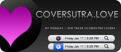
 paralexLX — Possible Business Card

Published: 2008-03-27 22:12:02 +0000 UTC; Views: 8670; Favourites: 41; Downloads: 0
Redirect to original
Description
I'm still playing with colors, fonts, and styles. Just can't make up my mind, so this might not be the final design. After I'm satisfied with my card (if I ever will be) I will probably print about 100 to start off with. Just tell me what you guys think about this, if I need to alter something or if you have anymore color/font ideas?Related content


Comments: 36


")

I can't finde that font, can you please send it to me?
👍: 0 ⏩: 1

Are you on OS X? It's a default font on OS X. The one in OS X is in .dfont format... I don't know where you can find a .ttf version of it.
👍: 0 ⏩: 1
yes I am. and sorry, I've found it. Thanks. But I meant the other font, which you used for "paralex".
👍: 0 ⏩: 1
That font is called SF New Republic. I believe I got it from dafont.com.
👍: 0 ⏩: 1


let's sit and watch ok? i said the red was the way to go
")
👍: 0 ⏩: 1

está muy bonita, lo que yo cambiaria sería redondear un poco los bordes y las letras que son finitas hacerlas más pequeñas, o tambien podrías mirar como queda hacerlas pequeñas, en mayúsculas y mas separadas de lo normal entre letra y letra!, un saludo!!!
👍: 0 ⏩: 1
Gracias por el comment. Quiero hacerla mas sencilla, no quiero mucha porqueria en la tarjeta, me entiendes? Me confundo mucho jeje, no se ni que hacer con esta tarjeta. Pero, voy a tratar de hacer lo que sugeriste. Gracias hermano.

👍: 0 ⏩: 1
si.. te entiendo.. quieres algo sencillo, discreto y elegante... y lo estás consiguiendo
un saludo!
👍: 0 ⏩: 0

Fonts need bolding and that's pretty much it.
I'm really diggin that logo you use
👍: 0 ⏩: 1
Thanks, already on the font situation.
 (Smile)")
👍: 0 ⏩: 0


Maybe you could make a web interface sort of...something cool with a menu across the top of the card and your name as the name of the website...and the phone number and the url in the main content of the interface...something like that...it could be shiny or some soft dark colors...
👍: 0 ⏩: 1
Good idea, but I'm looking for something more expandable in my portfolio. But this would make a good contact page, have it in flash.
👍: 0 ⏩: 0

Font needs a little more boldness, but not full on bold.
Otherwise, it's really nice.
👍: 0 ⏩: 1
Thanks, I will bold up the font soon man! I will post up a revision tomorrow!
👍: 0 ⏩: 0


i love the colors, font might be a little too thin tho
👍: 0 ⏩: 1
Thanks man, I will bold up the font. Look out for the revision tomorrow!
👍: 0 ⏩: 0


the colours are great
but the fonts are little bit to lighty
👍: 0 ⏩: 1
Thank you, I will bold them up. Look out for a revision by tomorrow!
👍: 0 ⏩: 1
 (Wink)")