HOME | DD
 PastryJournal — Crows View ink style

Published: 2016-02-22 11:12:24 +0000 UTC; Views: 441; Favourites: 24; Downloads: 1
Redirect to original
Description
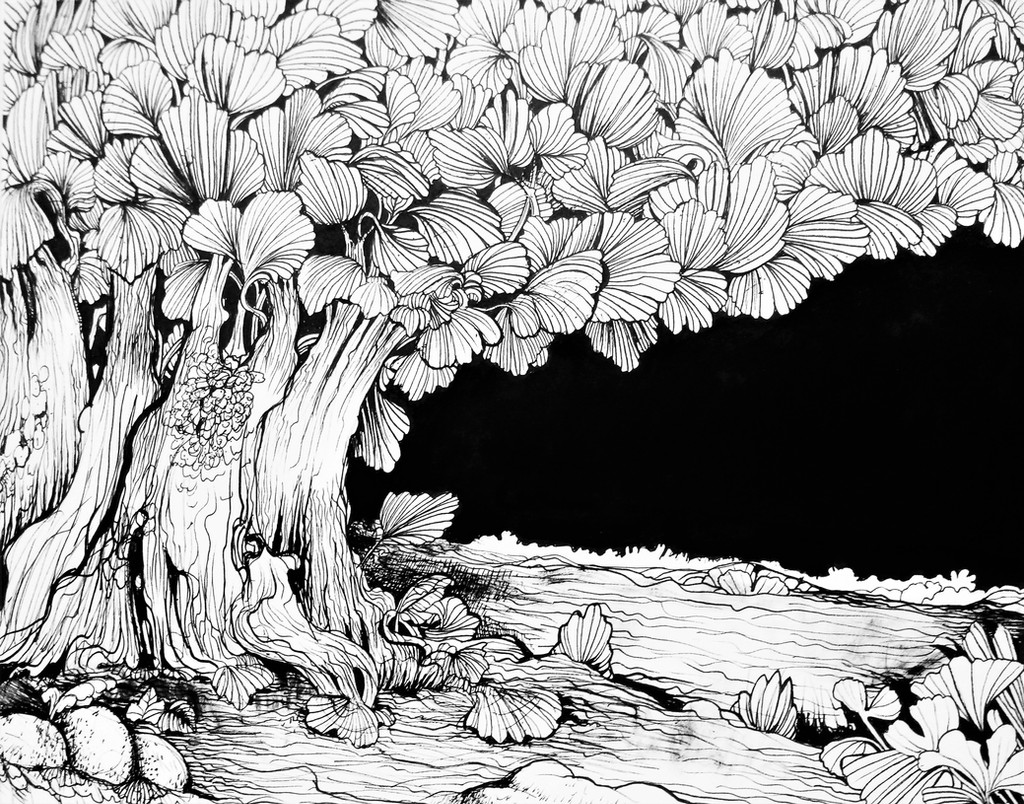
"Everything will rotcrows nest was shock as a branch
of fruiting corpse was blown near them
the crows tries to deny the unavoidable as if running away will change anything
a time will come the roots will call
but then that process will give life
and so the cycle will repeat itself
over and over again "
Related content


Comments: 13

This completely reminded me of Yoshitaka Amano's artwork.
Which is totally a compliment in itself.
👍: 0 ⏩: 0

Hello, I'm here thanks to ProjectComment !
First of all, I'm really impressed by the amount of lines in this, I'm always admirative of people who can find the patience with these because hell, I know it can take some time. I also like how your text come complement the picture too, to an extent it help grasping what the whole scene is about. The details on the flower (lotus one if I'm not mistaking) are really eyecatching and interesting! I also like how you changed your patterns according to the textures you wanted to represent: I can definitly differenciate the wood from the flower leaves!
Concerning the critiques I could do now, I think you could gain from studying birds postures and feathers, because even though we can see that they are birds in the picture, the crows on the top of the wooden human figure look a bit messy and it creates a contrast with the flowers on the side. A thing you could have done to make them more visible would be to add some small shadows under them, just like you did for the lotus flower, because I think you handled them really well on the right side!
To me, one side feels really messy and another feel very well handled, but given the picture's topic, that might be the intention, so I see where you're coming from so I can't be too harsh on this aspect either. I guess it's just the difference of the line treatment that gets a bit disturbing so that's why I suggested the bird studies and shadows. Given the work you put into the right side I think you could end up with some interesting results.
On the symbolic aspect now, I have nothing to add, there's definitly something poetic and everything seems on point to me.
As I previously said the fact that you even added a text helps but it also show that you knew what you had in mind!
I like the fact that there's some sort of human shape to, how to phrase this, 'embody' the crow's agitation too!
It makes me think about that well-known image of Hamlet holding a skull, but with a poetic twist.
I hope what I pointed out in this critique can help you!
👍: 0 ⏩: 1

Thank you for your comment sorry for not replying I became "busy" (games/study/chores) so I stop drawing on my free time
dem I guess my lazy side showed off :C on the left panel I was at the heat of the moment while I was doing this you know "expression" I was stressed at work that month and everytime I got home I was doing this I drew repeating lines over and over again then I came up with this random stuff ....I drew first the wood men then the birds
To tell you the truth the right side is just intentional (I forced things to compliment the random stuff I drew on the left side) I just want to complete the story out of the "expression" I created
I am almost calm when I started the right side since our Project was approved by clients the 2nd week I am doing this (hard work "sometimes" pays off)
SLAPS self
That's a lame excuse
I am glad you pointed out its kinda disturbing the contrast on the left vs right which means at first sight the work can be a turn off to people
I would study overall balance to the work so that it won't lost interest to you
you are absolutely right studying PROPER anatomy of birds would be great and make the piece itself a proper art as of now to tell you the truth I trying to study shading since that's my one of weakness
hmmm come to think of it I think my work lacks a background don't you think so ?
by the way the "poem" is not a poem but rather my pseudo reflection on what happened to my team that crazy month " the crows tries to deny the unavoidable as if running away will change anything"
hue hue Ain't life full of SHI*
👍: 0 ⏩: 0

Here from ProjectComment
I think the amount of detail and the precision in your line work is really beautiful; there is a lot to look at here, and it makes the piece very interesting! I also feel like this the piece and the poem go together well. My main problem I have with the image is that, with all of the details you've put into every element, it becomes very busy, and some of the shapes you've drawn become hard to read. For example: the crows at the top of the image, which I do really like, get lost. I feel like this could be helped if you had added some more line variation and thicknesses to make some of those figures more distinct. Also some more use of solid black, like in the pattern of the roots above the crow at the bottom, would have been nice to see. Although, that's just me being nit picky.
Overall, though, I think this is a stunning work. It tells an effective story, and holds a lot of emotion. You've done a lovely job!
👍: 0 ⏩: 0

Found this by
A very interesting and intricate pieceif I say so! And the poem really does fit with the illustration as well.
Some things that can be improved in making it look more readable to viewers is adding more shadows or 'blacks', particularly for the birds on the nest(or head which I interpret it). That way, people can distinguish the birds from each other, and even make the foreshadowing more visual impact too. And this is my preference but perhaps the wings of the bird on the top right can be facing upwards instead of downwards, and possibly reduce its size as well. Other than that, this is really a conceptual piece with a spark in it, loving how you drew the lines differently for each different object.
👍: 0 ⏩: 0

This is so abstract that the description goes with the art. It's just so creepy and strange I'm still trying to make out what is going on in this picture. Good job to you.
👍: 0 ⏩: 0

I really like the idea/ concept of this piece, and the line work is fantastic. The amount of detail is incredible and it shows this must have taken a good amount of patience and time  (Smile)")
ProjectComment
👍: 0 ⏩: 0

Very good work and imagination. It is highly creative and has wonderful detail.
👍: 0 ⏩: 0

Amazing rough sketch and details! Matched with literature too! Great work!
👍: 0 ⏩: 0

Truly incredible! Your detailing is fantastic. And as WatcherMagic said, somehow with so much going on you have managed to not make it look chaotic. Excellent!
👍: 0 ⏩: 0


Absolutely stunning, and is that a lotis I see? Bonus points for including my favorite flower! Seriously though, I could stare at this forever... I really like how it's intricate but not chaotic.
👍: 0 ⏩: 0

Amazing linework! There's a lot going on, but it doesn't look busy or messy! I love it!
👍: 0 ⏩: 0