HOME | DD
 PaulNLD — Cheap streaming V2

Published: 2010-01-21 00:06:04 +0000 UTC; Views: 3765; Favourites: 35; Downloads: 164
Redirect to original
Description
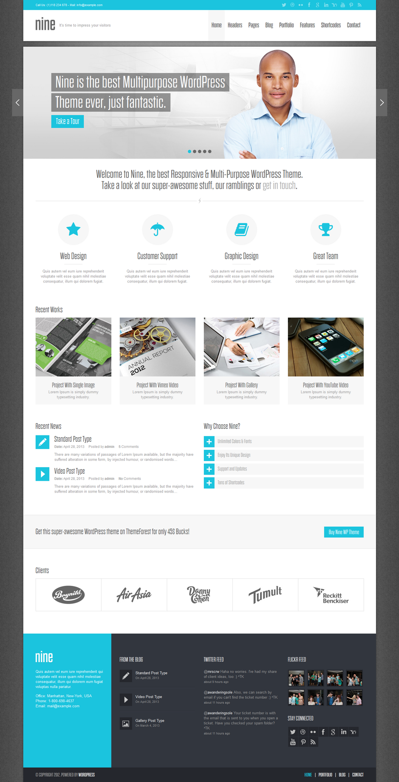
Cheap streamingFirst version for the client. A company wich provides media streaming. Audio and video
 (Smile) - :)")
Edit
V2
A complete new version.Client wasn't 2 happy with the design so I made this new version.
Related content


Comments: 20

Maybe explain yourself
👍: 0 ⏩: 1

Well, I think that it would have deserved much work. The center of the page is really too simple. Personnaly, I don't like the curves in the header and the footer. It takes too much place, is not really the best and usefull thing to code when comes the time to make the html template. It could be improved by working on gradients you could add, espacially in the arrow in the circle, in the navigation boxes. The design in its globality is a bit poor, I think, but it's a good base to work on it. The colors are good, the header is good, the background is nice. Well i'm the the best webdesigner in the world, so I don't know if my opinion is the best, but I give it to you anyway, that's one of deviantart's purposes
👍: 0 ⏩: 2
Anyones opinion is welcome mate
Thanks mate!
👍: 0 ⏩: 1
 (Wink) - ;)")
lol, I'm NOT the best ! Sorry for the mistake ^^
👍: 0 ⏩: 0

Awesome mate, love the colours. Very unique too!
👍: 0 ⏩: 1


Very nice indeed! I like the shape of the top part. It's really unique, and it ads a feel of 3d, because of perspective vision.
Think the sites other boxes (like the login box) should also get some kind of special shape not e just a mere rounded rectangle.
Something with a bit more twist just like the menu and the head.
👍: 0 ⏩: 1
Funny fact is that the client doesnt like al the round shapes
I agree with you though!
 - :P")
👍: 0 ⏩: 0

")


Top of the site is interesting, the rest is... unappealing.
👍: 0 ⏩: 1
What do you suggest I should do?
👍: 0 ⏩: 0

