HOME | DD
 PaulNLD —
Springbloggers
PaulNLD —
Springbloggers

Published: 2009-06-03 10:18:57 +0000 UTC; Views: 71683; Favourites: 418; Downloads: 1632
Redirect to original
Description
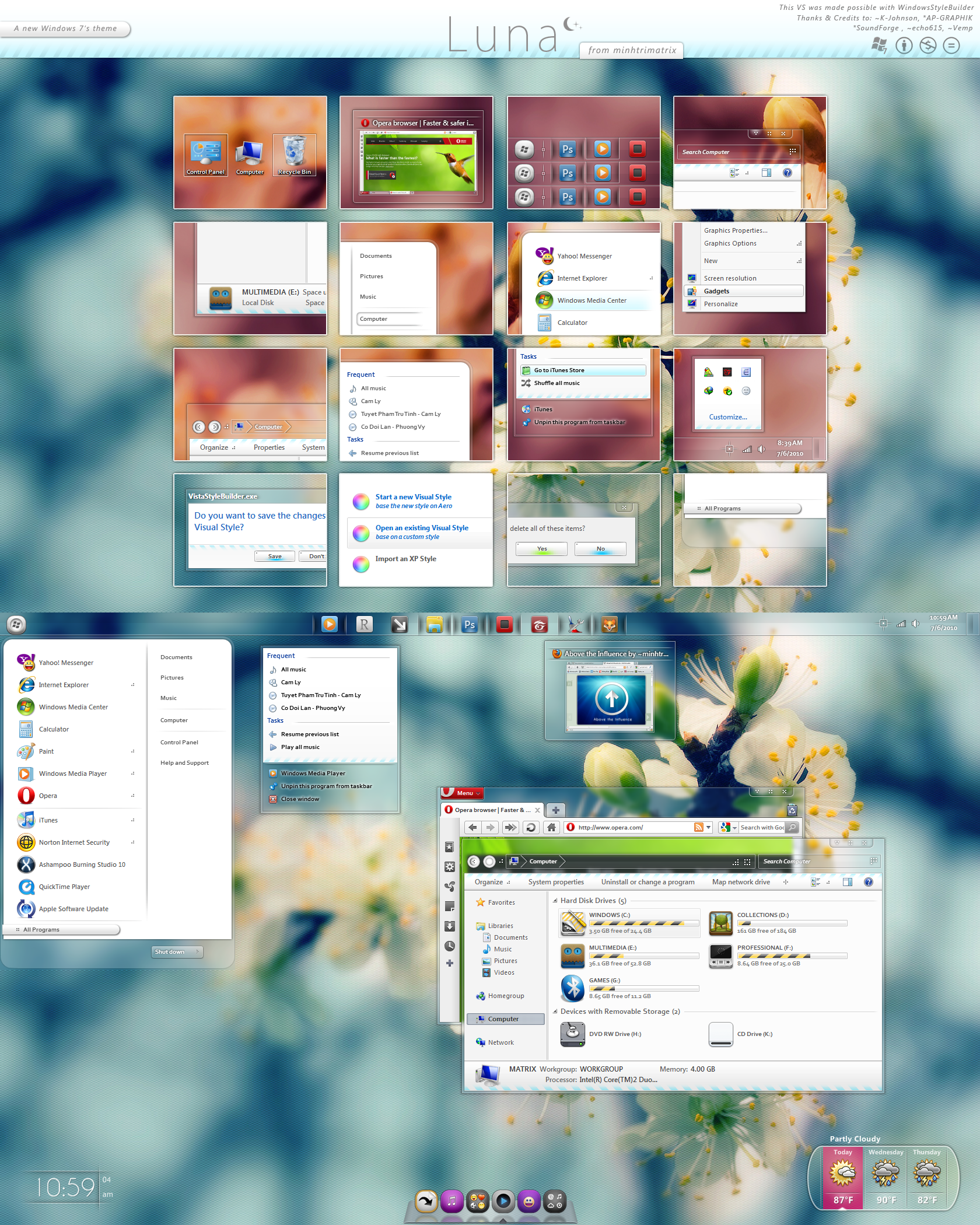
SpringbloggersA new wordpress theme
 (Smile)") My second one after making Creative bloggers
My second one after making Creative bloggers Materials
Iconspack:
Yoritsuki icons
Stockphotos:
Spring
Finally Spring
Little Chick
DD
")
Thanks for the DD Nuno! And thnx for al the favs/comments
Related content


Comments: 131

Schitterende weergave Paul en verdiende DD............
👍: 0 ⏩: 0


This has been shown off in my journal feature . 
Thank you for sharing with deviantART.

👍: 0 ⏩: 1

3! Haha awesome. Thanks for the features
👍: 0 ⏩: 0


Nice, but shadows and gradients are the downside here.
👍: 0 ⏩: 0


evet thought of making google browser designs? they are open source so it shouldn't be to hard ^^
👍: 0 ⏩: 0

I can code this, though it will cost some money. If your interested feel free to email me
👍: 0 ⏩: 0

I'd suggest putting the navigation icons a bit closer to the text. I think it'll bring it together a bit more - the navigation looks a bit busy.
But great job!
👍: 0 ⏩: 0


why latest, popular, archives you made rectangle? make it smooth! and too manu hearts for me
p.s. green triangle are awful too
👍: 0 ⏩: 0


Hmm, I can not, but a friend of mine can
👍: 0 ⏩: 0


Very awesome. Clean, charming, and attractive. I look forward to if/when this is coded for use!
👍: 0 ⏩: 1

Wow, great work. I love all the little tabs and such. They make the design very unique yet still functional. Greak work, a well deserved DD
👍: 0 ⏩: 1


It's a very clean design with a calm and relaxing color palette.
👍: 0 ⏩: 1
well then i succeeded my mission
👍: 0 ⏩: 0

Aww that looks so good !
But I'm wondering, for the round corner, do you use the -moz-border-radius?
That css features is not official but it's so simple... I was wondering what kind of thing something looking that professional was using
👍: 0 ⏩: 1
Nope, since its not crossbrowser compatible
 (Wink)")
👍: 0 ⏩: 1
That's what I thought... Too bad, would have been a right excuse: He doing it that way so I will as much, without that guilty feeling !
Lol,....
But that's a pretty cool job, I really like it... it's so soft... the ambiance remind me of the one in my bedroom or in the living room in evening, it's so warm, it changes from those shiney/glossy/wEb 2.0/vista designs that looks like a sterilized medical lab !
👍: 0 ⏩: 1


Hey bro! awesome for this one, is different from your others designs, and i prefer it! I'd really like to know what format do u use on your webDesigns, i mean you use a "work station" of 1024x768, or u use a 800x600, i'm asking 'couse i'm working on a web-project and i'm undecided of which one to use!
👍: 0 ⏩: 1
Im always working on 1280x1024 but im setting out some scanlines at the 1024x768 ranges
👍: 0 ⏩: 1
Thanks a lot bro for the advice! but i guess i'll do a 1024x768 bg and an inner 800x600 website becouse is the common format, i guess :S
Thanks again!
👍: 0 ⏩: 1
Nah mate, the common format is 1024x768. Atleast 90% of the world is on a screen with a minimal size like that!
👍: 0 ⏩: 1
,umm yeah, i think u're right, but i've done some courses where they've always said me to do a 800x600, however i'll do like you advise me
👍: 0 ⏩: 1
When did you do that course? Dont forget that people dont sit still, neither is technologie.
800x600 is dieing mn haha
👍: 0 ⏩: 1
Yeah, i know that technologie doesn't sit still but many people said to me to do a bg of 1024x768 and a workspace of 800x600, so i thought it would be better to do like they told me, in my country not everyone has a 17" monitor (1024x768), so that's why they told me so... however seeing around the web i found different formats, like the one u told me...and the course i did was in the last month...
👍: 0 ⏩: 0

congratulation for D.D ....
you deserve it .... wonderful design
👍: 0 ⏩: 0


| Next =>