HOME | DD
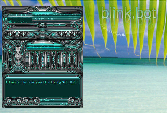
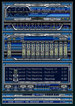
 peacemaker — Exile Extortion 2
Published: 2002-05-23 04:48:22 +0000 UTC; Views: 2094; Favourites: 9; Downloads: 628
Redirect to original
Description
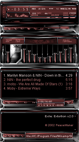
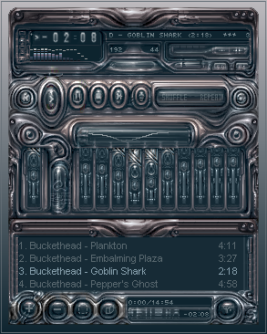
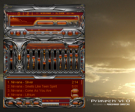
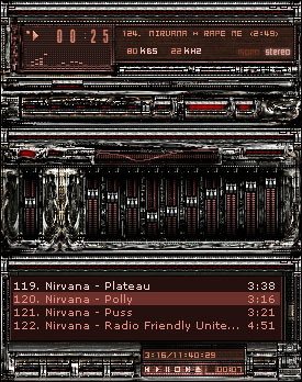
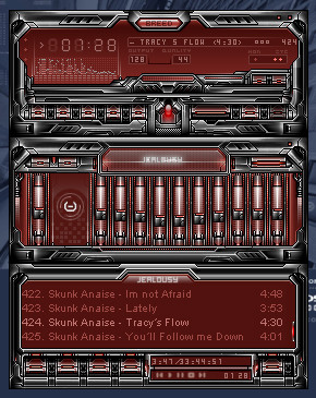
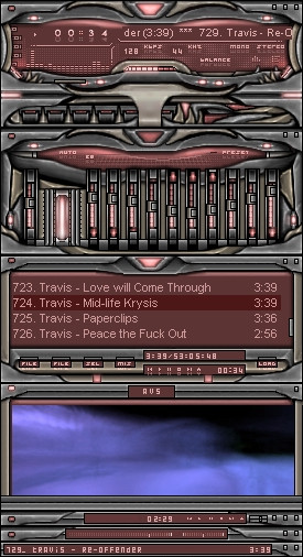
Some one ages ago suggested a colour change to red, so last night I went to work and done the change..Thnx
Full credits and comments in the readme.
- PM
Related content


Comments: 14


Very cool
I love the style you've imprinted in there. The color scheme looks great (I do love red ), and all that highlights and shadows add a cool and tech mood to it.
Great job!
-----
..:: ::..
You dont have to speak
I feel emotional landscapes
..:: ::..
👍: 0 ⏩: 0

Nice work,looks great.
-----
A man has to know his limitations
Speak softly and carry a big stick
👍: 0 ⏩: 0

I'm going against the popular vote. It's not too dark at all. And I love the color, like a raspberry jollyrancher. The only thing that doesn't seem to fit for me is the use of white in the highlighted areas of the frame. Perhaps if it were a more subtle tone it wouldn't seem as stark. But all in all a very nice amp
-----
One can never really climb all the way out of the gene pool, Detective.
A B N O R M I S www.ABNORMIS.com
👍: 0 ⏩: 0

this is awesome and great... it's pretty nice...my new winamp skin
and newest fave....//
//...
*+fav*a
👍: 0 ⏩: 0

very cool skin!
the metal parts are great, but maybe it is a lil too dark...
-----
you can not escape us!!!
👍: 0 ⏩: 0

This skin is blowing me away! Gotta download it and give it a go!
-----
If you want something witty, intelligent and profound, look elsewhere.
If you want a smartass, then this is the place. [link]
👍: 0 ⏩: 0

pretty cool metal affect, but the text in the pl could be changed
-----
-val
www.glitchedart.com
👍: 0 ⏩: 0

Good job, looks great in red (yup, I suggested it long ago. Never thought I'd see it so thanks a lot).
I agree with jhenney, the spotty borders are a bit out of place. they only look good in the right lower corner where the stripes are longer.
Nice job, the original and this red version are great skins.
-----
DarkbladE [link]
The way that I smile is the way that I cry
Roses to no one by Edguy (The Savage Poetry, 2000)
👍: 0 ⏩: 0

I really like the different tones of red. Only thing I don't like is the border with the (what, spotty, chequered?) effect. But it fits in with the skin I suppose. Good skin.
-----
---
- the jpeg is mightier than the sword -
👍: 0 ⏩: 0


Good work !! I like it, but as says evoleddy, it's maybe too dark on some parts
👍: 0 ⏩: 0

Looks good. I like the style and all, and the red looks really good. But I think it is a tad too dark on some of the areas, ie the posbar, and the eq top section, but thats really a minor thing. Looks very cool!
-----
evol e
👍: 0 ⏩: 0