HOME | DD
 PeekyChew — Forthold Town -Completed-

Published: 2011-07-14 20:06:18 +0000 UTC; Views: 11066; Favourites: 145; Downloads: 207
Redirect to original
Description
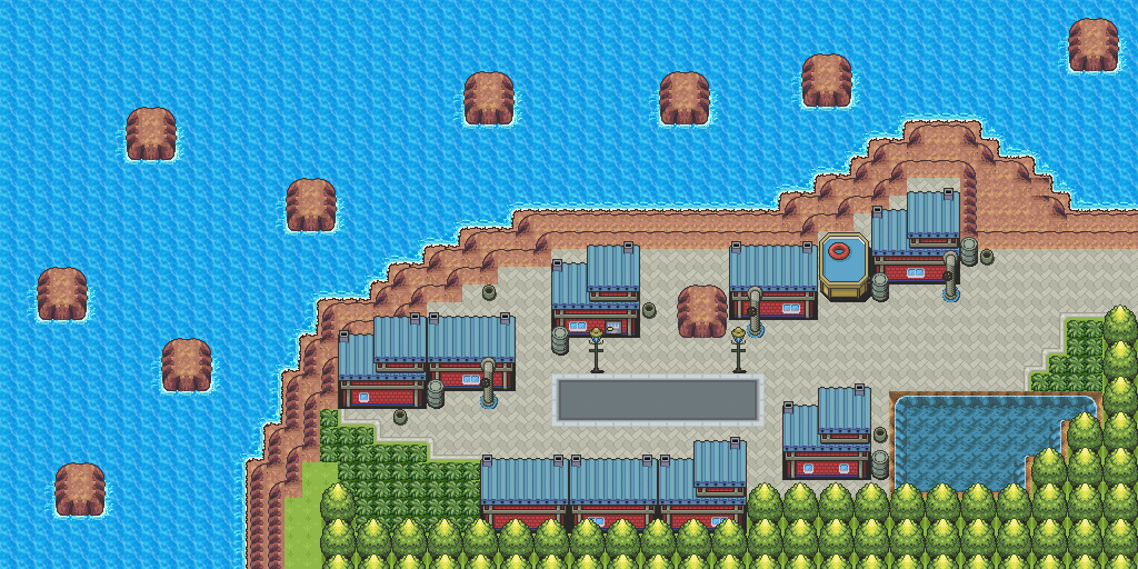
Update VII: Added the area to the south of Forthold Town, or no man's land if it's night. I've lowered the ground in from of the town because it looked a little too defenseless. The new part is a work in progress, so what do you think?Update VI: Some small changes in this one. Gate doors and Street lamps added along with some palette changes, tile error fixes and small rearrangement of bottom of map.
Update V: Since Forthold Town is quite north in the region of Okyto, and therefore colder, I've change the palettes to reflect that. Which do you prefer? Old version: [link]
Update IV: I've finished the entire town now, by adding a volcanic hot spring. I do still need to add some things to make the hot spring look less empty, but believe me, it looks much more interesting full of naked people 0_o
Update III: Added entrance.
Update II: Two changes here. The small one is the Poké Centre and Mart - they've been changed to match the style of the other buildings, as I thought they looked too out of place. And now the big part of the update, the last, and largest, building in this Town. It's a Town Hall, but also has multiple levels (including underground) for other areas. The thing on top is a watch tower, to keep an eye out on the viscous wild Pokémon in this area.
Update: I've added the area to the right, and removed a little of the bottom as that is now being completely revamped. Although there are a lot of buildings, I've tried to make it not look samey or too square by having them almost all look different.
A small preview of a new yet to be named Town in XENOTIME. It'll be directly north of Kindlewood Town, and in version 2.0 of the demo. It's a work in progress so there are still some errors, and the rest of the map isn't finished. There'll be no gym in this town by the way.
The walls are there to defend against the viscous wild Pokémon in this area. Although they're all doomed if Flying or Dragon types come...
What do you think of it so far? And any suggestions for it's name?
Credits:
Related content


Comments: 139

Overall


Vision
Originality
Technique
Impact
The town completed looks very nice. I like the smallness to it and the architecture of the walls and buildings.
I think the roads or paths feel a bit empty. I think a couple of flowers here and there would break the monotony of the roads and even add a bit of color to the town.
As for the hot spring: I think it should not be surrounded by grass because the grass makes it appear as a regular body of water. Perhaps you can make a towel rack to replace the two stones next to the hot spring.
_______________
Vision: I like the idea and concept of a fort town. Usually fort towns are small and compact so it appears very much like a real fort town.
Originality: The architecture is really nice and original. The PC and Mart fit in quite nice and their custom style helps the map.
Technique: The colors are nice, and the details, though subtle work well. I still feel the light-beige dirtpath does not fit in; a more desaturated stonepath or pebble road path would work well with the architecture.
Impact: Overall, a very nice town-it is interesting and unique.
👍: 0 ⏩: 2
The gray ground tiling under the hot spring looks really great!
The gray auto-tile you used instead of the dirtpath is the right color(I envisioned) because before the bright-beige one was so bright it stood out so much
But yea I agree, the gray one doesn't fit because it's too wide. Maybe you can edit it to make it narrower.
")
👍: 0 ⏩: 0

Thanks for the critique, I was getting the feeling nobody was going to xD
With all of the other towns and cities I've made, I've done the basic design first, then over about six months perfected them. With this, it's only been a month, so I haven't yet had time to perfect things like the paths looking empty. But over time it will look a lot better.
Thanks for the advice on that, I've changed it to a more natural looking plain rock now. That's a good idea to replace the rocks, I'll have a go at making that tile.
I knew it was the right idea to make it small xD
It's all about the subtle details in my opinion. A map can be great, but be ruined by tile errors. And for the path, I still haven't found a good auto-tile to use. This is the only one I have right now, and it doesn't really fit 100%: [link]
Thanks again!
 (Smile)")
👍: 0 ⏩: 0

👍: 0 ⏩: 0

Those rice field things are a nice touch, they really add too the feeling of the town ^^
👍: 0 ⏩: 1
Thanks, I appreciate it! I don't know if you've seen the new versions or not:
peekychew.deviantart.com/art/F…
peekychew.deviantart.com/art/F…
I'm actually taking this map and turning it into a new game. I'm going to change them quite a lot, first, making them much bigger. Stay tuned for an update on this sometime next week!
👍: 0 ⏩: 1

I must say I loved your design, looks really like from the real game, now I think the mart and pokecenter should keep their oroiginal design, its kinda, unique and perhaps you should use a dark shade of blue with some green in the rice fields, also, you could add something like paper lanterns and Torii arcs to increase this japanese feudal style ^^
👍: 0 ⏩: 0
Master-Pixel [2012-03-31 09:53:48 +0000 UTC]
Love this even more now
The blue patches however (outside of town) are too... structured, really square :/
Perhaps change the shape, or make one into water or something??
")
👍: 0 ⏩: 1
Thank you
They're paddy fields, so there design is meant to be square. I am trying to improve them to make them look more like paddy fields.
👍: 0 ⏩: 1
Master-Pixel In reply to PeekyChew [2012-04-02 09:42:55 +0000 UTC]
Ahh, that's cool then - at least you have a legitimate idea for them being there; and they aren't just plonked on
👍: 0 ⏩: 1


I like it, even the outside route fits the town.
👍: 0 ⏩: 1
Thank you, it took a while
Any suggestions for improvements?
👍: 0 ⏩: 1


ooh very nice.
I love the soft colours you used and the design in general is very sweet too.
The only thing that's bothering me a little is the perspective. It feels a tad too much from above, which makes it a little uncomfortable to look at it for too long. Plus, the water feels like it's seen from even an higher angle, so it seems a bit out of place.
But nonetheless, great work. :3
👍: 0 ⏩: 0


right one, the one on the left is too green and i feel that the flowers on the right one gives colour to the dull colours, even thought i know it's intentional i prefer it with some foliage other than green bushes, but if you were going to, change the colour of the flowers so that they dont stick out too much, that one pink flower really sticks out.
👍: 0 ⏩: 1
Thanks for the feedback. I've changed the colour of the pink so it doesn't stand out so much.
👍: 0 ⏩: 0

Right one... not meaning to be rude but the left tree makes that horrible grey stand out like a sore thumb. The right one helps but I still think you should change that one shade.
👍: 0 ⏩: 1
You don't seem rude. I'm assuming you mean the wall colours when you say grey? I've changed it to a lighter, whiter colour now, thanks for the advice.
👍: 0 ⏩: 1
Actually no. The grey was and in a way is in the trees, I guess I didn't explain it properly, there is (though not so much in this version) a really desaturated shade in the tree that looks almost grey but only in the biggest tree.
👍: 0 ⏩: 1
Oh, I didn't realise. On my monitor they just look green, but if I look at it from above slightly they do look greyer. Our monitors must be differently calibrated. But at least it's been mostly rectified.
👍: 0 ⏩: 1
I don't know why it looks so grey on mine, it does have a green tint but it's still for the most part pretty desaturated... I might change my screen tone and see what happens.
👍: 0 ⏩: 0

The trees are modified versions of ones from Platinum. The houses are highly modified versions of some from HG/SS. The rest is completely custom and not from any Pokémon game.
👍: 0 ⏩: 1

Oh ok well they look outstanding
👍: 0 ⏩: 0

nothing it just sounds nice
👍: 0 ⏩: 1
Ok, well thanks for the suggestion!
👍: 0 ⏩: 1
i like the idea of a hot-spring. maybe it can be used to bring your pokemon in and it slowly raises their happyness?(but not for rock,ground,electric,fire or steel types)
👍: 0 ⏩: 1
Nope, the walls are there to keep the local viscous Pokémon out, so everyone here is terrified of them.
👍: 0 ⏩: 1
damn right.
scared of pokemon, just like they should be.
im cereal, who wouldnt be afraid of often miniature creatures that have the ability to shoot lightning or create fissures or waterfalls or balls of demonic energy or shoot other mystical beams at you whilst using mystical powers from the unown.
they should be scared.
👍: 0 ⏩: 0


You walk into the side of the building. This is innovation xD
👍: 0 ⏩: 1


I still want to call it Wall Town. XD
I guess you could translate 'wall' into different languages for a better name...
Irish: Balla Town
Italian: Muro Town
Latvian: Sienas Town
Latin: Murus Town
Japanese: Kabe Town
👍: 0 ⏩: 1
| Next =>