HOME | DD
 PenUser — Planetfall

Published: 2012-07-21 21:12:26 +0000 UTC; Views: 30778; Favourites: 872; Downloads: 929
Redirect to original
Description
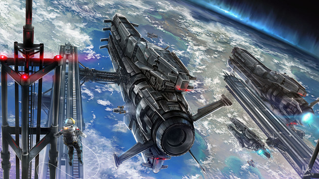
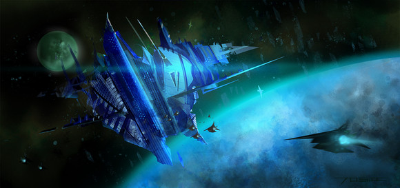
Ares Enterprises military carrier "Deepspace Horizon" releasing waves of orbital landing craft during opening phases of an assault against a rebel planet.Never has an invasion looked as beatiful as in the space age.
Blueprint I for the carrier ship(it also appears in my comic):
[link]
And of course, a link to Requiem, my comic:
[link]
So, I'm back!


 This little picture had been haunting me for some time, so I finally finished it today... although if you have suggestions or notes on how to make it better, I'm all ears. On a sidenote, the file of this pic is big enough to be used as a dektop background, if anyone wants to do that.
I'm also trying to get the Jeanne D'Arc pic colored at some point- I've inked it, but I've been just lazy and I haven't scanned it, sorry.
On other news, I've made great progress on "Requiem", just a few pages to ink, and all the pages for part 2 are done! I'll commence on coloring them soon, so expect to see the 26 final pages during the next month! I could also post some of the inked pages if anyone's interested.


 Oh and also, my job as a concept artist takes up some of my time, but you might see some of those pics at some point... we'll see.
Related content
Comments: 99

Your talent never ceasing to amaze me. This picture reminds me of several scenes from Deadspace. Do you work on a design team at all? Your creativity knows no bounds!
👍: 0 ⏩: 1

No, I don't work on a design team- although I have worked previously as a concept artist for a small games company. I might later on apply for something like that again, might be fun.
Thanks!
👍: 0 ⏩: 0

You Sir have a talent for world building whilst keeping a sense of reality to the story. As a writer I feel nothing but terrible, terrible envy. Keep up the good work!
👍: 0 ⏩: 1

Your welcome. I read your graphic novel, Requiem, last night: some excellent stuff there. I noticed the last update was some time in 2012 and wonder if it was on hiatus or if other creative projects had whisked you away from it. Then again being a man who likes leaving his audience on Cliff Hangers for every chapter, may my question never be answered
👍: 0 ⏩: 1

Thanks for reading it!
Well, actually it's not on hiatus. I'm scripting and drawing part 3 whenever there is time- though it is true that I've taken more projects that take up a part of the time that could be used for the comic, but some those are not shown here on dA(woodworking, armouring projects, prop weapons etc.) I'm also working on another method than with the last part, I'm making larger batches of pages in a certain workstage so they take longer as well. Still, could be faster with the new pages... I predict new pages within the next two months, but the next part being longer and introducing more plot driving scenes and a more complex mission it'll also be longer on the page count. Hopefully I'll be done with it by the start of next year. Altogether I've scripted some five parts, so it's roughly at a halfway mark with this part.
👍: 0 ⏩: 1

Ahhh.
And good, excellent! Plot is important, I find, but then again seeing a artist such as yourself run along with a mad cyborg and two psychopathic assassins I thought it might be fun to see what 'No Plot, No Problem' looked like haha. Heck most of my own work just starts off as a written doodle and ends up rolling along for a few aimless chapters. Last time IO tried to plan something out, an escape for a group of characters from 'The City' to 'Another Place', ended up with fourteen chapters of them some how getting into fights ever two steps.
So, rule of thumb there: never let the protagonist drive the creativity car.
👍: 0 ⏩: 0

Wonderful work...
You should illustrate the books of Kim Stanley Robinson !
👍: 0 ⏩: 1

His books really are sci-fi classics... it would be interesting, though I'm not sure if my level is good enough to make justice to the visions in the books. Thanks!
👍: 0 ⏩: 1

Your level is definitely enough, this picture proves it.
I've spent years illustrating his Mars trilogy for my own purpose, and I can tell you would do great at trying too, be it for his Mars books or for his recent and super ambitious "2312".
Anyway, keep the good work !
👍: 0 ⏩: 0

first thing I thought when I saw this was: Robotech.
👍: 0 ⏩: 0

What software did you use to get this effect? I really like it.
👍: 0 ⏩: 1

I used CS3 for the colors, the rest was made with Micron pens.
Thanks!
👍: 0 ⏩: 0

i love this style!and i also like how in the pic the dropships are upside down,makes you lose your bearings like youre really in space.
👍: 0 ⏩: 0

Have you ever seen the Japaness anime series Legend of the Galactic Heroes?
👍: 0 ⏩: 1

Well, no, I can't say I have. What's it like?
👍: 0 ⏩: 1

It's a sci-fi space opera about two heroes form opposite sides of the war ,but I've only seen two episodes but your ships do look alot like the Imperial ships. You can whatch the episodes on youtube well some of them at least.
👍: 0 ⏩: 0

this is the best ive seen in ages! great design man
👍: 0 ⏩: 1

Wow this is one of the most amazing sci-fi art I have seen lately ! 
👍: 0 ⏩: 1

top notch man. i love the detail, the suited figure in the foreground really gives a great sense of scale. the ships dropping away in formation just kills! reminds me of the shots of ww 2 bombers dropping those endless streams of bombs. this is just the kind of stuff i've got rattling around in my head.
you've done a man's job sir!
g
👍: 0 ⏩: 1

Very cool! I really like this style of work, nice one! Gone to check out the comic now
Only suggestion I have for you is to move the sun glare so it doesn't wash out the transport ship's nose, as it dominates the pic and detracts from the overall focus. Maybe move it up a little, or darken it slightly?
👍: 0 ⏩: 1

Thanks! 
👍: 0 ⏩: 1

No worries 
It did remind me a little of the planet fall scene in Avatar though (crossed with Gundam Wing 
👍: 0 ⏩: 0

Actually you nailed this one. Don't change anything. A lot of times you see a really cool scene drawn by someone. I FELT this one. I am standing on the deck of this ship and watching this all happen.
👍: 0 ⏩: 1

That was the general idea I wanted to convey with this, nice that it went through.
Thanks!
👍: 0 ⏩: 0

Thanks! 
👍: 0 ⏩: 1

I think the image had to have this blue-processed look for it to really jump, echoing the blue earth. If I wanted to find a technical explanation to why it would work, it would seem that the lens flare 'bleached' everything in blue, in that sense. Moreover in space there isn't atmosphere to diffuse light so the purity and contrast of the light is maintained.
Whatever it truly is or could be... its fucking kickass.
👍: 0 ⏩: 1

Makes sense. That's one of the reasons I like drawing space/scifi pics; you don't have to take the diffusion into consideration.
Thanks.
👍: 0 ⏩: 0

Awesome! I especially like all the fine details the "industrial" feel of everything.
👍: 0 ⏩: 1

This is a wonderful piece, mate. Damn! I love the atmosphere, blue coloring, composition, ships, everything. This is what I would do if I had the skills!
👍: 0 ⏩: 1
| Next =>

