HOME | DD
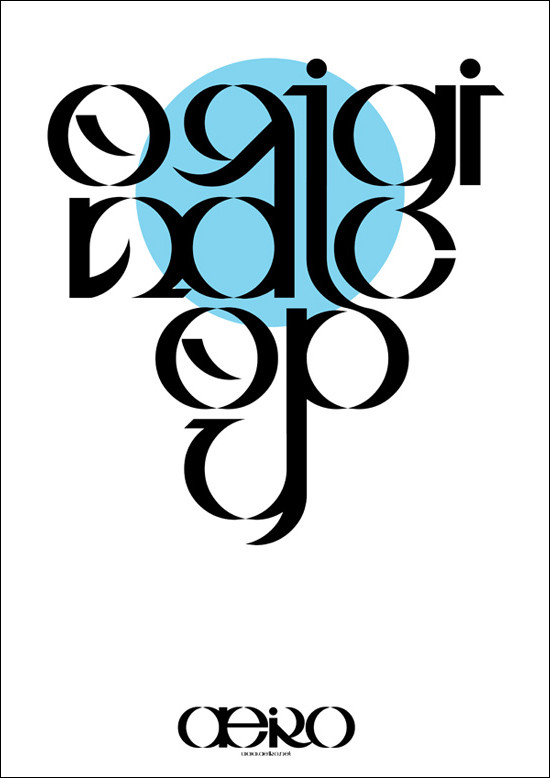
 pete-aeiko — Original Copy
Published: 2008-03-27 18:54:49 +0000 UTC; Views: 4426; Favourites: 54; Downloads: 132
Redirect to original
Description
Personal Typography Piece entitled 'Original Copy'Made a while ago, just uploading here..
Print available
Related content


Comments: 50

Very pretty, very unreadable. The purpose of words - communication. If you can't read them, why use them?
👍: 0 ⏩: 1

Because its not meant to be words, its meant to be a typographic piece, a design.
👍: 0 ⏩: 1
Let me disagree. Typography isn't about making the letters beautiful, it's about making them look like they mean what they say
👍: 0 ⏩: 1
Im going to leave it there, its obvious from the last comment you dont know what your talking about..
👍: 0 ⏩: 1
It's a shame that you end conversation without making a statement
👍: 0 ⏩: 0

I dont get why people are having a problem with reading it, its meant to be a graphical font/logotype
Tho, the C part for 'Type' looks pretty weird with the 'g' hanging the way it is.
Nevermind, its nice, releasing it as a full typeface?
👍: 0 ⏩: 0

The words appeared fairly clear to me, but only because of the deviation title. The balance of the text is amazing considering how complicated it is!
")
👍: 0 ⏩: 0


or perhaps its a good thing? did you think of that?
👍: 0 ⏩: 1

really depends on what the message of the piece is.
👍: 0 ⏩: 0


really great typography wpork pete!
Loking really nice!
👍: 0 ⏩: 0


good work. I think some of the letters are a bit too ambiguous tho so that if I didn't know what it already said it would be rather hard to read.
That said, it's very well designed.
👍: 0 ⏩: 0

well done pete, i think its really creative and it got a nice flow in it.
👍: 0 ⏩: 0

I don't know why people have such a hard time figuring it out. Great flow, and the minimal use of different shapes to create the letters gives a really coherent look to it all.
👍: 0 ⏩: 0


 (Smile)")

Very good.
But the "k" letter looks like "r" hahaha....
but I like it, very good work.
👍: 0 ⏩: 0

Overall its not a great peice of typo. the communication of the leters is purely not there. I finally made the letters out after 15 minutes. I think you could have done more to make it readable while maintaining that look.
👍: 0 ⏩: 1
no it took me 15mins to read the text.
👍: 0 ⏩: 0

That is so funky cool! I love the connections.
I am currently studying Visual Communications at UniSA. I am wondering what you learnt in Uni? Was it a Bachelor of Creative Arts? I was going to do that, but I am glad I didn't. Purely because my current Uni looks funky....
👍: 0 ⏩: 0


"One day..."
*looks longingly into the distance...*
Fantastic work man.
👍: 0 ⏩: 0


Lookin sharp bro, you definitely have the eye for type.
👍: 0 ⏩: 0


really really cool.
i love the lettering, and the simple blue works perfectly!
👍: 0 ⏩: 0

Fantastic typeface to work with; everything flows nicely into each other.
👍: 0 ⏩: 0


uh, you re-designed your logotype?
really nice typo, interesting and creative style.
👍: 0 ⏩: 0

After careful study, I was able to make out the letters. It was a little hard at first. If making the words a part of the design was important, then I agree they should have been more readable. But if they were just meant as design elements, I think you were very successful with symmetry, contrast, positioning, and noticeability. Is that a commercial font or something of your own? If its your own, copyright it right away. Its pretty cool and works well for your design.
👍: 0 ⏩: 0


I like how the letter forms have round unity to them. Any inspirations for the letters? Reminds me of something..
👍: 0 ⏩: 0


it's a K!!!!
R makes no sense or?
like it...
")
👍: 0 ⏩: 0


I like it, and can read it. what did you use to make it?
👍: 0 ⏩: 1
I love the symetrical simplicity also.
👍: 0 ⏩: 0

well, its communication is not clear for me... I can't understand the letters.
👍: 0 ⏩: 1

it's a creative solution, maybe therefore i can read the letters....
nice work, pete
 (Wink)")
👍: 0 ⏩: 0