HOME | DD
 pete-aeiko — aeiko.version.one

Published: 2005-07-02 00:51:07 +0000 UTC; Views: 3477; Favourites: 19; Downloads: 1893
Redirect to original
Description
www.aeiko.netWell i have finally got something up!
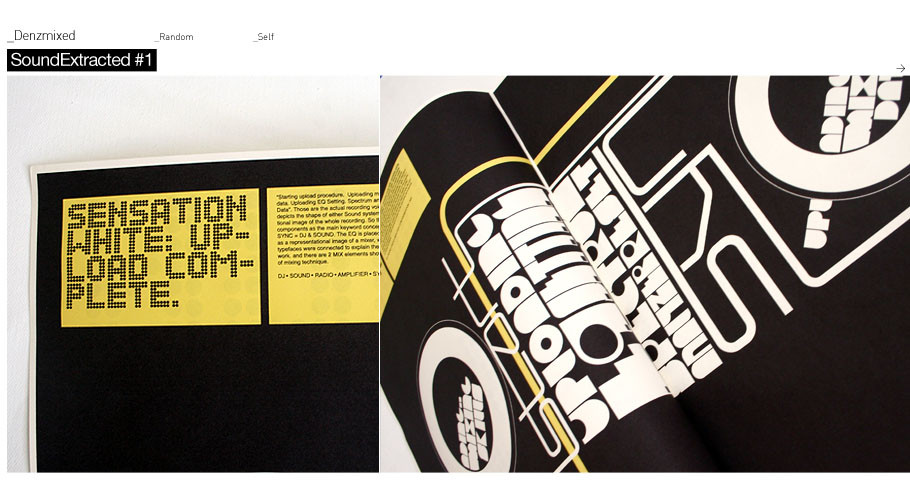
I know portfolio is half full - will be adding and completing this week, I just wanted to get it up today (1st July). Still have a fair bit to do (individual image and project info, splash, news section). The image show (batterybox) is just one of the print pieces shown in the portfolio.
Summer is here at last...lemme know what u guys think about the new site, I wanted to keep it quite minimal with simple navigation, yet still functional with more emphasis on my work..
so yeah go check it out - www.aeiko.net
Related content


Comments: 60

")

 (Smile)")
Have fun creating
👍: 0 ⏩: 0


Well, goody overally. Red '||' (paused) button doesn't fit in, brownish rectangles are no good. ")
As for you site. 1st page looks too dirty.
'Love' and 'Sound off', being close to each other make one think that 'Love' word is not an element of menu.
👍: 0 ⏩: 2
Nope.
👍: 0 ⏩: 0

i think your talking about a piece of print work in the portfolio rather than the actual site itself
👍: 0 ⏩: 0

Nicely put together. Liked the austerity of it all. It's very easy to make something with every bell and whistle right out there. Much harder to present a clean, elegant interface. This is as true for web design as it is for other professions, such as figure skating or GIS mapping.
I am on dial-up, and so for me, load-up was a bit slow, though not so slow I left to go elsewhere. Liked that ambient background sound, and in fact, I think it was one of the things that kept me there, waiting for sub-menus to load. The other was the percentage counter, so I had a way to gauge how long my wait would be. Both provided that anticipatory link between menu click and resulting pages.
Nice work. I continue to follow your stuff with great interest.
Best,
Russell (a mapper)
👍: 0 ⏩: 0


Very nice color scheme.
I want a print of Session 150k so bad.
👍: 0 ⏩: 0

people will kiss your ass all over for the other parts of this site, so ill concentrate on one thing that is different - because quite frankly sites like this have been done before.
Anyway, I love your colourscheme. It is really interesting and it works beautifully with the text. So full marks on that.
👍: 0 ⏩: 0


What's up with the first 4 interactive / misc link bits? They look as though they should load an image or something, but they don't work. Other than that, that's a really clean, direct site.
👍: 0 ⏩: 1
yeah im working on those, will fill my portfolio up this week
👍: 0 ⏩: 0

Very slick, i for one found the colour scheme innoffensive and easy on the eyes. I also genrally get annoyed by sound on websites but the ambient approach works well. As you said tho it is in need of more text.
👍: 0 ⏩: 0


Very nice site. I'm so dumb with flash I'm really impressed, thought I know it's your job to know all of this stuff ")
One suggestion would be to have a little first impression of the piece in the little orange squares, bcause there, you get a bit lost, clicking blindly ...
👍: 0 ⏩: 0


Hey man. Website looks awesome. Like it's clean look and how your work stands out on the website as a background. Nice one
👍: 0 ⏩: 0

Bland. I don't like the colour choice, and header and footer text is hard to read. Overall not that good of a design.
👍: 0 ⏩: 1
what header and footer text :s
👍: 0 ⏩: 1
The black "batterybox" or is that not a part of the design?
👍: 0 ⏩: 1
as stated in the description, this is just an example of one of the print pieces in my gallery and nothing to do with the web design.
👍: 0 ⏩: 0


nice man. im liking the flash and nice work u have on there
👍: 0 ⏩: 0


Very nice site! It's loads fast en naviagation is simple ^^
And the little brown shapes where you can clickt on are great because you don't know what you get ^^
👍: 0 ⏩: 0
spritek [2005-07-02 09:54:09 +0000 UTC]
This is an excellent web design 
")
 (Wink)")

👍: 0 ⏩: 1
I just wanted to keep it kind of pastilly / summery colours, I was thinking of doing another version though a darker one, and having the user pick - what u think?
👍: 0 ⏩: 2
spritek In reply to pete-aeiko [2005-07-02 18:16:08 +0000 UTC]
yep, a darker one would fit better I think; and for the summer touch, maybe put a vector flower or something like that 
👍: 0 ⏩: 0

yer a dark side would look sweet
👍: 0 ⏩: 0

That was simply great.
Quastion: how could you make the screen that show the images change from a size into another fit the choosen image or option?
thank you.
👍: 0 ⏩: 0


its nice, like the animation and so on, it just feels a little...I dunno...boring? nah, wrong word...but you know what I mean? But then again, if you're trying to emphasize your work, it's perfect
👍: 0 ⏩: 0

looking very fresh mate...nice and simple and loads of style.
you have to tell me how to do the resizing of the boxes man...I've been looking for a script for that for ages.
👍: 0 ⏩: 0

it's really cool - i especially love that the thumbs back is fitting to their size(i wonder how you did it) - cool effect, but if i can suggest you sth - you should block re reloading of image, when clicking active button again. (just one "if")
👍: 0 ⏩: 0


One thing I dig about it is how you show some of the prints being held and hung on the walls. Just show how much your/our type of art really comes out. And that it looks great even if its not a Painting from an Art gallery. Sheer class man. +fav
BookMarked it!
👍: 0 ⏩: 0

first block in the third row isnt accessible
u can click on it,and the box forms, but ntohign comes up
sorry if u knew that already. i tend to annoy people
anyway EXCELLENT SITE
i wish i had found it alot sooner!!!!!!!!!!!
too bad
so mad props 2 u for all that work. thats an amazing portfolio... i will reccomend u if i meed anyone looking for a good graphic designer
👍: 0 ⏩: 0

awesome stuff!
found a couple of bugs tho:
-once sound is turned off, i couldnt get it back on
-some links didnt work at all or didnt load completely.
👍: 0 ⏩: 0

that bold dark font is awful...but im diggin the Univers or is it Helvetica? Its ok...the grid seems a bit weird. but it works.
👍: 0 ⏩: 0

| Next =>