HOME | DD
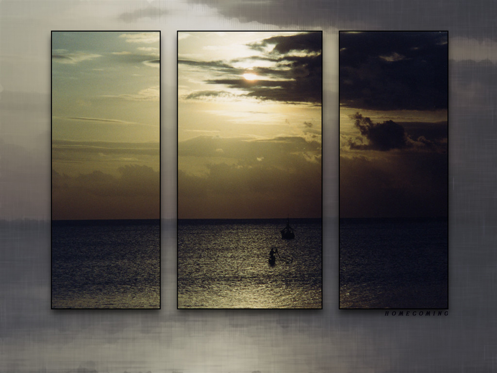
 ph-enix — - homecoming v2 -
Published: 2003-08-05 20:03:32 +0000 UTC; Views: 506; Favourites: 1; Downloads: 60
Redirect to original
Description
the first version is herei'd appreciate some feedback as to which version you think is better and why. thanks.
 (Smile)")
edit: i took the first version down. this one was unanimously more popular. thnks to everyone who gave me feedback.
Related content


Comments: 9

really great composition, i think this version is better, especially the border is wonderful, good presentation
keep it up!
👍: 0 ⏩: 1

thanks very much for your input and support.
👍: 0 ⏩: 0

i love the photos man, this is the better version.
try just teh photo with a thin black border
👍: 0 ⏩: 0

i think they're both beautiful
but i like this one the best.....compliments
the image better ...imho
^,,^
👍: 0 ⏩: 0

this is nicely conceived and executed. the three panes with the beautifully setting/rising? sun really leaves a good impression.
")
👍: 0 ⏩: 0

I like this one better- the background is an ocean to itself which is really creative and this one just has a nicer feeling to it .
👍: 0 ⏩: 0

This version most definitely. I think by lightning the background, the main area, which you are trying to emphasize pops out much more. And it's much softer, which I think works better for the overall composition. Sunsets...to me...are very calming and having it softened a bit...just works better for me personally. I'd like to see a lil' bit more detail in the right rectangle....but it's beautiful overall...*sigh* wish I was there! Oh...I also really like the tones of the background area...very pretty!
👍: 0 ⏩: 0

v2 all the way. the contrast of dark picture and light background work really well. i love the layout of the whole thing, very unique. the picture itself is very inviting. great work.
👍: 0 ⏩: 0

I like the boarder on the old one, its just got more too it, nice colour switch with the white/yellow tint
Yet i like the back ground on the new one (this one) its alot brighter and happier but more importantly it flows much better with your 3 window design. Its acctually given me ideas i could do for websites, i like good work.
👍: 0 ⏩: 0