HOME | DD
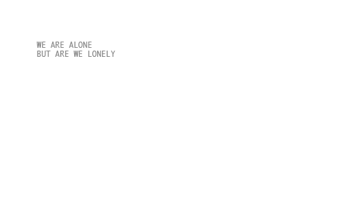
 Phillus — Suffering Stamp IV

Published: 2008-03-25 02:04:03 +0000 UTC; Views: 999; Favourites: 91; Downloads: 12
Redirect to original
Description
Being left alone.Related content


Comments: 23

When I'm all alone I like to tell myself some jokes so I can laugh and feel less lonely. (:
👍: 0 ⏩: 1

haha, yea?
It's sad..isn't it >_<
Loneliness sucks.
👍: 0 ⏩: 1

It's pretty sad for most people, but as long as you get used to it, it's really nothing at all.
👍: 0 ⏩: 1
....lofl I've been lonely for...too long,
It doesnt get any easier...its just...there
though. You do get use to it.
👍: 0 ⏩: 1

I approve on how this message is conveyed. 83 Like you don't have to read the letters itself to get the message, but to see it to get that feeling of what the stamp is trying to say.
When I see it in the corner, it makes me feel like it's symboling the said person, staying in a corner of the room, suffering in the loneliness
👍: 0 ⏩: 1
Thanks; this is how I interpreted the stamp while I am making it. The whole idea is based on white because loneliness is alone, which means you are in a vast space with no one else. Also, I think I've been using black too much, thus white is pretty much an alternative choice for this.
👍: 0 ⏩: 1
Nice interpretation 83
The placement of the words among the white would also make me feel like the words are suffering the same problem
I'd also think of blue as a nice alternative, probably to go along with how people feel alone, and blue as in sadness. "Feeling alone and blue", as I'd probably put it < x3
👍: 0 ⏩: 1
No blue! x3 I like that colour and not going to use it in something as bad as this one~
No wonder I seem to be pleased with the result. ")
👍: 0 ⏩: 1
XD Haha! that's understandable :3
Yeah 83 I'd probably also feel like the words could have originally been black, but it's turned grey, as it feels like it's slowly blending in, feeling alone.
👍: 0 ⏩: 1
I wasn't into animated stamp that time, but at least you don't need a stamp to animate when it's good enough in some sense, right?
👍: 0 ⏩: 1
Yeah 8D That's just how I saw it in my interpretation :3 The message is at least sent through.
Heh, makes me think of how some people complain how people fave their stamps more than their other artworks. I can understand that, if they are more prideful in their artwork than a simple stamp, but in some way, Stamps could be just as artistic, based on how you illustrate it, could possibly symbolize it, and what the message is.

👍: 0 ⏩: 1
The reason that people rant about this is because a stamp is small, easy and look effortless (seriously...you see some of those nice messages which are SHORT and WITHOUT ANIMATION get so much faves!) that's why people dislike stamp because it's too simple to create on. I care more of my drawings too, even though they are not good...
👍: 0 ⏩: 1
Yeah, that's why I understand if some people don't like their stamps being given more attention, since it's not nearly as important, or prized as hard work like original drawings and stuff.
👍: 0 ⏩: 1
But think of it: stamps are more practical since you can use it to tell somebody something and decorate your page, while drawings are aesthetic items and you usually don't use them as much as you use stamps.
👍: 0 ⏩: 1
Hmm, that's a good point. I think I know what you're saying there.
👍: 0 ⏩: 1
If you don't know what I am saying there, that means my English is horrible.
👍: 0 ⏩: 0

 (Smile)")
You can use it, but I hope you would remove it soon enough.
👍: 0 ⏩: 0