HOME | DD
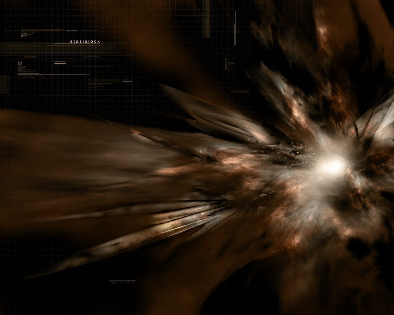
 phylum — abstract exp colors

Published: 2002-12-01 21:44:29 +0000 UTC; Views: 746; Favourites: 4; Downloads: 22
Redirect to original
Description
I put alot of work into this probly in all 7 hours. I feel pretty happy with the results. please comment state your opinions.PS: please view full size for full detail!
Related content


Comments: 20

Damn ... i just love the organicness of the shape and the lighting and typo are great too , good work m8
👍: 0 ⏩: 0


NIIIIIIIIIIIIIIIIIIIIIIIIIIIIIIIIIIIIIIIIICE +fav
👍: 0 ⏩: 0

Nice, but OW! Too many little lines at the bottom.
👍: 0 ⏩: 0

It's awesome as hell. The only thing that I didn't like was probably all the shite little boxes on the bottom... :\ Other than that. Great job man.
👍: 0 ⏩: 0


nice one, but i dont get y the light rau just seems to stop?? hmmmm il be pondering over this for quite some time lol
👍: 0 ⏩: 0

the colors look sweet... i'm heterosexual and i like purple... there is nothing wrong with that.
👍: 0 ⏩: 0

awesome job dude....A+ on the vec's and i love the style...looks like something from cubadust. no fav's yet... this img deserves quite a few. +fav man.
👍: 0 ⏩: 0


i like the colors, but the typo at the bottom could use some work
👍: 0 ⏩: 0


nice
doesnt seem very original, but it is cool.
👍: 0 ⏩: 0

Render could be smoother at some pints. And I think the airbrushing needs more work, maybe more color. But very good nontheless.
👍: 0 ⏩: 0


this is pretty damn cool.. you should make a wallpaper out of this
👍: 0 ⏩: 0


love the colours and the blending, really nice design. great job.
👍: 0 ⏩: 0

its beautiful man very nice work i love the refraction with the raytrace maps
plus the light in the middle i love that but how did you do that?
over all great work +fav my friend
👍: 0 ⏩: 0