HOME | DD
 phylum — inscerection

Published: 2002-04-06 18:31:24 +0000 UTC; Views: 1699; Favourites: 10; Downloads: 106
Redirect to original
Description
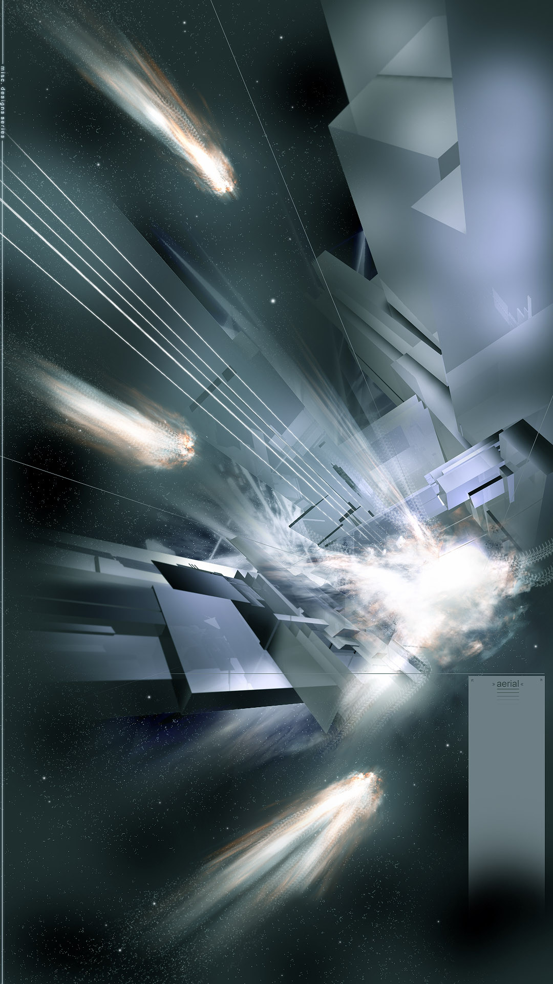
I worked rally hard on this one, its a big step up in my art. I hope youn guys enjoy this.(it even has icon space!)Related content


Comments: 26

This has got to be the best deviation I've seen YET. Good work!
👍: 0 ⏩: 0


Shit, that's one amazing piece. Great colors, feeling. MAkes me all happy and inspired inside.
👍: 0 ⏩: 0

Renders look really great, maybe another material or something would be better. I dont like the grid either, but the rest is great!
👍: 0 ⏩: 0


1) insurrection
2) big grid is awful
3) rest is damned ok!
-----
{++trendwhorekud.com
👍: 0 ⏩: 0

Great render. I love the way you took a fairly mellow hue and turned up the notch on intensity
-----
20020613_0000+
👍: 0 ⏩: 0

quite the piece of eyecandy here. very spiky, and i like the colors, maybe could use a little darkening in the top left area, but thats nothing big. excellent piece.
[newest pieces submitted 5/2/02]
[link] Less Than Human-Red
[link] Less Than Human-Blue/Green
👍: 0 ⏩: 0

damn, this is about the time you wish you were in this community a long time ago so more people would see you tight work!
-----
.:king-arthur-xvi:. [link]
support :ninjafella:! [link]
👍: 0 ⏩: 0

sonik u fucking niw what i think of it to fucking good
👍: 0 ⏩: 0

good work mate hope to see more works from u soon.
-----
Progressive minds never lose their Objectives
👍: 0 ⏩: 0

Looks nice enough from the thumbnail, so I am guessing it is even better in full view. Being the silly twerp I am I always comment before I look at things *smacks his head*. What program did you use?
👍: 0 ⏩: 0

The silver and the blue work really well together. The design is awesome
-----
To be upset over what you dont have is to waste what you do have
👍: 0 ⏩: 0

Mmm blue always gets me too. Great work...you certainly have moved up a gear. **Added to Favs **
-----
Mmm..time for some adverts: https://stotty.deviantart.com/gallery
👍: 0 ⏩: 0


this is really really good. nice and complex, nice textures, etc. go you.
👍: 0 ⏩: 0


That is SO cool *adds to faves*. I like the way they're reflecting da light off each other.....
👍: 0 ⏩: 0

i gotta fix the inscirection but yes it is suppose to be spelled inscerection i jus wanted it to be diffrent and btw thanx for the fav man.
👍: 0 ⏩: 0


also, there is a typo on the top of the 3 inscerection, you spelled it inscirection
-----
hey there mr krinkle, how are you today?
👍: 0 ⏩: 0
oh god, i never use anyone elses pieces except mine on my desktop, but you just made it there
awesome work!
but is it supposed to say insurrection?
hehe*adds to faves as well*
-----
hey there mr krinkle, how are you today?
👍: 0 ⏩: 0

Amazing. You weren't trying to spell insurrection, were you?
-----
Sir Angram
👍: 0 ⏩: 0

whooa tripy lol i like the light? that are originating from these objects
-----
-=Keep on top=-
👍: 0 ⏩: 0