HOME | DD
 Platinus — Contemplations on the Universe

Published: 2009-11-18 19:41:11 +0000 UTC; Views: 893; Favourites: 17; Downloads: 0
Redirect to original
Description
UF 5Using =FarDareisMai 's inside coloring tutorial thinger


Related content
Comments: 11


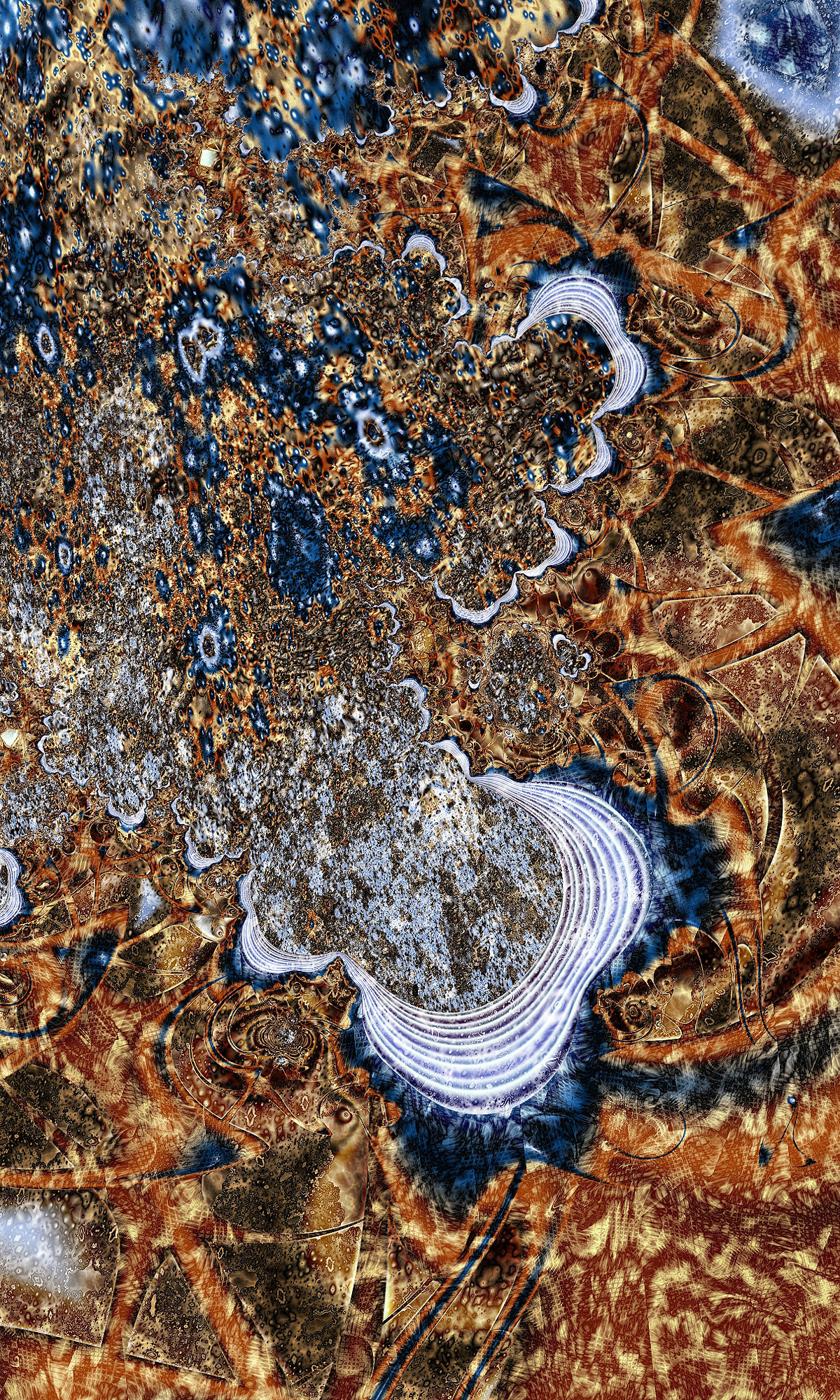
I think this fractal is at war with itself. I'm used to the way you bring in a bunch of different textures and competing shapes; in works like "Candy Coated Dish Washer" and "Ore," the internal competition engages the viewer with tension, an edge-of-the-seat off-kilter kind of thing. Here, though, I'm not reading tension. I'm reading infection.
This is partly because the blue shapes very strongly remind me of spreading mold, but that's not the only reason. After all, that in itself wouldn't be a bad thing—I'm sure someone could make wondrous art out of spreading-mold shapes. It's mostly because of the composition. You have a very distinct division in this fractal: there is the mitosis-esque stuff on the left side of the white lines (part A), and the more structured section to the right of and below the white lines (part B). Right now, it looks like part A is swooping down on part B and pushing it towards the edge of the image, as part B tries desperately to escape. It isn't even in a dramatic sweeping look-what-we-are-facing way. It's more like a tumor has bitten off the corner of your image. It's heavy and unbalanced and haphazardly done.
The gradients also need work, I think. Especially in part A. They are swerving all over the value range, going from darkest dark to brightest bright in fractions of a millimeter, and what could have been a great texture turns into visual static, buzzing on my screen. It almost looks like it was oversharpened or overfiltered in postprocessing. A gentler fade would work much better.
Now, what this fractal DOES have going for it is, it's thought-provoking. Obviously if I can go into this much depth about my reaction to it, all is not lost. But even here, somehow I do not think you intended this fractal to make me think about destruction, invasion, genocide, and mold. It would be one thing if you were actually trying to depict such things. But you called it "Contemplations on the Universe." Contemplation seems much more calm, more more about searching for hidden order—or at least integrating oneself into the chaos. There is nothing contemplative about this fractal; it's all confrontation. Unless you are trying to slyly tell us that your contemplations have lead to the discovery that the universe is a terrifying mess of confusion, hopelessness, and despair... but somehow I doubt that that is the case. e.deviantart.net/emoticons/w/w… " width="15" height="15" alt="


Anyway, I am starting to wonder how many people are going to rate this as unfair (perhaps without even reading this far), so I suppose it's time to talk about what I *do* like, and then wrap it up. First, the mesh/crosshatching is really awesome. It's also interacting with the layer(s) beneath it in a way that creates a complex distorted outline effect. That's how you do chaos beautifully. Second, as vehemently as I dislike the placement of those white lines and the composition that it creates, the lines themselves are actually quite nice and even serene. And, last but not least, the underlying structure in part A looks really, really interesting and promising. It's burdened by some of the frills right now, but the nature of the fractal underneath shows through and intrigues the eye. If you were to revisit this piece focusing on these three things, you could have quite the fractal on your hands.
So, even though I see some potential here—even though I definitely admire the original and daring attitude behind it—even though it provokes a reaction, which is more than can be said for many other fractals—the final product just doesn't work for me. But hey, it wouldn't be experimenting if the results were guaranteed, now would it?
👍: 0 ⏩: 0

much better work than those overused shiny happy flower fractals. keep going.
👍: 0 ⏩: 0

tooo busy 
Too many textures with same values of opacity and not enough blends 
👍: 0 ⏩: 0

It's a hot mess of a fractal.
I'm not a fan of the whole thing, but there are definitely some nice elements to it. Split into four parts top to bottom and I love the second from the bottom with the blue swirly bit. The combination of textures is also impressive and transition to each other far better than a lot of others you've made with multiple textures.
👍: 0 ⏩: 0

the very bottom and the far right is pretty nice but the middle and the left not so good
👍: 0 ⏩: 0

I'm not sure where you're going with this one. A little bit confusing but the gradient is cool.
👍: 0 ⏩: 0

God, it looks organic! Messy or not, very cementy lol I like it. It would also make a great texture.
👍: 0 ⏩: 0

i think this is a little too messy...
but i like the blues!
👍: 0 ⏩: 0


